Group assignment 1 of Applied Statics

Where Do People Drink The Most Beer, Wine And Spirits?
Back in 2014, fivethiryeight.com published an article on alchohol consumption in different countries. The data drinks is available as part of the fivethirtyeight package. Make sure you have installed the fivethirtyeight package before proceeding.
# Download data
library(fivethirtyeight)
data(drinks)- What are the variable types? Any missing values we should worry about?
# Skimming the data set to identify missing data and characteristics
glimpse(drinks)
## Rows: 193
## Columns: 5
## $ country <chr> "Afghanistan", "Albania", "Algeria", "And~
## $ beer_servings <int> 0, 89, 25, 245, 217, 102, 193, 21, 261, 2~
## $ spirit_servings <int> 0, 132, 0, 138, 57, 128, 25, 179, 72, 75,~
## $ wine_servings <int> 0, 54, 14, 312, 45, 45, 221, 11, 212, 191~
## $ total_litres_of_pure_alcohol <dbl> 0.0, 4.9, 0.7, 12.4, 5.9, 4.9, 8.3, 3.8, ~skim(drinks)| Name | drinks |
| Number of rows | 193 |
| Number of columns | 5 |
| _______________________ | |
| Column type frequency: | |
| character | 1 |
| numeric | 4 |
| ________________________ | |
| Group variables | None |
Variable type: character
| skim_variable | n_missing | complete_rate | min | max | empty | n_unique | whitespace |
|---|---|---|---|---|---|---|---|
| country | 0 | 1 | 3 | 28 | 0 | 193 | 0 |
Variable type: numeric
| skim_variable | n_missing | complete_rate | mean | sd | p0 | p25 | p50 | p75 | p100 | hist |
|---|---|---|---|---|---|---|---|---|---|---|
| beer_servings | 0 | 1 | 106.16 | 101.14 | 0 | 20.0 | 76.0 | 188.0 | 376.0 | ▇▃▂▂▁ |
| spirit_servings | 0 | 1 | 80.99 | 88.28 | 0 | 4.0 | 56.0 | 128.0 | 438.0 | ▇▃▂▁▁ |
| wine_servings | 0 | 1 | 49.45 | 79.70 | 0 | 1.0 | 8.0 | 59.0 | 370.0 | ▇▁▁▁▁ |
| total_litres_of_pure_alcohol | 0 | 1 | 4.72 | 3.77 | 0 | 1.3 | 4.2 | 7.2 | 14.4 | ▇▃▅▃▁ |
The data set contains 193 rows and 5 columns. ‘country’ column has a character data type. ‘beer_servings’, ‘spirit_servings’ and ‘wine_servings’ have an integer data type, while ‘total_litres_of_pure_alcohol’ has a double data type. None of the columns have any missing values. The data is available for 193 unique countries.
- Make a plot that shows the top 25 beer consuming countries
#Matching beer servings drunk per person to each country in descending order and show top 25
drinks %>%
  slice_max(order_by = beer_servings, n=25) %>%
  ggplot(
    aes(x=beer_servings,y=fct_reorder(country,beer_servings))) +
  geom_col(fill='blue') +
  #label graph
  labs(
    title = "Top 25 beer-consuming countries",
    subtitle = "Namibia has the highest beer consumption. \nMost of the top 25 countries belong to Europe.",
    x = "Beer servings drunk per person in 2010",
    y = "Country") +
  theme_bw()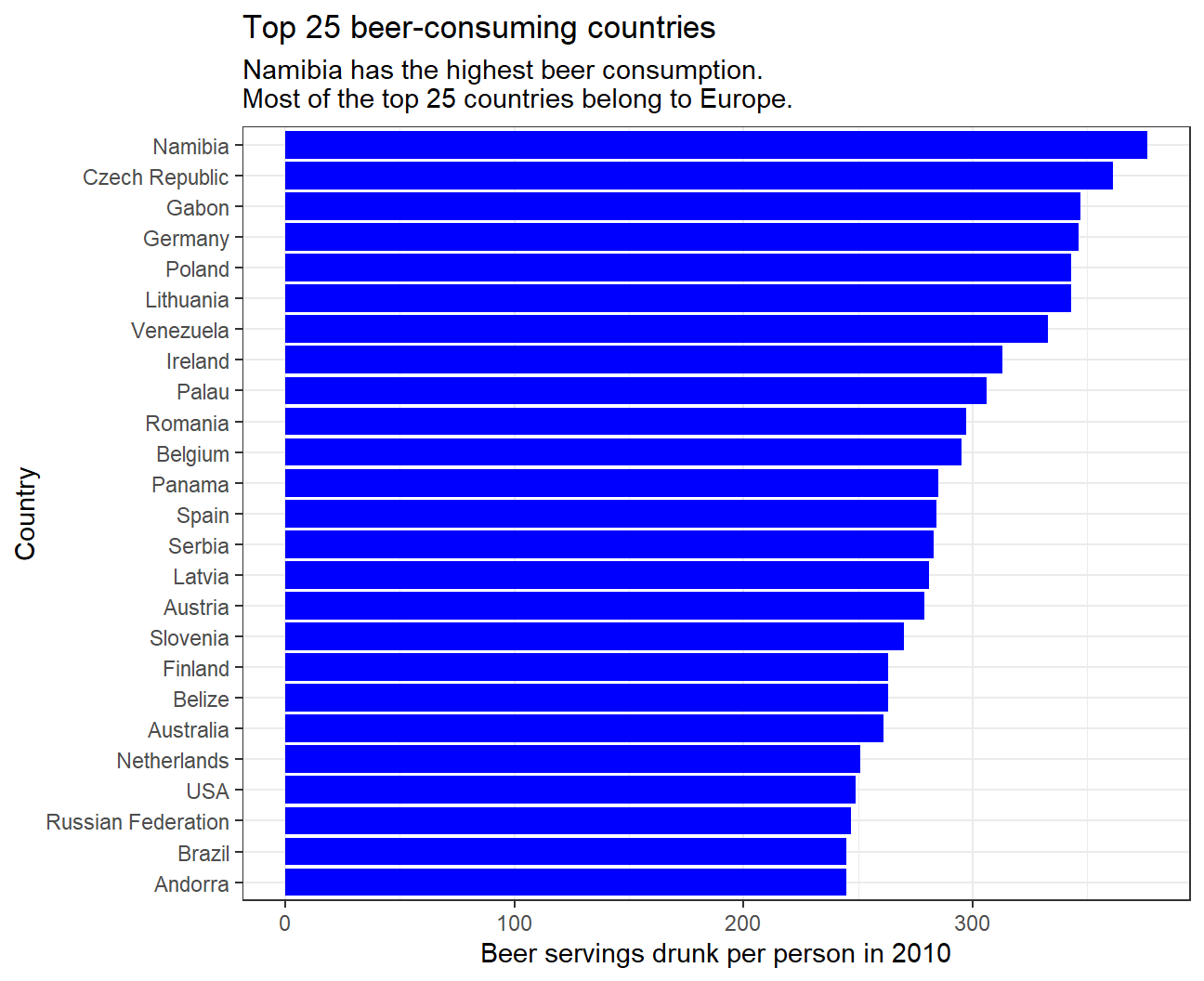
- Make a plot that shows the top 25 wine consuming countries
#Matching wine servings drunk per person to each country in descending order and show top 25
drinks %>%
  slice_max(order_by = wine_servings, n=25) %>%
  ggplot(
    aes(x=wine_servings,y=fct_reorder(country,wine_servings))) +
  geom_col(fill='blue') +
  #Label graph
  labs(
    title = "Top 25 wine-consuming countries",
    subtitle = "France has the highest wine consumption \nMost of the top 25 countries belong to Europe.",
    x = "Wine servings drunk per person in 2010",
    y = "Country") +
  theme_bw()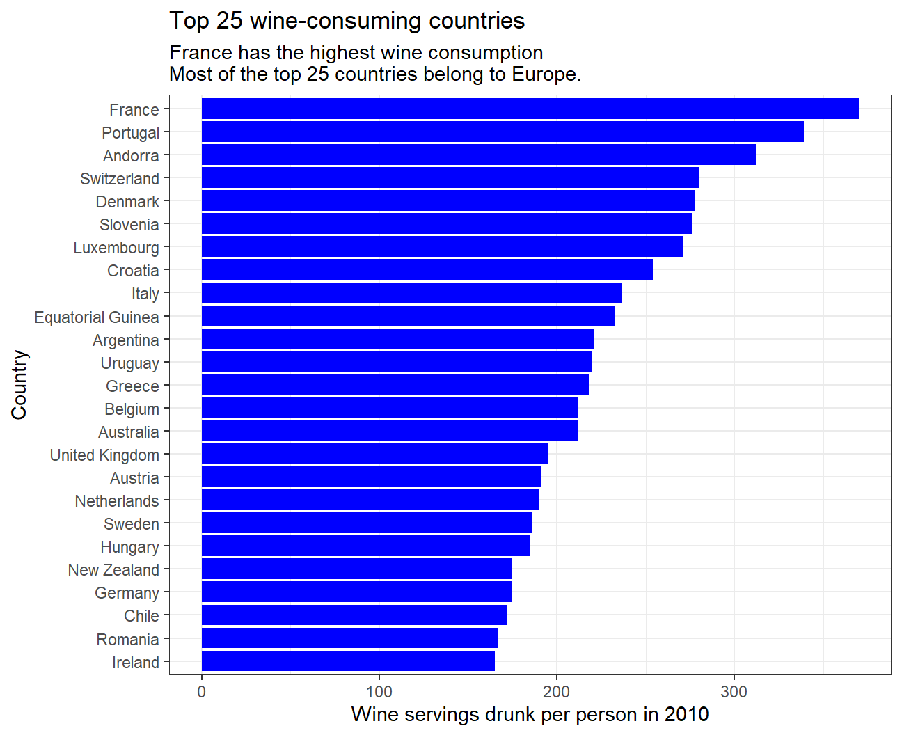
- Finally, make a plot that shows the top 25 spirit consuming countries
#Matching spirit servings drunk per person to each country in descending order and show top 25
drinks %>%
  slice_max(order_by = spirit_servings, n=25) %>%
  ggplot(
    aes(x=spirit_servings,y=fct_reorder(country,spirit_servings))) +
  geom_col(fill='blue') +
  #Label graph
  labs(
    title = "Top 25 spirit-consuming countries",
    subtitle = "Grenada has the highest spirit consumption. \nMost of the top 25 countries belong to Europe and Caribbean region.",
    x = "Spirit servings drunk per person in 2010",
    y = "Country") +
  theme_bw()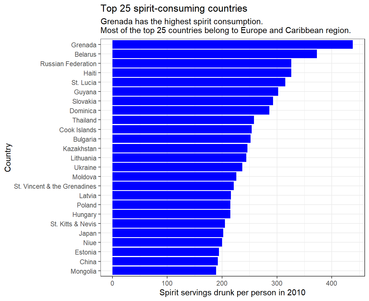
- What can you infer from these plots?
The data shows that most of the top 25 countries consuming all three types of alcoholic drinks belong to Europe, inferring that alcohol consumption is very popular in most European countries. Interestingly, spirits are very popular in the Caribbean region while beer and wine are not. In addition, the data displays that some Asian countries such as Kazakhstan and Japan are fond of spirits, while there is almost no Asian country in the top 25 for beer or wine consumption. For all three alcoholic drinks, the increase in consumption in the top 25 is gradual.
Analysis of movies- IMDB dataset
We will look at a subset sample of movies, taken from the Kaggle IMDB 5000 movie dataset
#Loading the dataset
movies <- read_csv(here::here("data", "movies.csv"))

#Examining the structure and summary statistics for the data
glimpse(movies)
## Rows: 2,961
## Columns: 11
## $ title <chr> "Avatar", "Titanic", "Jurassic World", "The Avenge~
## $ genre <chr> "Action", "Drama", "Action", "Action", "Action", "~
## $ director <chr> "James Cameron", "James Cameron", "Colin Trevorrow~
## $ year <dbl> 2009, 1997, 2015, 2012, 2008, 1999, 1977, 2015, 20~
## $ duration <dbl> 178, 194, 124, 173, 152, 136, 125, 141, 164, 93, 1~
## $ gross <dbl> 7.61e+08, 6.59e+08, 6.52e+08, 6.23e+08, 5.33e+08, ~
## $ budget <dbl> 2.37e+08, 2.00e+08, 1.50e+08, 2.20e+08, 1.85e+08, ~
## $ cast_facebook_likes <dbl> 4834, 45223, 8458, 87697, 57802, 37723, 13485, 920~
## $ votes <dbl> 886204, 793059, 418214, 995415, 1676169, 534658, 9~
## $ reviews <dbl> 3777, 2843, 1934, 2425, 5312, 3917, 1752, 1752, 35~
## $ rating <dbl> 7.9, 7.7, 7.0, 8.1, 9.0, 6.5, 8.7, 7.5, 8.5, 7.2, ~skim(movies)| Name | movies |
| Number of rows | 2961 |
| Number of columns | 11 |
| _______________________ | |
| Column type frequency: | |
| character | 3 |
| numeric | 8 |
| ________________________ | |
| Group variables | None |
Variable type: character
| skim_variable | n_missing | complete_rate | min | max | empty | n_unique | whitespace |
|---|---|---|---|---|---|---|---|
| title | 0 | 1 | 1 | 83 | 0 | 2907 | 0 |
| genre | 0 | 1 | 5 | 11 | 0 | 17 | 0 |
| director | 0 | 1 | 3 | 32 | 0 | 1366 | 0 |
Variable type: numeric
| skim_variable | n_missing | complete_rate | mean | sd | p0 | p25 | p50 | p75 | p100 | hist |
|---|---|---|---|---|---|---|---|---|---|---|
| year | 0 | 1 | 2.00e+03 | 9.95e+00 | 1920.0 | 2.00e+03 | 2.00e+03 | 2.01e+03 | 2.02e+03 | ▁▁▁▂▇ |
| duration | 0 | 1 | 1.10e+02 | 2.22e+01 | 37.0 | 9.50e+01 | 1.06e+02 | 1.19e+02 | 3.30e+02 | ▃▇▁▁▁ |
| gross | 0 | 1 | 5.81e+07 | 7.25e+07 | 703.0 | 1.23e+07 | 3.47e+07 | 7.56e+07 | 7.61e+08 | ▇▁▁▁▁ |
| budget | 0 | 1 | 4.06e+07 | 4.37e+07 | 218.0 | 1.10e+07 | 2.60e+07 | 5.50e+07 | 3.00e+08 | ▇▂▁▁▁ |
| cast_facebook_likes | 0 | 1 | 1.24e+04 | 2.05e+04 | 0.0 | 2.24e+03 | 4.60e+03 | 1.69e+04 | 6.57e+05 | ▇▁▁▁▁ |
| votes | 0 | 1 | 1.09e+05 | 1.58e+05 | 5.0 | 1.99e+04 | 5.57e+04 | 1.33e+05 | 1.69e+06 | ▇▁▁▁▁ |
| reviews | 0 | 1 | 5.03e+02 | 4.94e+02 | 2.0 | 1.99e+02 | 3.64e+02 | 6.31e+02 | 5.31e+03 | ▇▁▁▁▁ |
| rating | 0 | 1 | 6.39e+00 | 1.05e+00 | 1.6 | 5.80e+00 | 6.50e+00 | 7.10e+00 | 9.30e+00 | ▁▁▆▇▁ |
Use your data import, inspection, and cleaning skills to answer the following:
- Are there any missing values (NAs)? Are all entries distinct or are there duplicate entries?
The data has 2961 rows and 11 columns and no missing values. However, it is likely to contain duplicate entries since it has 2961 entries but only 2097 unique movie titles. Similarly, values for genre (17 unique values) and director (1366 unique values) are also repeated.
- Produce a table with the count of movies by genre, ranked in descending order
#See how many movies our data has for each genre
movies %>%
    group_by(genre) %>%
    count(sort=TRUE)
## # A tibble: 17 x 2
## # Groups: genre [17]
## genre n
## <chr> <int>
## 1 Comedy 848
## 2 Action 738
## 3 Drama 498
## 4 Adventure 288
## 5 Crime 202
## 6 Biography 135
## 7 Horror 131
## 8 Animation 35
## 9 Fantasy 28
## 10 Documentary 25
## 11 Mystery 16
## 12 Sci-Fi 7
## 13 Family 3
## 14 Musical 2
## 15 Romance 2
## 16 Western 2
## 17 Thriller 1- Produce a table with the average gross earning and budget (
grossandbudget) by genre. Calculate a variablereturn_on_budgetwhich shows how many $ did a movie make at the box office for each $ of its budget. Ranked genres by thisreturn_on_budgetin descending order
#Calculate the average gross earning and budget for each genre. Rank the genres by highest return on budget.
movies %>%
  group_by(genre) %>%

  #Calculating average gross earnings and budget
  summarise(mean_gross = mean(gross),
            mean_budget = mean(budget),

            #Calculating the mean of return_on_budget for each genre
            return_on_budget = round(mean((gross/budget)), 2)) %>%

  #Sorting the genres by mean return_on_budget
  arrange(desc(return_on_budget))
## # A tibble: 17 x 4
## genre mean_gross mean_budget return_on_budget
## <chr> <dbl> <dbl> <dbl>
## 1 Horror 37713738. 13504916. 88.3
## 2 Biography 45201805. 28543696. 22.3
## 3 Musical 92084000 3189500 18.8
## 4 Family 149160478. 14833333. 14.1
## 5 Documentary 17353973. 5887852. 8.7
## 6 Western 20821884 3465000 7.06
## 7 Fantasy 42408841. 17582143. 6.68
## 8 Animation 98433792. 61701429. 5.01
## 9 Comedy 42630552. 24446319. 3.71
## 10 Mystery 67533021. 39218750 3.27
## 11 Romance 31264848. 25107500 3.17
## 12 Drama 37465371. 26242933. 2.95
## 13 Adventure 95794257. 66290069. 2.41
## 14 Crime 37502397. 26596169. 2.17
## 15 Action 86583860. 71354888. 1.92
## 16 Sci-Fi 29788371. 27607143. 1.58
## 17 Thriller 2468 300000 0.01We observe that Family genre has the highest mean gross while Thriller has the least. Also, the mean budget is the highest for Action movies while its the least for Thriller movies.
For return_on_budget, we see that its the highest for Horror movies, which means that on average, Horror movies make the most $ at the box office for each $ of its budget. On the other hand, Thriller movies have the lowest return_on_budget.
- Produce a table that shows the top 15 directors who have created the highest gross revenue in the box office. Don’t just show the total gross amount, but also the mean, median, and standard deviation per director.
#Rank directors by the highest gross revenue their movies made in total and see the means, medians and standard deviations in gross revenue for each director.
movies %>%
  group_by(director) %>%

  #Calculating summary stats for gross movie earnings of each director
  summarize(total_gross = sum(gross),
            mean_gross = mean(gross),
            median_gross = median(gross),
            std_gross = sd(gross)) %>%

  #Sorting the directors by total gross earnings in descending order
  arrange(desc(total_gross)) %>%

  #Picking the top 15 directors according to total gross earnings
  top_n(15, total_gross)
## # A tibble: 15 x 5
## director total_gross mean_gross median_gross std_gross
## <chr> <dbl> <dbl> <dbl> <dbl>
## 1 Steven Spielberg 4014061704 174524422. 164435221 101421051.
## 2 Michael Bay 2231242537 171634041. 138396624 127161579.
## 3 Tim Burton 2071275480 129454718. 76519172 108726924.
## 4 Sam Raimi 2014600898 201460090. 234903076 162126632.
## 5 James Cameron 1909725910 318287652. 175562880. 309171337.
## 6 Christopher Nolan 1813227576 226653447 196667606. 187224133.
## 7 George Lucas 1741418480 348283696 380262555 146193880.
## 8 Robert Zemeckis 1619309108 124562239. 100853835 91300279.
## 9 Clint Eastwood 1378321100 72543216. 46700000 75487408.
## 10 Francis Lawrence 1358501971 271700394. 281666058 135437020.
## 11 Ron Howard 1335988092 111332341 101587923 81933761.
## 12 Gore Verbinski 1329600995 189942999. 123207194 154473822.
## 13 Andrew Adamson 1137446920 284361730 279680930. 120895765.
## 14 Shawn Levy 1129750988 102704635. 85463309 65484773.
## 15 Ridley Scott 1128857598 80632686. 47775715 68812285.Steven Spielberg’s movies have had the highest total gross across all directors by a large margin. In terms of mean gross of movies, George Lucas is the most successful director out of these 15. The data displays that out of these 15 directors, James Cameron’s movies have had the highest variability in gross collection, Shawn Levy’s movies have showed the least variation in gross collection.
- Finally, ratings. Produce a table that describes how ratings are distributed by genre. We don’t want just the mean, but also, min, max, median, SD and some kind of a histogram or density graph that visually shows how ratings are distributed.
#Examine how IMDB ratings are distributed within various genres. Inspect the summary statistics for each genre.
movies %>%
  group_by(genre) %>%

  #Calculating summary stats of ratings for movies of each genre
  summarise(mean_rating = mean(rating),
            min_rating = min(rating),
            max_rating = max(rating),
            median_rating = median(rating),
            SD_rating = sd(rating))
## # A tibble: 17 x 6
## genre mean_rating min_rating max_rating median_rating SD_rating
## <chr> <dbl> <dbl> <dbl> <dbl> <dbl>
## 1 Action 6.23 2.1 9 6.3 1.03
## 2 Adventure 6.51 2.3 8.6 6.6 1.09
## 3 Animation 6.65 4.5 8 6.9 0.968
## 4 Biography 7.11 4.5 8.9 7.2 0.760
## 5 Comedy 6.11 1.9 8.8 6.2 1.02
## 6 Crime 6.92 4.8 9.3 6.9 0.849
## 7 Documentary 6.66 1.6 8.5 7.4 1.77
## 8 Drama 6.73 2.1 8.8 6.8 0.917
## 9 Family 6.5 5.7 7.9 5.9 1.22
## 10 Fantasy 6.15 4.3 7.9 6.45 0.959
## 11 Horror 5.83 3.6 8.5 5.9 1.01
## 12 Musical 6.75 6.3 7.2 6.75 0.636
## 13 Mystery 6.86 4.6 8.5 6.9 0.882
## 14 Romance 6.65 6.2 7.1 6.65 0.636
## 15 Sci-Fi 6.66 5 8.2 6.4 1.09
## 16 Thriller 4.8 4.8 4.8 4.8 NA
## 17 Western 5.7 4.1 7.3 5.7 2.26#Plotting density plots to see how ratings are distributed
ggplot(movies, aes(x=rating)) +
geom_density() +
#Faceting the graph by genres
facet_wrap(~genre, nrow = 5) +
#Adding titles and axes labels
labs(title = 'Distribution of ratings by genre',
x = 'IMDB Rating',
y = 'Density') +
theme_bw()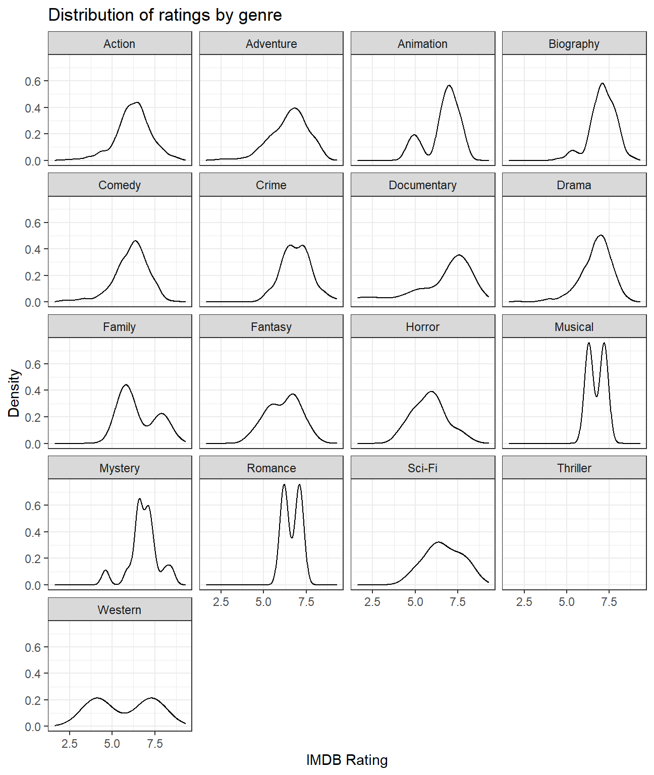 We observe that movies of Biography genre have the highest mean rating of 7.11. Movies belonging to Musical and Romance genres have the least variability in ratings (each having a standard deviation of 0.636). Although there is only one movie in the Thriller genre, it has the lowest mean rating of 4.8.
Use ggplot to answer the following
- Examine the relationship between
grossandcast_facebook_likes.
#Plotting a scatterplot and regression line for gross earnings vs cast facebook likes
  ggplot(movies, aes(x=cast_facebook_likes, y=gross))+
  geom_point()+
  geom_smooth() +

  #Adding titles and axes labels
  labs(title = 'Scatterplot for gross movie earnings vs facebook likes of cast members',
       subtitle = 'No significant pattern can be observed',
       x = 'Number of facebook likes that the cast has received',
       y = 'Gross earnings in the US box office ($)')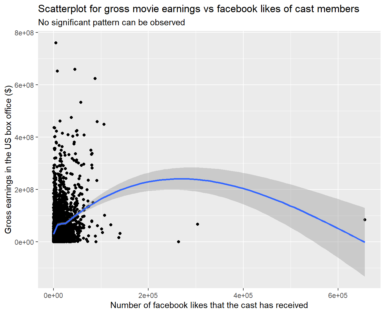
#Performing a correlation test between gross and cast facebook likes
cor.test(movies$gross, movies$cast_facebook_likes)
##
## Pearson's product-moment correlation
##
## data: x and y
## t = 12, df = 2959, p-value <2e-16
## alternative hypothesis: true correlation is not equal to 0
## 95 percent confidence interval:
## 0.179 0.247
## sample estimates:
## cor
## 0.213We have mapped ‘gross’ to the y-variable and ‘cast_facebook_likes’ to the x-variable. As we have to see if number of facebook likes is a good predictor of a movie’s gross earnings, ‘gross’ is the dependent variable (Y) and ‘cast_facebook_likes’ is the independent variable (X).
‘cast_facebook_likes’ does not seem to be a good predictor for ‘gross’ because there is no clear relationship or pattern evident from the scatterplot.
On performing a correlation test, although we observed that the correlation is statistically significant, but the value of correlation is too low (0.213) for ‘cast_facebook_likes’ to be used as a predictor.
- Examine the relationship between
grossandbudget. Produce a scatterplot and write one sentence discussing whether budget is likely to be a good predictor of how much money a movie will make at the box office.
#Plotting a scatterplot and regression line for gross earnings vs budget
  ggplot(movies, aes(x=budget, y=gross)) +
  geom_point() +
  geom_smooth() +

  #Adding titles and axes labels
  labs(title = 'Scatterplot for gross movie earnings vs movie budget',
       subtitle = 'Positive correlation observed',
       x = 'Movie budget ($)',
       y = 'Gross earnings in the US box office ($)')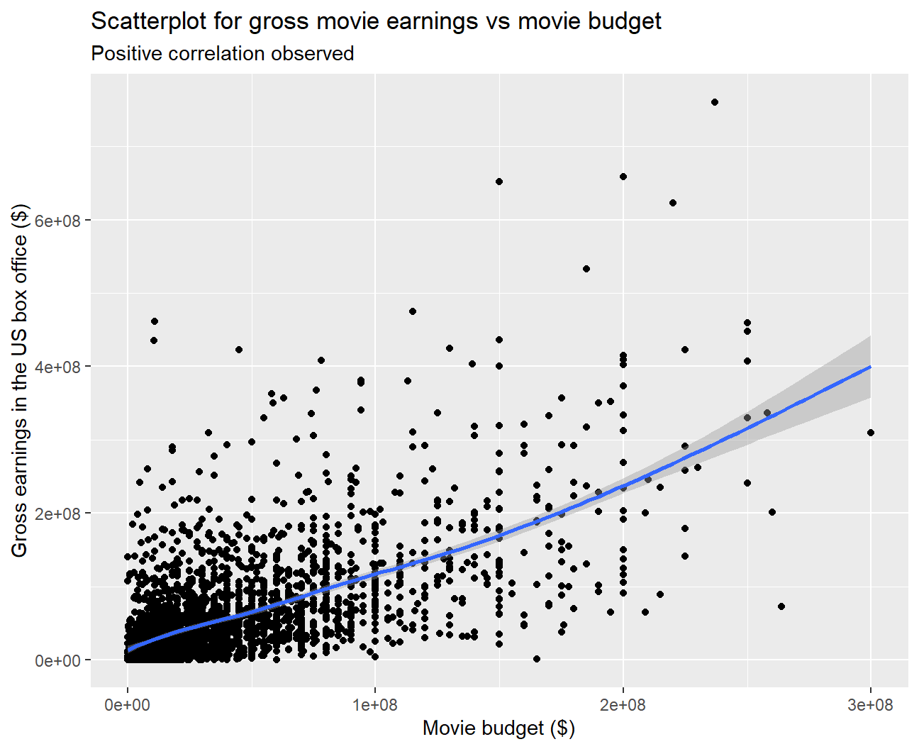
#Performing a correlation test between gross and budget
cor.test(movies$gross, movies$budget)
##
## Pearson's product-moment correlation
##
## data: x and y
## t = 45, df = 2959, p-value <2e-16
## alternative hypothesis: true correlation is not equal to 0
## 95 percent confidence interval:
## 0.619 0.662
## sample estimates:
## cor
## 0.641We can clearly observe a positive correlation from the scatterplot between a movie’s gross earnings and budget. On performing a correlation test, we observed that the correlation is high (0.641) and is statistically significant. Hence, budget is likely to be a good predictor for gross.
- Examine the relationship between
grossandrating. Produce a scatterplot, faceted bygenreand discuss whether IMDB ratings are likely to be a good predictor of how much money a movie will make at the box office. Is there anything strange in this dataset?
#Plotting a scatterplot and regression line for gross earnings vs rating
  ggplot(movies, aes(x=rating, y=gross))+
  geom_point()+
  geom_smooth() +

  #Faceting the graph by genre
  facet_wrap(~genre) +

  #Adding titles and axes labels
  labs(title = 'Scatterplot for gross movie earnings vs average IMDB rating',
       subtitle = 'Positive correlation observed for some genres',
       x = 'Average IMDB Rating',
       y = 'Gross earnings in the US box office ($)')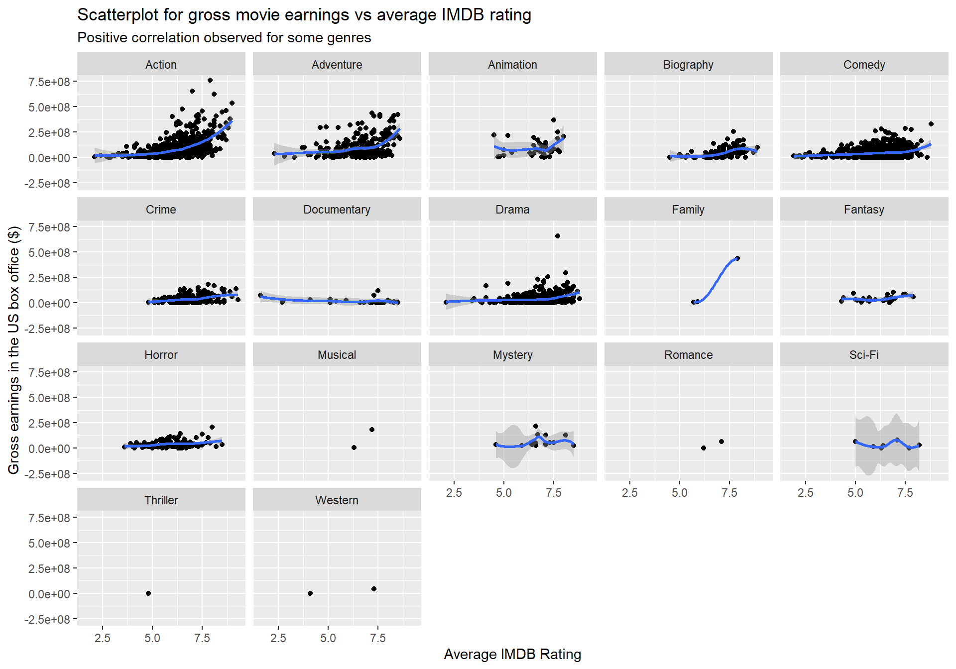
#Performing a correlation test between gross and rating
cor.test(movies$gross, movies$rating)
##
## Pearson's product-moment correlation
##
## data: x and y
## t = 15, df = 2959, p-value <2e-16
## alternative hypothesis: true correlation is not equal to 0
## 95 percent confidence interval:
## 0.236 0.303
## sample estimates:
## cor
## 0.269We observe that for some genres such as Action and Adventure, gross earnings and ratings seem to be positively correlated. However, for other genres, the relationship between the two variables does not indicate a strong pattern.
We also see that the correlation is low (0.269) although it is statistically significant. Overall, ratings do not seem to be a good predictor of gross earnings.
Something strange in this dataset is that quite popular genres such as Thriller and Romance are represented by a very small number of movies.
Returns of financial stocks
nyse <- read_csv(here::here("data","nyse.csv"))- Based on this dataset, create a table and a bar plot that shows the number of companies per sector, in descending order
#Table of the number of companies per sector, in descending order
nyse %>%
  group_by(sector)%>%
  count(sort=TRUE)
## # A tibble: 12 x 2
## # Groups: sector [12]
## sector n
## <chr> <int>
## 1 Finance 97
## 2 Consumer Services 79
## 3 Public Utilities 60
## 4 Capital Goods 45
## 5 Health Care 45
## 6 Energy 42
## 7 Technology 40
## 8 Basic Industries 39
## 9 Consumer Non-Durables 31
## 10 Miscellaneous 12
## 11 Transportation 10
## 12 Consumer Durables 8#Plotting a bar plot for the number of companies per sector
nyse %>%
mutate(sector=fct_rev(fct_infreq(sector))) %>%
ggplot(aes(y=sector)) +
geom_bar() +
#Adding titles and axes labels
labs(title = 'Number of companies per sector',
subtitle = 'Finance has the largest no. of companies while Consumer Durables has the least',
x = 'Count of companies',
y = 'Sector') +
theme_bw()+
theme(plot.subtitle=element_text(size=6))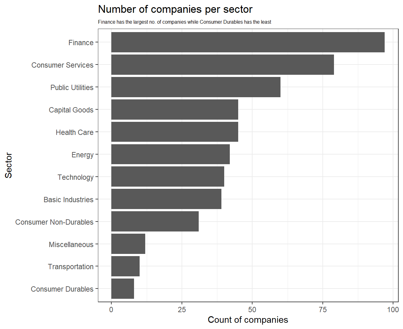
# Notice the cache=TRUE argument inthe chunk options. Because getting data is time consuming,
# cache=TRUE means that once it downloads data, the chunk will not run again next time you knit your Rmd

#Geting data for 6 different stocks and 'SPY'
myStocks <- c("PLOW","GOOGL","ZEUS","ORCL","FUN","ROCK","SPY" ) %>%
  tq_get(get  = "stock.prices",
         from = "2011-01-01",
         to   = "2021-08-31") %>%
  group_by(symbol)

glimpse(myStocks) # examine the structure of the resulting data frame
## Rows: 18,781
## Columns: 8
## Groups: symbol [7]
## $ symbol <chr> "PLOW", "PLOW", "PLOW", "PLOW", "PLOW", "PLOW", "PLOW", "PLOW~
## $ date <date> 2011-01-03, 2011-01-04, 2011-01-05, 2011-01-06, 2011-01-07, ~
## $ open <dbl> 15.3, 15.2, 15.0, 15.0, 14.9, 14.7, 14.9, 15.0, 15.0, 15.3, 1~
## $ high <dbl> 15.4, 15.4, 15.3, 15.1, 14.9, 15.0, 15.0, 15.1, 15.5, 15.5, 1~
## $ low <dbl> 15.2, 14.6, 14.7, 14.8, 14.6, 14.7, 14.8, 14.9, 15.0, 15.1, 1~
## $ close <dbl> 15.2, 14.9, 15.0, 14.9, 14.7, 14.8, 14.9, 15.0, 15.3, 15.2, 1~
## $ volume <dbl> 39700, 43200, 110500, 33700, 38500, 50800, 61800, 59400, 2100~
## $ adjusted <dbl> 9.75, 9.55, 9.59, 9.54, 9.42, 9.49, 9.55, 9.58, 9.76, 9.74, 9~#calculate daily returns
myStocks_returns_daily <- myStocks %>%
tq_transmute(select = adjusted,
mutate_fun = periodReturn,
period = "daily",
type = "log",
col_rename = "daily_returns",
cols = c(nested.col))
#calculate monthly returns
myStocks_returns_monthly <- myStocks %>%
tq_transmute(select = adjusted,
mutate_fun = periodReturn,
period = "monthly",
type = "arithmetic",
col_rename = "monthly_returns",
cols = c(nested.col))
#calculate yearly returns
myStocks_returns_annual <- myStocks %>%
group_by(symbol) %>%
tq_transmute(select = adjusted,
mutate_fun = periodReturn,
period = "yearly",
type = "arithmetic",
col_rename = "yearly_returns",
cols = c(nested.col))- Create a table where you summarise monthly returns for each of the stocks and
SPY; min, max, median, mean, SD.
#Calculating summary stats of monthly returns for each stock
myStocks_returns_monthly %>%
  group_by(symbol) %>%
  summarise_each(
    funs(min, max, median, mean, sd), monthly_returns
    )
## # A tibble: 7 x 6
## symbol min max median mean sd
## <chr> <dbl> <dbl> <dbl> <dbl> <dbl>
## 1 FUN -0.590 0.573 0.00912 0.0186 0.108
## 2 GOOGL -0.132 0.218 0.0177 0.0198 0.0651
## 3 ORCL -0.182 0.143 0.0133 0.0109 0.0572
## 4 PLOW -0.175 0.197 0.00159 0.0139 0.0791
## 5 ROCK -0.244 0.380 0.0120 0.0194 0.112
## 6 SPY -0.125 0.127 0.0174 0.0123 0.0381
## 7 ZEUS -0.325 0.651 -0.00164 0.0128 0.168It can be observed that GOOGL has the highest mean (0.0198) and median (0.01774) monthly returns out of all the stocks. The lowest mean monthly return is for ORCL (0.0109).
In terms of standard deviation of monthly returns, ZEUS is the most risky stock as its standard deviation is highest, while SPY is the least risky.
Plot a density plot, using geom_density(), for each of the stocks.
#Density plot for monthly returns
ggplot(myStocks_returns_monthly,
       aes(x=monthly_returns)) +
  geom_density() +

  #Faceting the plot by symbols
  facet_wrap(~symbol) +

  #Adding title and axes labels
  labs(title = 'Monthly Returns of Stocks',
       x = 'Monthly returns',
       y = 'Density')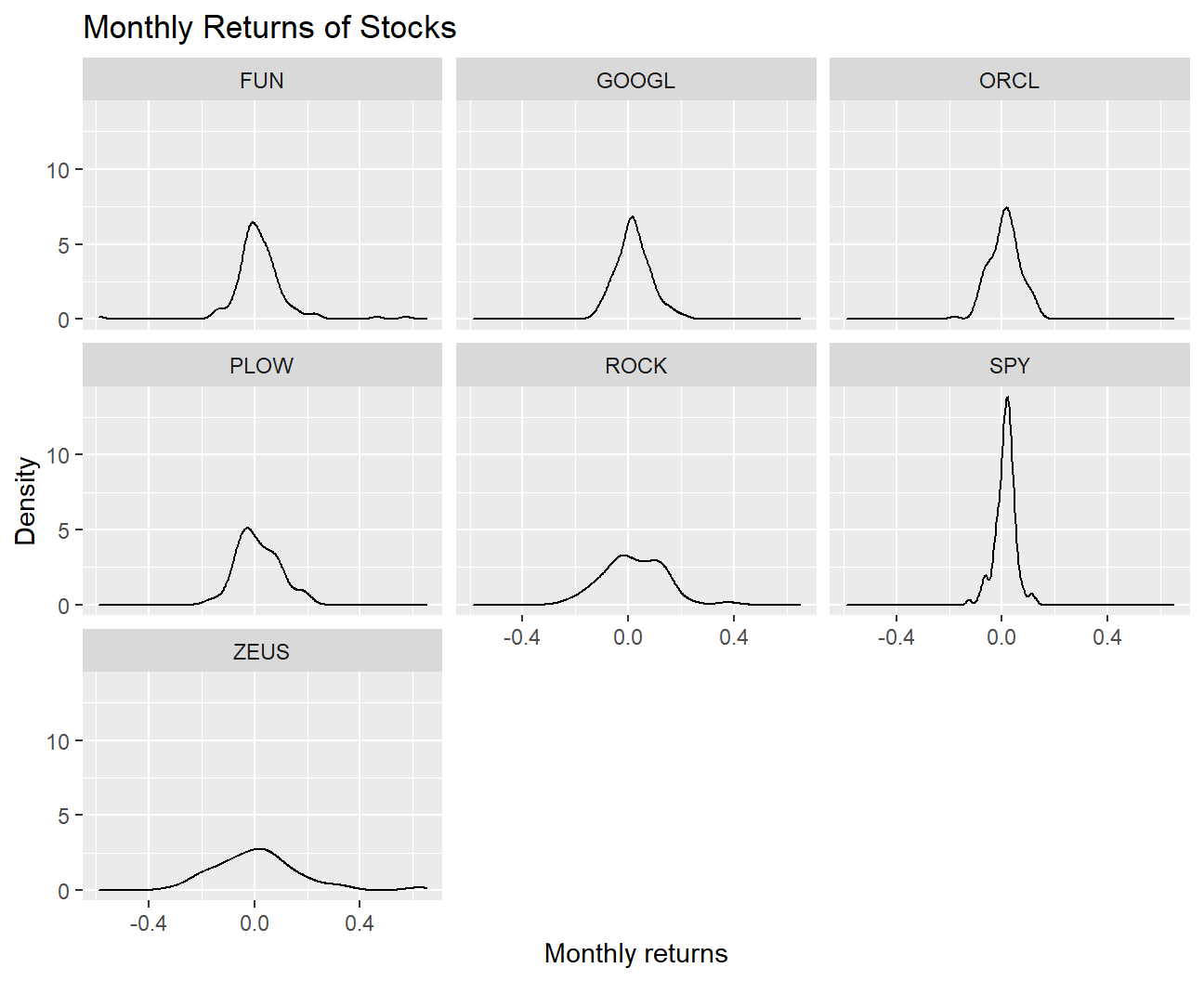
- What can you infer from this plot? Which stock is the riskiest? The least risky?
The distribution of the monthly returns for all the mentioned stocks follow an approximately normal distribution. We observe that the riskiest stock is ZEUS as the distribution of its returns has fat tails and the standard deviation of returns is the highest (0.1683). On the other hand, the least risky stock is SPY as the returns are very concentrated around the mean and the standard deviation is the least (0.0381).
- Finally, make a plot that shows the expected monthly return (mean) of a stock on the Y axis and the risk (standard deviation) in the X-axis. Please use
ggrepel::geom_text_repel()to label each stock
myStocks_returns_monthly %>%
  group_by(symbol) %>%

  #Calculating mean and std dev of monthly returns for each stock
  summarise_each(
    funs(mean, sd), monthly_returns
    ) %>%

  #Plotting expected monthly return on the Y Axis and risk on the X-axis
  ggplot(aes(x=sd,y=mean,color=symbol)) +
  geom_point() +

  #Labeling each stock
  ggrepel::geom_text_repel(aes(label=symbol)) +

  #Adding title and axis labels
  labs(title = 'Risk vs Returns',
       y = 'Mean monthly returns',
       x = 'Standard Deviation of monthly returns',
       color="Stock") + theme_bw()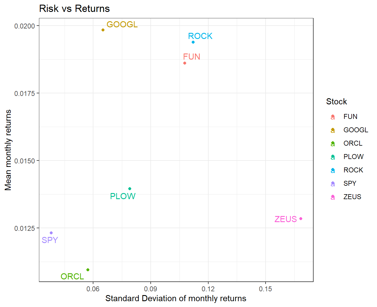
What can you infer from this plot? Are there any stocks which, while being riskier, do not have a higher expected return?
We observe that GOOGL seems to be the best investment out of these stocks as it has the highest return and lower risk than most other stocks. ZEUS seems to be a bad investment as the risk is highest but the returns are on the lower side.
For a similar level of risk, GOOGL gives a much higher return than ORCL. Additionally, ROCK gives a higher return than FUN for a similar level of risk.
On your own: IBM HR Analytics
hr_dataset <- read_csv(here::here("data", "datasets_1067_1925_WA_Fn-UseC_-HR-Employee-Attrition.csv"))
glimpse(hr_dataset)
## Rows: 1,470
## Columns: 35
## $ Age <dbl> 41, 49, 37, 33, 27, 32, 59, 30, 38, 36, 35, 2~
## $ Attrition <chr> "Yes", "No", "Yes", "No", "No", "No", "No", "~
## $ BusinessTravel <chr> "Travel_Rarely", "Travel_Frequently", "Travel~
## $ DailyRate <dbl> 1102, 279, 1373, 1392, 591, 1005, 1324, 1358,~
## $ Department <chr> "Sales", "Research & Development", "Research ~
## $ DistanceFromHome <dbl> 1, 8, 2, 3, 2, 2, 3, 24, 23, 27, 16, 15, 26, ~
## $ Education <dbl> 2, 1, 2, 4, 1, 2, 3, 1, 3, 3, 3, 2, 1, 2, 3, ~
## $ EducationField <chr> "Life Sciences", "Life Sciences", "Other", "L~
## $ EmployeeCount <dbl> 1, 1, 1, 1, 1, 1, 1, 1, 1, 1, 1, 1, 1, 1, 1, ~
## $ EmployeeNumber <dbl> 1, 2, 4, 5, 7, 8, 10, 11, 12, 13, 14, 15, 16,~
## $ EnvironmentSatisfaction <dbl> 2, 3, 4, 4, 1, 4, 3, 4, 4, 3, 1, 4, 1, 2, 3, ~
## $ Gender <chr> "Female", "Male", "Male", "Female", "Male", "~
## $ HourlyRate <dbl> 94, 61, 92, 56, 40, 79, 81, 67, 44, 94, 84, 4~
## $ JobInvolvement <dbl> 3, 2, 2, 3, 3, 3, 4, 3, 2, 3, 4, 2, 3, 3, 2, ~
## $ JobLevel <dbl> 2, 2, 1, 1, 1, 1, 1, 1, 3, 2, 1, 2, 1, 1, 1, ~
## $ JobRole <chr> "Sales Executive", "Research Scientist", "Lab~
## $ JobSatisfaction <dbl> 4, 2, 3, 3, 2, 4, 1, 3, 3, 3, 2, 3, 3, 4, 3, ~
## $ MaritalStatus <chr> "Single", "Married", "Single", "Married", "Ma~
## $ MonthlyIncome <dbl> 5993, 5130, 2090, 2909, 3468, 3068, 2670, 269~
## $ MonthlyRate <dbl> 19479, 24907, 2396, 23159, 16632, 11864, 9964~
## $ NumCompaniesWorked <dbl> 8, 1, 6, 1, 9, 0, 4, 1, 0, 6, 0, 0, 1, 0, 5, ~
## $ Over18 <chr> "Y", "Y", "Y", "Y", "Y", "Y", "Y", "Y", "Y", ~
## $ OverTime <chr> "Yes", "No", "Yes", "Yes", "No", "No", "Yes",~
## $ PercentSalaryHike <dbl> 11, 23, 15, 11, 12, 13, 20, 22, 21, 13, 13, 1~
## $ PerformanceRating <dbl> 3, 4, 3, 3, 3, 3, 4, 4, 4, 3, 3, 3, 3, 3, 3, ~
## $ RelationshipSatisfaction <dbl> 1, 4, 2, 3, 4, 3, 1, 2, 2, 2, 3, 4, 4, 3, 2, ~
## $ StandardHours <dbl> 80, 80, 80, 80, 80, 80, 80, 80, 80, 80, 80, 8~
## $ StockOptionLevel <dbl> 0, 1, 0, 0, 1, 0, 3, 1, 0, 2, 1, 0, 1, 1, 0, ~
## $ TotalWorkingYears <dbl> 8, 10, 7, 8, 6, 8, 12, 1, 10, 17, 6, 10, 5, 3~
## $ TrainingTimesLastYear <dbl> 0, 3, 3, 3, 3, 2, 3, 2, 2, 3, 5, 3, 1, 2, 4, ~
## $ WorkLifeBalance <dbl> 1, 3, 3, 3, 3, 2, 2, 3, 3, 2, 3, 3, 2, 3, 3, ~
## $ YearsAtCompany <dbl> 6, 10, 0, 8, 2, 7, 1, 1, 9, 7, 5, 9, 5, 2, 4,~
## $ YearsInCurrentRole <dbl> 4, 7, 0, 7, 2, 7, 0, 0, 7, 7, 4, 5, 2, 2, 2, ~
## $ YearsSinceLastPromotion <dbl> 0, 1, 0, 3, 2, 3, 0, 0, 1, 7, 0, 0, 4, 1, 0, ~
## $ YearsWithCurrManager <dbl> 5, 7, 0, 0, 2, 6, 0, 0, 8, 7, 3, 8, 3, 2, 3, ~hr_cleaned <- hr_dataset %>%
clean_names() %>%
mutate(
education = case_when(
education == 1 ~ "Below College",
education == 2 ~ "College",
education == 3 ~ "Bachelor",
education == 4 ~ "Master",
education == 5 ~ "Doctor"
),
environment_satisfaction = case_when(
environment_satisfaction == 1 ~ "Low",
environment_satisfaction == 2 ~ "Medium",
environment_satisfaction == 3 ~ "High",
environment_satisfaction == 4 ~ "Very High"
),
job_satisfaction = case_when(
job_satisfaction == 1 ~ "Low",
job_satisfaction == 2 ~ "Medium",
job_satisfaction == 3 ~ "High",
job_satisfaction == 4 ~ "Very High"
),
performance_rating = case_when(
performance_rating == 1 ~ "Low",
performance_rating == 2 ~ "Good",
performance_rating == 3 ~ "Excellent",
performance_rating == 4 ~ "Outstanding"
),
work_life_balance = case_when(
work_life_balance == 1 ~ "Bad",
work_life_balance == 2 ~ "Good",
work_life_balance == 3 ~ "Better",
work_life_balance == 4 ~ "Best"
)
) %>%
select(age, attrition, daily_rate, department,
distance_from_home, education,
gender, job_role,environment_satisfaction,
job_satisfaction, marital_status,
monthly_income, num_companies_worked, percent_salary_hike,
performance_rating, total_working_years,
work_life_balance, years_at_company,
years_since_last_promotion)- Produce a one-page summary describing this dataset
We will employ a number of graphs and different statistics to examine how some key metrics affect salary. We will also take an overall look on employee satisfaction and examine how employees perceive their employment. Hopefully this will give us a meaningful insight on the company’s working environment
Lets begin by seeing how employees relate to their job:
Firstly we will take a look at two key metrics: 1. Employee job satisfaction 2. Employee work life balance
to do that we plot poll results from within the company:
library(scales)
#Job Satisfaction
#create table showing count of every satisfaction level
satisfaction_table<-hr_cleaned %>%
   mutate(job_satisfaction=fct_infreq(job_satisfaction),N=n()) %>%
   group_by(job_satisfaction) %>%
   mutate(count=n(),per=percent(count/N,0.1)) %>%
  select(job_satisfaction,count,per) %>%
  unique() #remove duplicates

#display table
satisfaction_table
## # A tibble: 4 x 3
## # Groups: job_satisfaction [4]
## job_satisfaction count per
## <fct> <int> <chr>
## 1 Very High 459 31.2%
## 2 Medium 280 19.0%
## 3 High 442 30.1%
## 4 Low 289 19.7%ggplot(satisfaction_table, aes(x=fct_rev(reorder(job_satisfaction,count)),y=count,fill=job_satisfaction))+
geom_col(width=0.3)+geom_text(aes(label=per),nudge_y = 15,size=3,colour = "black")+
#edit theme, text size exc.
theme(axis.text =element_text(size=10),axis.title = element_text(size=10),legend.text = element_text(size=10) ,legend.title = element_text(size=10),legend.box.background = element_rect()) +
#add labels
labs(
title = "Job Satisfaction Ratings",
subtitle = "Employees seem satisfied with their working enviroment in general",
x = "Satisfaction Rating",
y = "Count",
fill="Job Satisfaction")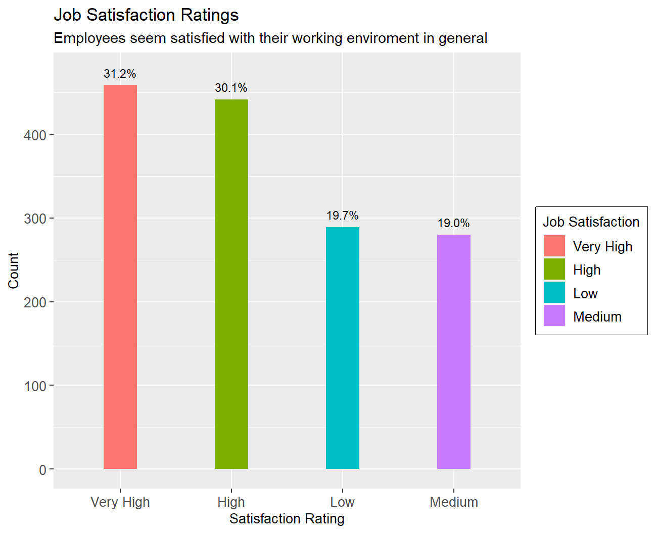
#Work Life Balance

#create table showing count of every worklife balance level
life_balance_table<-hr_cleaned %>%
   mutate(N=n()) %>%
   group_by(work_life_balance) %>%
   mutate(count=n(),per=percent(count/N,0.1)) %>%
   select(work_life_balance,count,per) %>%
   unique()

#display table
life_balance_table
## # A tibble: 4 x 3
## # Groups: work_life_balance [4]
## work_life_balance count per
## <chr> <int> <chr>
## 1 Bad 80 5.4%
## 2 Better 893 60.7%
## 3 Good 344 23.4%
## 4 Best 153 10.4%ggplot(life_balance_table, aes(x=fct_rev(reorder(work_life_balance,count)),y=count,fill=work_life_balance))+
geom_col(width=0.3)+geom_text(aes(label=per),nudge_y = 25,size=3,colour = "black")+
#edit theme, text size exc.
theme(axis.text =element_text(size=10),axis.title = element_text(size=10),legend.text = element_text(size=10) ,legend.title = element_text(size=10),legend.box.background = element_rect())+
#add labels
labs(
title = "Work Life Balance Ratings",
subtitle = "Employees seem satisfied with their work life balance in general",
x = "Work Life Balance Rating",
y = "Count",
fill="Rating")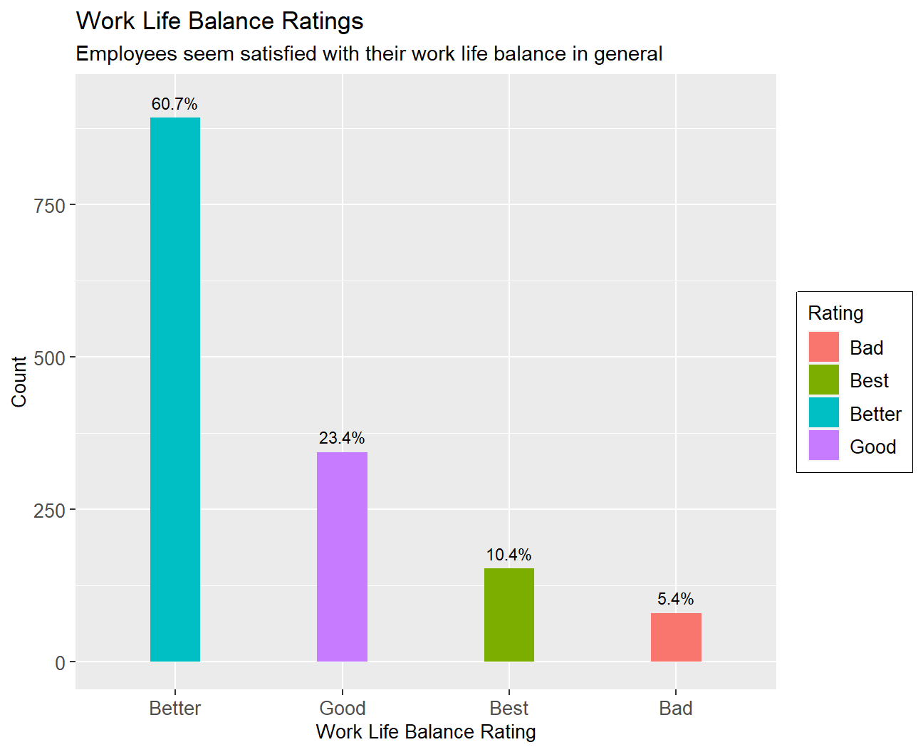 Job Satisfaction: Over 60% of the sample have either a job satisfaction of very high or high while 20% have a job satisfaction of medium and low respectively.
Work Life Balance: While 60% have a “better” work-life balance 23% have a “good” work-life balance, 10% have the “best” work-life balance and only 5% have a “bad” work-life balance.
Job Satisfaction: Over 60% of the sample have either a job satisfaction of very high or high while 20% have a job satisfaction of medium and low respectively.
Work Life Balance: While 60% have a “better” work-life balance 23% have a “good” work-life balance, 10% have the “best” work-life balance and only 5% have a “bad” work-life balance.
The above figures indicate a healthy working environment with minimal employee dissatisfaction.
Going forward it would be interesting to see how this perceived as a happy working environment measures against employee turnover. We will examine how probable it is for an employee to change employment depending on his years in the company
# find when employees quit (descriptive statistics)
Quit_employees<-hr_cleaned %>%
  filter(attrition=='Yes')
Quit_employees%>%
  summarise_each(funs(mean,max,min,median,sd),years_at_company)
## # A tibble: 1 x 5
## mean max min median sd
## <dbl> <dbl> <dbl> <dbl> <dbl>
## 1 5.13 40 0 3 5.95#create density graph
hr_cleaned %>%
filter(attrition =="Yes") %>%
ggplot(aes(x=years_at_company))+geom_density()+
labs(
title = "Density Plot",
subtitle = "How many years people spent in the company before leaving",
x = "Years employed",
y = "Density Function")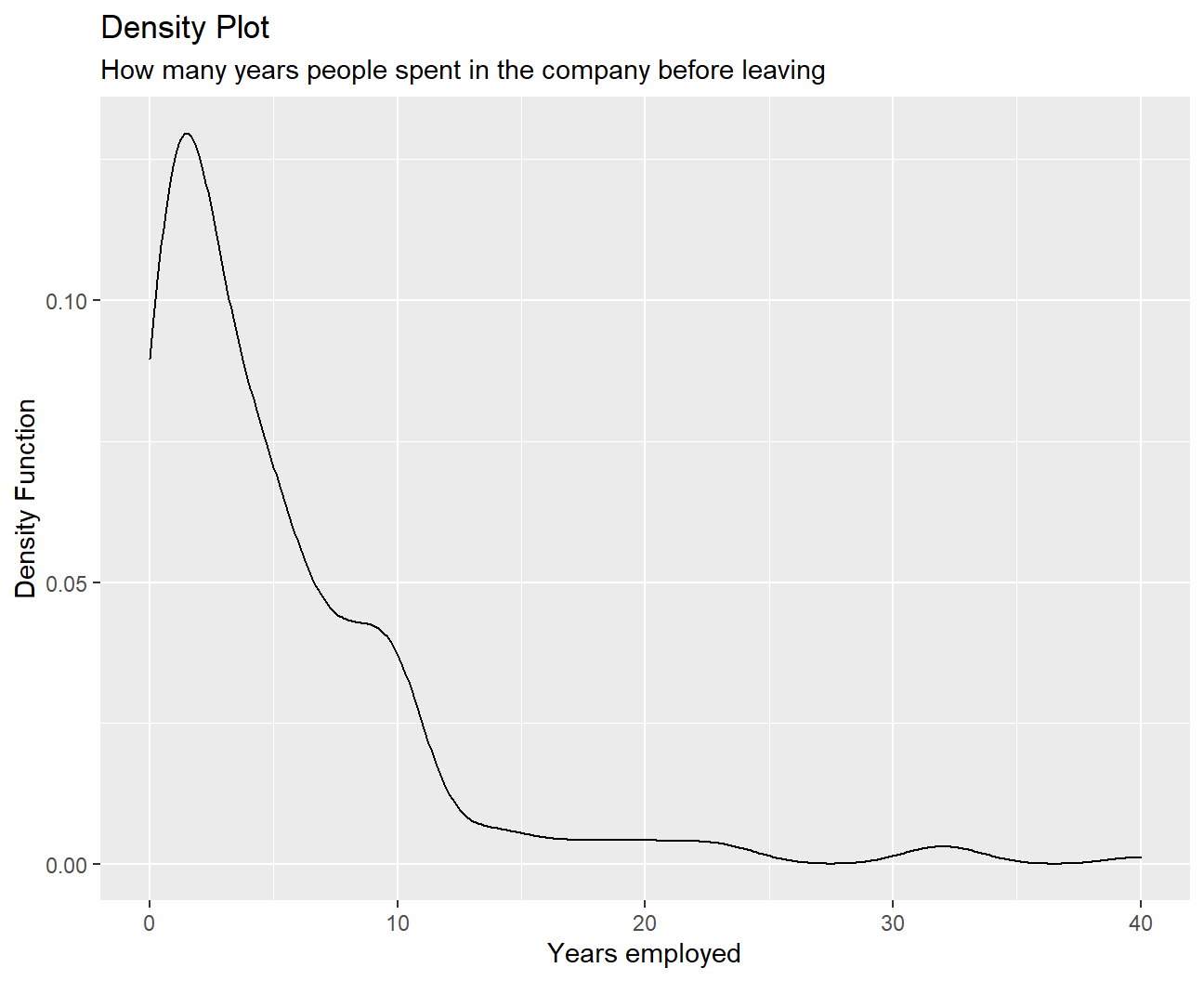 We can tell from this graph that people tend to leave between the 0th and 12th years of work. Among them, the first 2-3 years are the peak period of resignation. The number of quits is relatively small if people have worked for more than 15 years.
It seems like people who are not a good fit, find out soon enough and change environments. Employees who commit for more years on the other hand , seem to stick to their choice, with people leaving after more than 10 years within company ranks being considerably fewer.
Then we will examine how employee age, years at the company, monthly income, and years since last promotion, are distributed and examine the descriptive statistics in order to gain more insights:
skim(list(hr_cleaned$age,hr_cleaned$years_at_company,hr_cleaned$monthly_income,hr_cleaned$years_since_last_promotion))| Name | list(…) |
| Number of rows | 1470 |
| Number of columns | 4 |
| _______________________ | |
| Column type frequency: | |
| numeric | 4 |
| ________________________ | |
| Group variables | None |
Variable type: numeric
| skim_variable | n_missing | complete_rate | mean | sd | p0 | p25 | p50 | p75 | p100 | hist |
|---|---|---|---|---|---|---|---|---|---|---|
| c.41..49..37..33..27..32..59..30..38..36..35..29..31..34..28.. | 0 | 1 | 36.92 | 9.14 | 18 | 30 | 36 | 43 | 60 | ▂▇▇▃▂ |
| c.6..10..0..8..2..7..1..1..9..7..5..9..5..2..4..10..6..1..25.. | 0 | 1 | 7.01 | 6.13 | 0 | 3 | 5 | 9 | 40 | ▇▂▁▁▁ |
| c.5993..5130..2090..2909..3468..3068..2670..2693..9526..5237.. | 0 | 1 | 6502.93 | 4707.96 | 1009 | 2911 | 4919 | 8379 | 19999 | ▇▅▂▁▂ |
| c.0..1..0..3..2..3..0..0..1..7..0..0..4..1..0..8..0..0..3..1.. | 0 | 1 | 2.19 | 3.22 | 0 | 0 | 1 | 3 | 15 | ▇▁▁▁▁ |
# age fits into the normal distributionBy looking at the summary statistics, we can observe that the variable ‘age’ is closer to normal distribution as the difference between p25 and p50 (6), and p50 and p75 (7) is similar. Additionally, the difference between p0 and p50 (18), and p50 and p100 (24) is close. This means that the distribution is somewhat symmetrical and hence, closer to normal distribution than others. People seem to be getting promotions, on average, every 2 years (although there is a quite the variability), which might explain high rates of satisfaction. Average time at the company is 7 years (again sd is quite large) but also indicates low turnover rates.
As a final measure of the company’s standing we will examine how salaries vary for women compared to men, and comment on the results:
#create boxplots showing distribution of salaries, for males and females

#create table with desired data
hr_cleaned %>%
  group_by(gender) %>%
  summarise_each(funs(min,max,median,mean,sd),
                 monthly_income) %>%
  arrange(desc(mean))
## # A tibble: 2 x 6
## gender min max median mean sd
## <chr> <dbl> <dbl> <dbl> <dbl> <dbl>
## 1 Female 1129 19973 5082. 6687. 4696.
## 2 Male 1009 19999 4838. 6381. 4715.#plot the boxplots
hr_cleaned %>%
ggplot(aes(x=fct_reorder(gender,monthly_income),y= monthly_income,fill=gender))+
geom_boxplot(width=0.5)+
#add labels
labs(title='Monthly income and Gender',
x='Gender',
y='Monthly income',
fill='Gender')+theme(axis.title = element_text(size=15))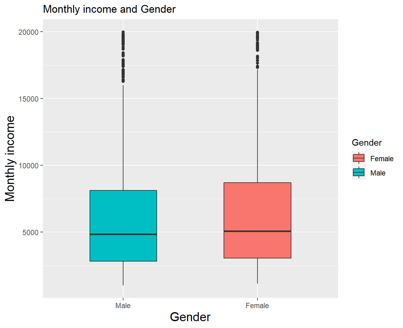
Females seem to be making slightly more money than males on this company. Even though median salaries are very close (with female employees showing only a slight lead) it can be seen that essentially every quartile is higher for women than for men, in particular the 4th. On the other hand high earners of both genders, as seen by outliers, earn similar salaries. However differences are not high enough to constitute discrimination, and it seems like the company has done an exceptional job on creating an equal and fair working environment. This could very well be another reason employee satisfaction is so high, as it is not uncommon to observe discrimination when it comes to salaries.
We have shown that gender doesn’t play a big role in determining monthly income, but what else could be an important factor?
Lets take a look at how one’s educational background, relate to monthly income:
#RELATIONSHIP BETWEEN MONTHLY INCOME AND EDUCATION
hr_cleaned %>%
  group_by(education) %>%
  summarise_each(funs(min,max,median,mean,sd),
                 monthly_income) %>%
  arrange(desc(mean))
## # A tibble: 5 x 6
## education min max median mean sd
## <chr> <dbl> <dbl> <dbl> <dbl> <dbl>
## 1 Doctor 2127 19586 6203 8278. 5061.
## 2 Master 1359 19999 5342. 6832. 4657.
## 3 Bachelor 1081 19926 4762 6517. 4817.
## 4 College 1051 19613 4892. 6227. 4525.
## 5 Below College 1009 19973 3849 5641. 4485.hr_cleaned %>%
ggplot(aes(x = reorder(education, monthly_income), y = monthly_income, fill=education)) +
geom_boxplot() +
#add labels
labs(title = 'Distribution of Monthly Income and Education',
subtitle = 'We observe that higher education leads to higher monthly income on average.',
x = 'Education level',
y = 'Monthly Income',
fill='Education') +
theme_bw()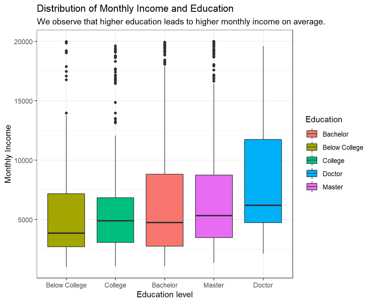 We observe a clear pattern in the relationship between Monthly income and Education. On average, a higher educated employee earns more than a lesser educated employee. Although we see that the median income of Bachelor is slightly lower than that of College, the mean income of Bachelor is higher than that for College.
We also obverse that many outliers who have education till Below College, College, Bachelor or Master level earn almost as much as the maximum paid Doctor.
Since we have outliers for almost all education levels, median would be the better central tendency measure to look at instead of a mean as median is not much affected by outliers.
We observe a clear pattern in the relationship between Monthly income and Education. On average, a higher educated employee earns more than a lesser educated employee. Although we see that the median income of Bachelor is slightly lower than that of College, the mean income of Bachelor is higher than that for College.
We also obverse that many outliers who have education till Below College, College, Bachelor or Master level earn almost as much as the maximum paid Doctor.
Since we have outliers for almost all education levels, median would be the better central tendency measure to look at instead of a mean as median is not much affected by outliers.
We will persist on the matter of education level and how it relates to to income level. We will create a bar chart showing the median of salaries for different educational backgrounds. Median is preferred over mean for salaries as it is more robust to outliers.
#create boxplots for salaries as they reate to different educational backgrounds
hr_cleaned %>%
  group_by(education) %>%
  summarise(median_income=median(monthly_income)) %>%
  arrange(desc(median_income))
## # A tibble: 5 x 2
## education median_income
## <chr> <dbl>
## 1 Doctor 6203
## 2 Master 5342.
## 3 College 4892.
## 4 Bachelor 4762
## 5 Below College 3849hr_cleaned %>%
group_by(education) %>%
summarise(median_income=median(monthly_income)) %>%
mutate(education=fct_reorder(education,median_income)) %>%
ggplot(aes(x=education,y=median_income,fill=education))+
#edit theme, text size exc.
geom_col(width=0.5)+geom_text(aes(label=round(median_income)),colour='black',nudge_y = 190,size=3)+
theme(axis.text =element_text(size=8),axis.title = element_text(size=8) ) +
#add labels
labs(title = 'Barchart of Monthly Income vs Educational Background',
x = 'Education',
y = 'Median Income',
fill='Education')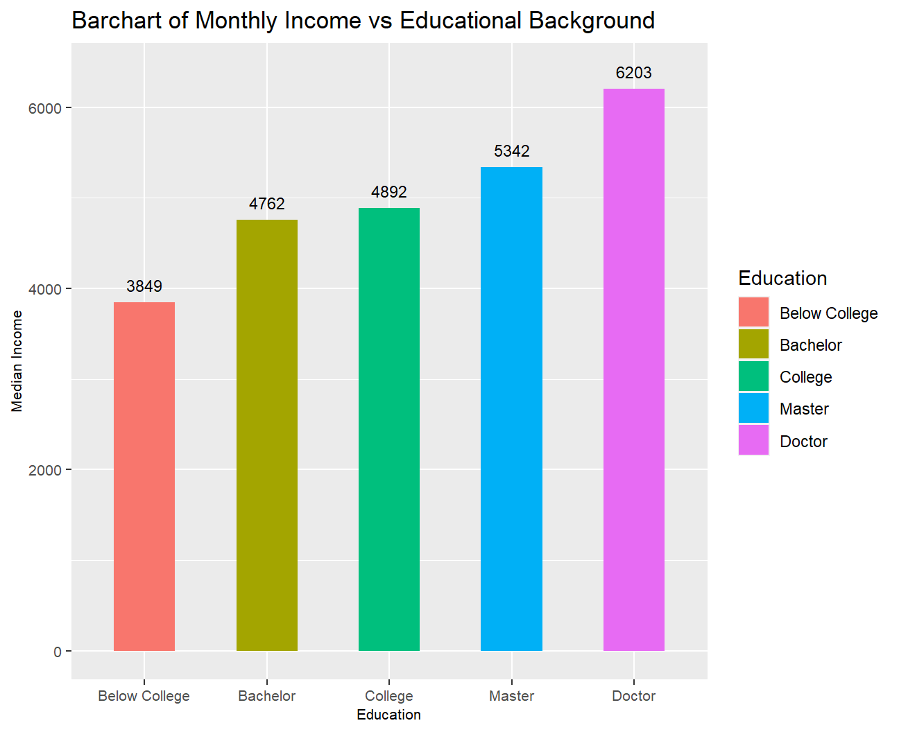
Not surprisingly PhD holders are the highest earners.
In order to more closely examine how educational level relates to income we will also plot density plots.
#create density plots for salary as it relates to educational level
ggplot(hr_cleaned,aes(x=monthly_income,color=education))+
geom_density(alpha=0)+
#facet for education level
facet_wrap(~education)+
theme_economist()+
#edit theme, text size exc.
theme(legend.position = "none",axis.text =element_text(size=5),axis.title = element_text(size=5,hjust = 0.5) ,strip.text=element_text(size=5),axis.title.x.bottom = element_text(margin=margin(15,0,0,0)),axis.title.y.left = element_text(margin=margin(0,15,0,0)),plot.title = element_text(hjust = 0.5,size=9,margin=margin(0,0,7,0)))+
#add labels
labs(title = 'Density plots of Monthly Income vs Education',
x = 'Monthly Income',
y = 'Density Function')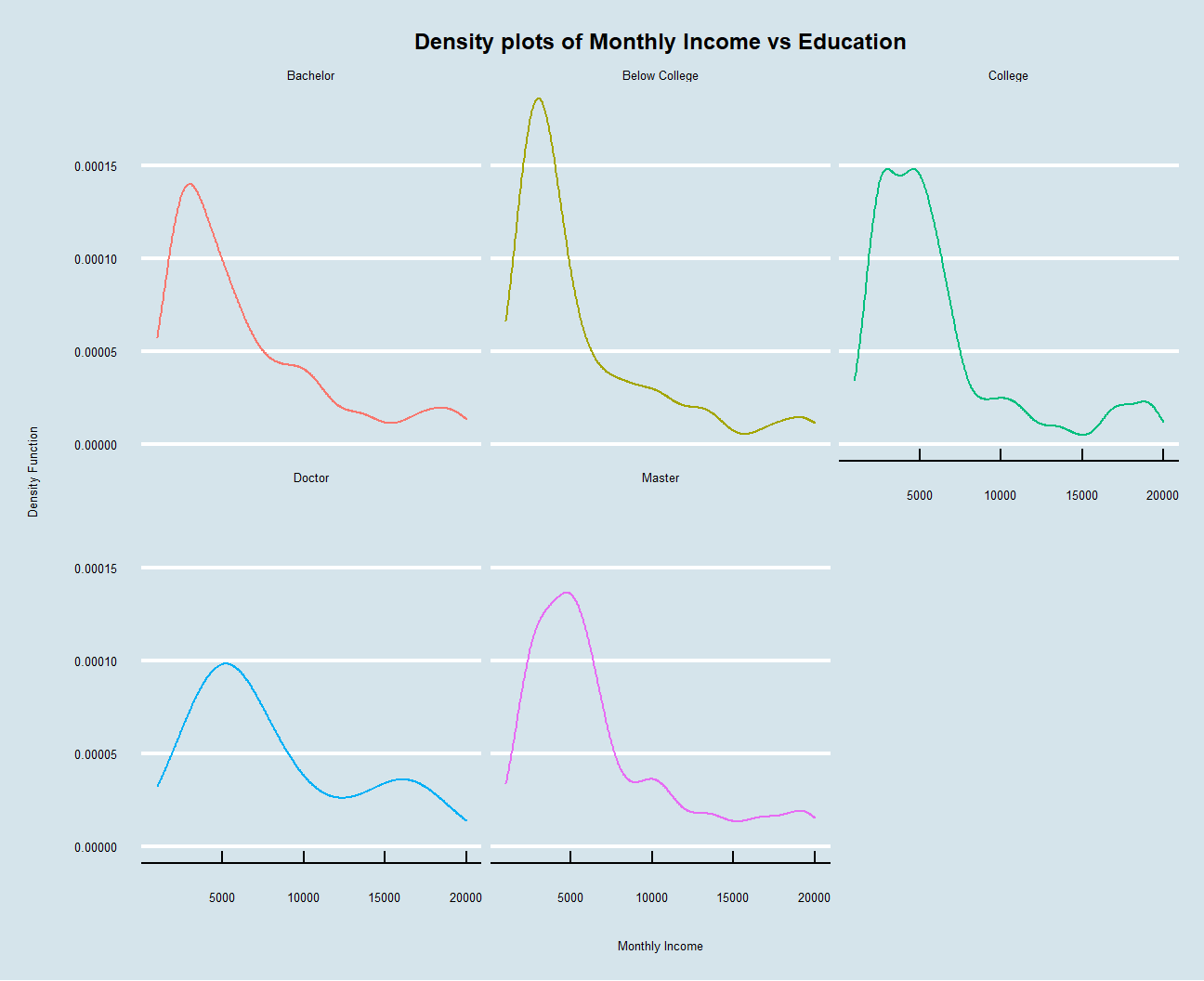 As what have been interpreted before, people are more likely to have higher monthly wages if they have been educated for a longer period. Besides, all these five density plots are right-skewed, so there are other factors that help to differentiate earnings between people having similar education backgrounds. The plot also looks a lot better when we use the economist graph format.
Finally it is time to examine how different job roles are compensated within the company, as one would expect this to be the most important factor:
#examine incomes as they relate to job titles
hr_cleaned %>%
mutate(job_role = fct_reorder(job_role, monthly_income)) %>%
ggplot(aes(x = monthly_income, y = job_role,
fill = job_role)) +
geom_boxplot() +
#add labels
labs(title = 'Boxplot of Monthly Income vs Job Role',
x = 'Monthly Income',
y = 'Job Role',
fill='Job Role') +
theme_bw()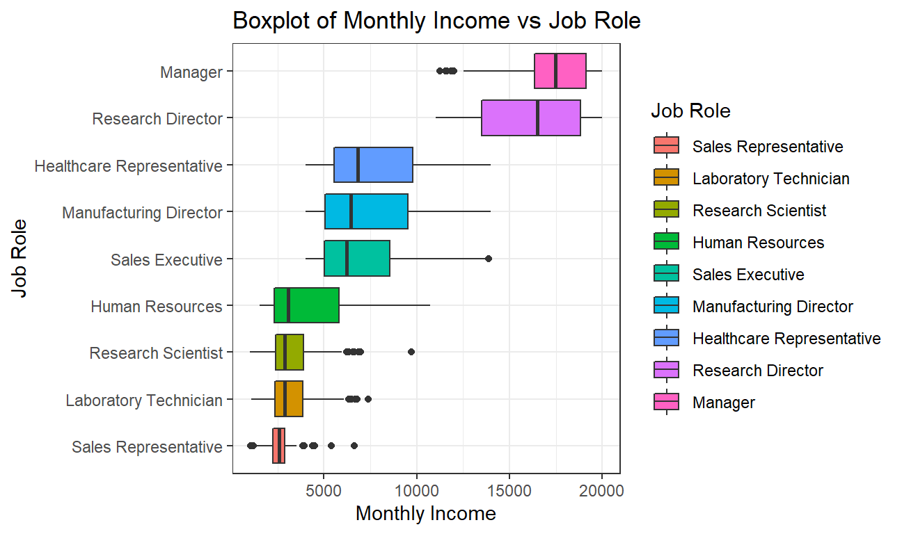 It can be observed that the median monthly income of a Manager is the highest while that of a Sales Representative is the lowest. Managers are closely followed by Research directors and then there is a large income gap between Research Directors and Healthcare Representative.
We also observe that job roles with lower monthly income have less spread as the data is more concentrated towards the median and the interquartile range is low. On the other hand, job roles with higher monthly income have more spread out values and the interquartile range is high.
To gain a little more insight on how job role and age in particular affect monthly compensations we will plot a few more scatter plots, one for each job title:
# scatter plots with regression line, for income as it relates to age and job role
ggplot(hr_cleaned,aes(x=age,y=monthly_income))+
  geom_point()+
  geom_smooth()+
  #facet for job role
  facet_wrap(~job_role,ncol=3)+
  theme(legend.position = 'none',axis.text =element_text(size=15),axis.title = element_text(size=15) ,strip.text=element_text(size=10) )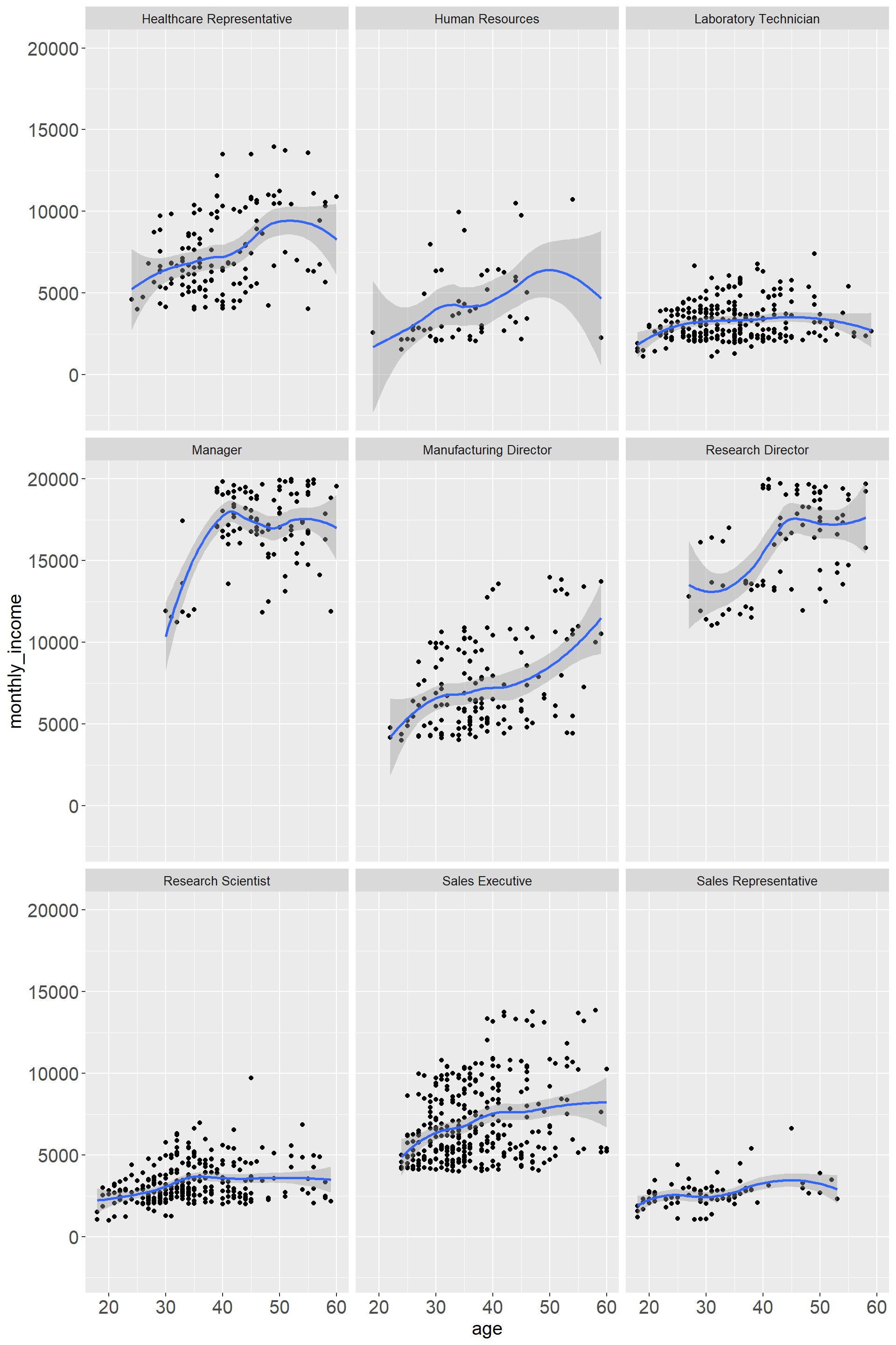
Overall there is an increase in income with older age. Managers and Research Directors display the highest income, however, there is only data for older age implying that these are more senior positions. Interestingly there are also quite a few positions where towards older age the monthly income is declining again. “Human Resources” has the greatest variability while “Research Assistant” and “Sales Representatives” show a more narrow distribution.
Challenge 1: Replicating a chart

# We choose the latest date as the day that we are going to analyze
vaccinations_cleaned<-vaccinations %>%
  filter(date=="09/03/2021")

# Filtering the vaccination data to focus on how many % votes Donald Trump had secured, and calculating his support rate.
election_cleaned<-election2020_results %>%
  mutate(support_rate=candidatevotes/totalvotes) %>%
  filter(candidate=="DONALD J TRUMP") %>%
  group_by(fips) %>%
  mutate(support_rate=sum(support_rate)) %>%
  select(fips,county_name,support_rate) %>%
  unique()

# Merging all three tables together into one for graphing later.
vacc_election<-left_join(vaccinations_cleaned,election_cleaned,by="fips")%>%
  select(fips,county_name,series_complete_pop_pct,support_rate)
vacc_election_pop<-left_join(vacc_election,population,by="fips") %>%
  rename(pop=pop_estimate_2019,vacc_rate=series_complete_pop_pct) %>%
  filter(vacc_rate>=5) %>%
  mutate(vacc_rate=vacc_rate/100)

# Carrying out a linear regression analysis and writing down the formula
fit <- lm(vacc_rate ~ support_rate, data=vacc_election_pop)
summary(fit)
# Making the basic scatterplot
ggplot(vacc_election_pop,aes(x=support_rate,y=vacc_rate,size=pop))+
geom_point(alpha=0.6,colour='black')+
# Some exterior fixings
theme(legend.position = "none",plot.title=element_text(hjust=0.5,size=15,face="bold"),plot.subtitle = element_text(hjust = 0.5,size=10),axis.text =element_text(size=5),axis.title = element_text(size=5))+
# Set the scale of our axis
scale_y_continuous(labels = scales::percent_format(accuracy = 1),breaks=seq(0,1,by=0.05),limit=c(0,1.05))+
scale_x_continuous(labels = scales::percent_format(accuracy = 1),breaks=seq(0,1,by=0.05),limit=c(0,1))+
# Adding all the texts
labs(title = "COVID-19 VACCINATION LEVELS OUT OF TOTAL POPULATION BY COUNTY",
subtitle = "(most states based on FULLY vaccinated only;CA,GA,IA,MI & TX based on total doses administered) \n Data via Centers for Disease Control, COVID Act Now, state health depts \n Graph by Study Group 4",
x = "2020 Trump Vote %",
y = "% of Total Population Vaccinated")+
# Changing the background
annotate("text",x=0.5,y=1.05,label="EVERY U.S. COUNTY",size=7,color='black',face='bold')+geom_smooth(method='lm',formula=y~x,se=FALSE,alpha=0.1,linetype="dashed")+
annotate("text",x=0.1,y=0.035,label="y=-0.4173x+0.6601",color='red',face='bold',size=3)+
annotate("text",x=0.1,y=0.01,label="R squared=0.272",color='red',face='bold',size=3)+
annotate("text",x=0.3,y=0.02,label="09/03/2021",color='red',face='bold',size=3)+
geom_hline(yintercept=0.495, linetype="dashed", color = "black")+
geom_hline(yintercept=0.539, linetype="dashed", color = "black")+
geom_hline(yintercept=0.85, linetype="dashed", color = "black")+
annotate("text",x=0.01,y=0.501,label="Actual:49.5%",color='blue',face='bold',size=3)+
annotate("text",x=0.01,y=0.545,label="Target:53.9%",color='blue',face='bold',size=3)+
annotate("text",x=0.02,y=0.856,label="Herd Immunity threshold (?)",color='blue',face='bold',size=3)+
annotate("rect", xmin=-Inf, xmax=0.55, ymin=-Inf, ymax=Inf, alpha=0.2, fill="blue")+
annotate("rect", xmin=0.45, xmax=Inf, ymin=-Inf, ymax=Inf, alpha=0.2, fill="red")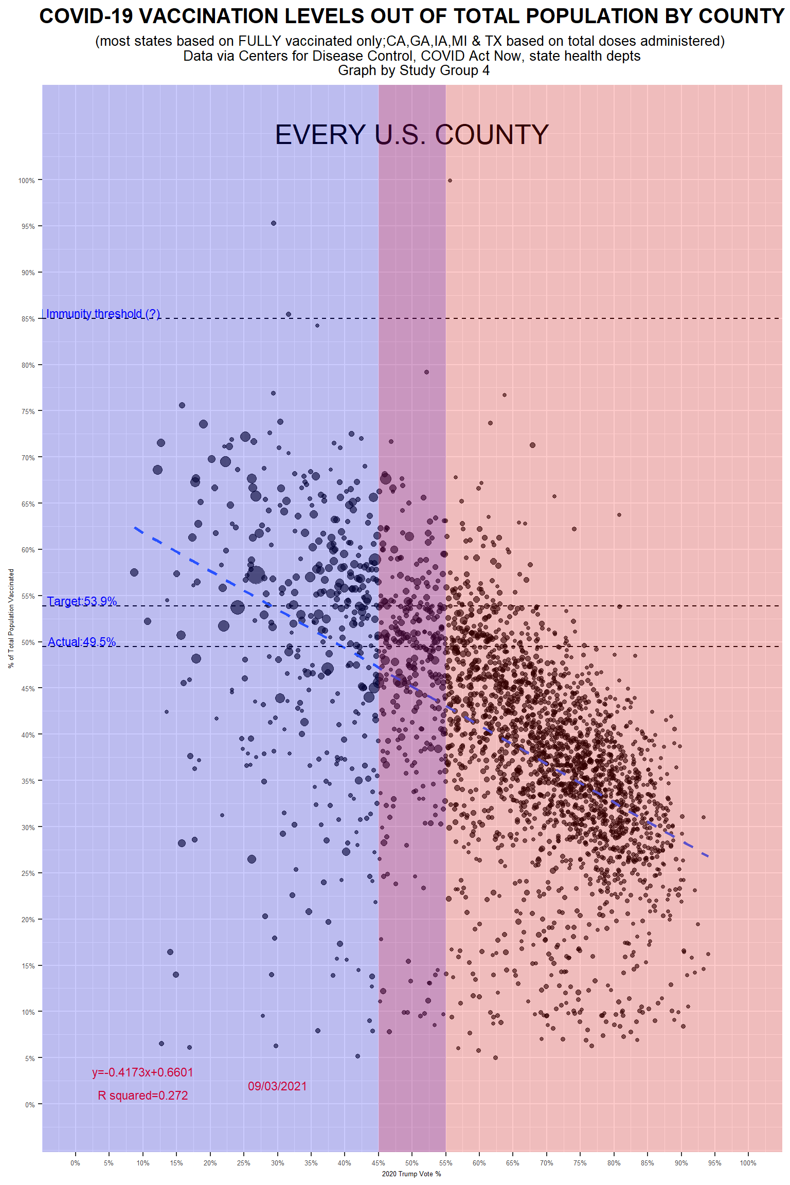
Although we get a different regression result, the conclusions drawn from it are the same as the original article. We believe this graph does the right job.
Challenge 2: Opinion polls for the 2021 German elections
url <- "https://en.wikipedia.org/wiki/Opinion_polling_for_the_2021_German_federal_election"
# https://www.economist.com/graphic-detail/who-will-succeed-angela-merkel
# https://www.theguardian.com/world/2021/jun/21/german-election-poll-tracker-who-will-be-the-next-chancellor


# get tables that exist on wikipedia page
tables <- url %>%
  read_html() %>%
  html_nodes(css="table")


# parse HTML tables into a dataframe called polls
# Use purr::map() to create a list of all tables in URL
polls <- map(tables, . %>%
             html_table(fill=TRUE)%>%
             janitor::clean_names())


# list of opinion polls
german_election_polls <- polls[[1]] %>% # the first table on the page contains the list of all opinions polls
  slice(2:(n()-1)) %>%  # drop the first row, as it contains again the variable names and last row that contains 2017 results
  mutate(
         # polls are shown to run from-to, e.g. 9-13 Aug 2021. We keep the last date, 13 Aug here, as the poll date
         # and we extract it by picking the last 11 characters from that field
         end_date = str_sub(fieldwork_date, -11),

         # end_date is still a string, so we convert it into a date object using lubridate::dmy()
         end_date = dmy(end_date),

         # we also get the month and week number from the date, if we want to do analysis by month- week, etc.
         month = month(end_date),
         week = isoweek(end_date)
)nrow(german_election_polls)## [1] 238#Removing duplicate values
german_election_polls <- german_election_polls[!duplicated(german_election_polls), ]
nrow(german_election_polls)## [1] 237#Calculating rolling average for different political parties
german_election_polls_avg <- german_election_polls %>%
mutate(
union_avg = rollmean(union, 14, align="left", fill = NA),
spd_avg = rollmean(spd, 14, align="left", fill = NA),
afd_avg = rollmean(af_d, 14, align="left", fill = NA),
fdp_avg = rollmean(fdp, 14, align="left", fill = NA),
linke_avg = rollmean(linke, 14, align="left", fill = NA),
grune_avg = rollmean(grune, 14, align="left", fill = NA)
)Sys.setlocale(locale="en_US.UTF-8")## [1] ""#Plotting the graph
#Setting colors for different political parties
color_parties<-c("SPD"="red3","CDU/CSU"="black","Grüne"="green3","FDP"="orange","AfD"="blue3","Linke"="purple3")
german_election_polls_avg %>%
ggplot +
#Union
geom_point(aes(x=end_date,y=union,colour="CDU/CSU"), alpha=0.5)+
geom_line(aes(x=end_date,y=union_avg,colour="CDU/CSU"),
se=FALSE,size=1.1, alpha=0.6)+
#spd
geom_point(aes(x=end_date,y=spd,colour="SPD"), alpha=0.5)+
geom_line(aes(x=end_date,y=spd_avg,colour="SPD"),
se=FALSE,size=1.1, alpha=0.6)+
#af_d
geom_point(aes(x=end_date,y=af_d,colour="AfD"), alpha=0.5)+
geom_line(aes(x=end_date,y=afd_avg,colour="AfD"),
se=FALSE,size=1.1, alpha=0.6)+
#fdp
geom_point(aes(x=end_date,y=fdp,colour="FDP"), alpha=0.5)+
geom_line(aes(x=end_date,y=fdp_avg,colour="FDP"),
se=FALSE,size=1.1, alpha=0.6)+
#linke
geom_point(aes(x=end_date,y=linke,colour="Linke"), alpha=0.5)+
geom_line(aes(x=end_date,y=linke_avg,colour="Linke"),
se=FALSE,size=1.1, alpha=0.6)+
#grune
geom_point(aes(x=end_date,y=grune,colour="Grüne"), alpha=0.5)+
geom_line(aes(x=end_date,y=grune_avg,colour="Grüne"),
se=FALSE,size=1.1, alpha=0.6)+
scale_colour_manual(name="09/03/2021",values=color_parties)+
#Setting x and y axes labels to be null
labs(x="", y="") +
#Date labels for x-axis
scale_x_date(date_minor_breaks = "1 months",
date_labels = "%b %Y") +
#Percentage labels for y-axis
scale_y_continuous(breaks = c(5, 15, 25, 35, 45),
labels = function(x) paste0(x, "%")) +
#Setting black and white theme, and removing grid lines
theme_bw() +
theme(panel.grid.major = element_blank(), panel.grid.minor = element_blank(),legend.title = element_text(size=10,face="bold"),legend.box.background = element_rect(),legend.position=c(0.99,0.99),legend.justification = c("right", "top")) +
#Plotting horizontal lines
geom_hline(aes(yintercept = 5), linetype="dashed", alpha=0.2) +
geom_hline(aes(yintercept = 15), linetype="dashed", alpha=0.2) +
geom_hline(aes(yintercept = 25), linetype="dashed", alpha=0.2) +
geom_hline(aes(yintercept = 35), linetype="dashed", alpha=0.2)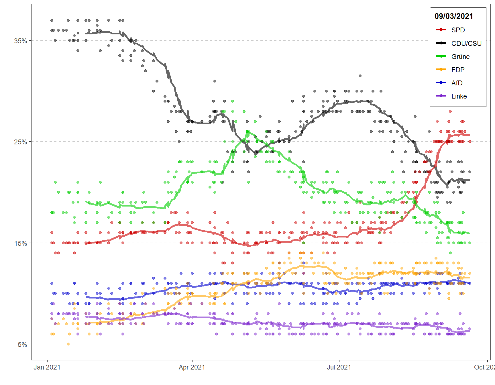
Details
- Who did you collaborate with: Study Group 4
- Approximately how much time did you spend on this problem set: 10 hours
- What, if anything, gave you the most trouble: Two challenges