Group assignment 2 of Applied Statics

1. Climate change and temperature anomalies
If we wanted to study climate change, we can find data on the Combined Land-Surface Air and Sea-Surface Water Temperature Anomalies in the Northern Hemisphere at NASA’s Goddard Institute for Space Studies. The tabular data of temperature anomalies can be found here
To define temperature anomalies you need to have a reference, or base, period which NASA clearly states that it is the period between 1951-1980.
We run the code below to load the file:
weather <-
  read_csv("https://data.giss.nasa.gov/gistemp/tabledata_v4/NH.Ts+dSST.csv",
           skip = 1,
           na = "***")
Notice that, when using this function, we added two options: skip and na.
- The
skip=1option is there as the real data table only starts in Row 2, so we need to skip one row. na = "***"option informs R how missing observations in the spreadsheet are coded. When looking at the spreadsheet, you can see that missing data is coded as “***“. It is best to specify this here, as otherwise some of the data is not recognized as numeric data.
Once the data is loaded, notice that there is a object titled weather in the Environment panel. If you cannot see the panel (usually on the top-right), go to Tools > Global Options > Pane Layout and tick the checkbox next to Environment. Click on the weather object, and the dataframe will pop up on a seperate tab. Inspect the dataframe.
For each month and year, the dataframe shows the deviation of temperature from the normal (expected). Further the dataframe is in wide format.
You have two objectives in this section:
Select the year and the twelve month variables from the
weatherdataset. We do not need the others (J-D, D-N, DJF, etc.) for this assignment. Hint: useselect()function.Convert the dataframe from wide to ‘long’ format. Hint: use
gather()orpivot_longer()function. Name the new dataframe astidyweather, name the variable containing the name of the month asmonth, and the temperature deviation values asdelta.
#select desired columns
weather_cleaned<-weather %>%
  select(1:13,)

#convert dataframe to long format
tidyweather<- weather_cleaned %>%
  pivot_longer(cols=2:13,names_to = "Month",values_to = "delta")

tidyweather
## # A tibble: 1,704 x 3
## Year Month delta
## <dbl> <chr> <dbl>
## 1 1880 Jan -0.34
## 2 1880 Feb -0.5
## 3 1880 Mar -0.22
## 4 1880 Apr -0.29
## 5 1880 May -0.05
## 6 1880 Jun -0.15
## 7 1880 Jul -0.17
## 8 1880 Aug -0.25
## 9 1880 Sep -0.22
## 10 1880 Oct -0.31
## # ... with 1,694 more rowsInspecting our dataframe we find that it has three variables now, one each for
- year,
- month, and
- delta, or temperature deviation.
Plotting Information
Let us plot the data using a time-series scatter plot, and add a trendline. To do that, we first need to create a new variable called date in order to ensure that the delta values are plot chronologically.
tidyweather <- tidyweather %>%
mutate(date = ymd(paste(as.character(Year), Month, "1")),
month = month(date, label=TRUE),
year = year(date))
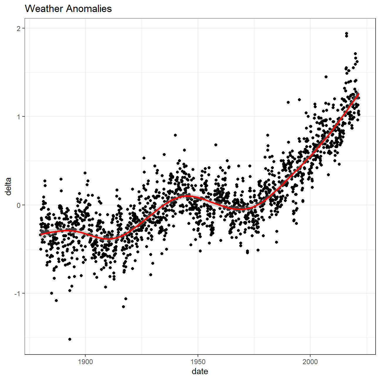
ggplot(tidyweather, aes(x=date, y = delta))+
geom_point()+
geom_smooth(color="red") +
theme_bw() +
labs (
title = "Weather Anomalies"
)
Is the effect of increasing temperature more pronounced in some months? We use facet_wrap() to produce a seperate scatter plot for each month, again with a smoothing line. Our chart now has human-readable labels; that is, each month is labeled “Jan”, “Feb”, “Mar” (full or abbreviated month names are fine), not 1, 2, 3.
#change labels so that month names appear instead of numbers
month_labs<-c("Jan","Feb","Mar","Apr","May","Jun","Jul","Aug","Sep","Oct","Nov","Dec")
tidyweather$month <-factor(tidyweather$month,label=month_labs,ordered = TRUE)

#plot the graph
ggplot(tidyweather,aes(x=Year,y=delta,color=month))+
  geom_point()+

  #facet by month
  facet_wrap(~month,
             scales = "free")+
  theme(plot.title = element_text(hjust = 0.5,size=15,margin=margin(0,0,7,0)),strip.text = element_text(size=12))+
  geom_smooth(se=FALSE)+

  #add legends
    labs(title="Changes of Monthly Temperature Anomalies through years",
                             x="Year",
                             y="Delta Values",
                             color="Month")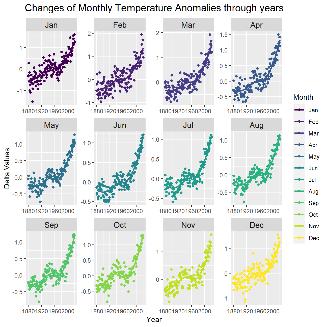
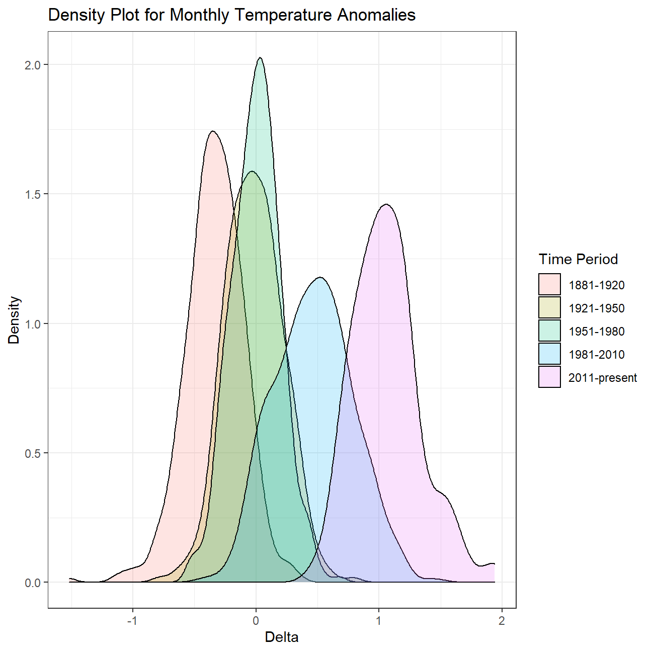
It is sometimes useful to group data into different time periods to study historical data. For example, we often refer to decades such as 1970s, 1980s, 1990s etc. to refer to a period of time. NASA calcuialtes a temperature anomaly, as difference form the base periof of 1951-1980. The code below creates a new data frame called comparison that groups data in five time periods: 1881-1920, 1921-1950, 1951-1980, 1981-2010 and 2011-present.
We remove data before 1800 and before using filter. Then, we use the mutate function to create a new variable interval which contains information on which period each observation belongs to. We can assign the different periods using case_when().
comparison <- tidyweather %>%
  filter(Year>= 1881) %>%     #remove years prior to 1881
  #create new variable 'interval', and assign values based on criteria below:
  mutate(interval = case_when(
    Year %in% c(1881:1920) ~ "1881-1920",
    Year %in% c(1921:1950) ~ "1921-1950",
    Year %in% c(1951:1980) ~ "1951-1980",
    Year %in% c(1981:2010) ~ "1981-2010",
    TRUE ~ "2011-present"
  ))
Now that we have the interval variable, we can create a density plot to study the distribution of monthly deviations (delta), grouped by the different time periods we are interested in. We are gonna set fill to interval to group and colour the data by different time periods.
ggplot(comparison, aes(x=delta, fill=interval))+
  geom_density(alpha=0.2) +   #density plot with tranparency set to 20%
  theme_bw() +                #theme
  labs (
    title = "Density Plot for Monthly Temperature Anomalies",
    y     = "Density",         #changing y-axis label to sentence case
    fill="Time Period",
    x= "Delta"
  )
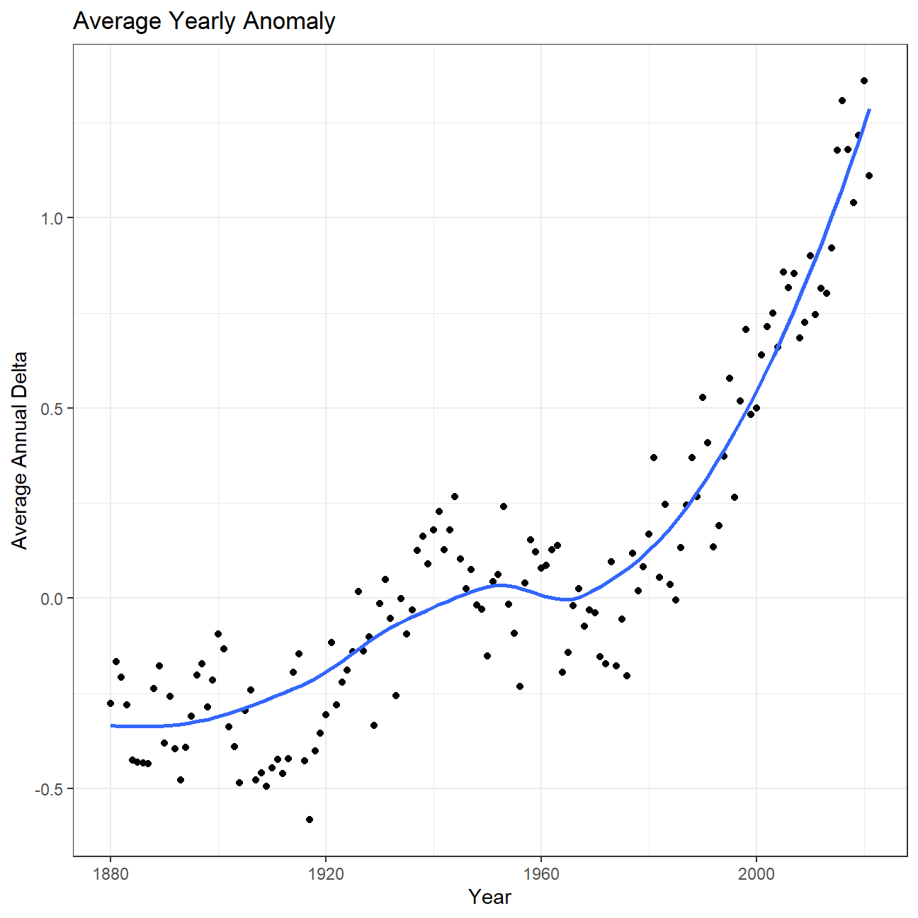
So far, we have been working with monthly anomalies. However, we might be interested in average annual anomalies. We can do this by using group_by() and summarise(), followed by a scatter plot to display the result.
#creating yearly averages
average_annual_anomaly <- tidyweather %>%
  group_by(Year) %>%   #grouping data by Year

  # creating summaries for mean delta
  # use `na.rm=TRUE` to eliminate NA (not available) values
  summarise(annual_average_delta=mean(delta,na.rm=TRUE))
average_annual_anomaly
## # A tibble: 142 x 2
## Year annual_average_delta
## <dbl> <dbl>
## 1 1880 -0.276
## 2 1881 -0.167
## 3 1882 -0.208
## 4 1883 -0.281
## 5 1884 -0.425
## 6 1885 -0.432
## 7 1886 -0.432
## 8 1887 -0.436
## 9 1888 -0.238
## 10 1889 -0.178
## # ... with 132 more rows#plotting the data:
ggplot(average_annual_anomaly, aes(x=Year, y= annual_average_delta))+
geom_point()+
#Fit the best fit line, using LOESS method
geom_smooth(method = "loess",se=FALSE) +
#change to theme_bw() to have white background + black frame around plot
theme_bw() +
labs (
title = "Average Yearly Anomaly",
y = "Average Annual Delta"
) 
Confidence Interval for delta
NASA points out on their website that
A one-degree global change is significant because it takes a vast amount of heat to warm all the oceans, atmosphere, and land by that much. In the past, a one- to two-degree drop was all it took to plunge the Earth into the Little Ice Age.
Our task is to construct a confidence interval for the average annual delta since 2011, both using a formula and using a bootstrap simulation with the infer package. Recall that the dataframe comparison has already grouped temperature anomalies according to time intervals; we are only interested in what is happening between 2011-present.
options(digits=3)
formula_ci <- comparison %>%
  filter(interval=="2011-present") %>%
  summarise(mean_delta=mean(delta,na.rm=TRUE),
            median_delta=median(delta,na.rm=TRUE),
            sd_delta=sd(delta,na.rm=TRUE),
            count=n(),
            t_critical=qt(0.975,count-1),
            se_delta=sd_delta/sqrt(count),
            lower_delta=mean_delta-t_critical*se_delta,
            upper_delta=mean_delta+t_critical*se_delta)
formula_ci
## # A tibble: 1 x 8
## mean_delta median_delta sd_delta count t_critical se_delta lower_delta
## <dbl> <dbl> <dbl> <int> <dbl> <dbl> <dbl>
## 1 1.06 1.04 0.274 132 1.98 0.0239 1.01
## # ... with 1 more variable: upper_delta <dbl># use the infer package to construct a 95% CI for delta
set.seed(007)
library(infer)
bootstrap_delta<- comparison %>%
filter(interval=="2011-present") %>%
specify(response = delta) %>%
generate(reps = 1000,type="bootstrap") %>%
calculate(stat = "mean")
bootstrap_delta## Response: delta (numeric)
## # A tibble: 1,000 x 2
## replicate stat
## <int> <dbl>
## 1 1 1.04
## 2 2 1.04
## 3 3 1.08
## 4 4 1.06
## 5 5 1.05
## 6 6 1.06
## 7 7 1.08
## 8 8 1.07
## 9 9 1.09
## 10 10 1.06
## # ... with 990 more rowsbootstrap_confidence_interval<-bootstrap_delta %>%
get_ci(level=0.95,type="percentile")
bootstrap_confidence_interval## # A tibble: 1 x 2
## lower_ci upper_ci
## <dbl> <dbl>
## 1 1.01 1.11What is the data showing us? let try to answer this question
Essentially, we are trying to understand how the global warming starts from a minor issue and grows into a big problem. We use the variable called "delta" to describe temperature anomalies of every date (in our case, the first day of each month) and see how it changes through time. We could see from the first chart that the value of delta slowly climbed above 0 before rose sharply over 1 in a relatively shorter period of time. This demonstrates the fact that the global warming has severely exacerbated by human actions in last few years. Then we have a closer look on the picture of each month and could discover a similar pattern between months, they all experiencing a gradually increase before jumping remarkably with situation of first four months being the worst. Then we create a variable called “interval” to compare temperature anomalies between different time periods and we could also conclude from the density plot that things are getting worse because the average delta of these periods is increasing, some delta even reaching the level of 2. Finally, we only focus on the most recent period (2011-present) and calculate the confidence interval of the average delta, and the result ranges from 1.01 to 1.11, meaning that We are 95% confident that the average delta is between 1.01 and 1.11. In conclusion, having an average anomaly larger than 1 is never a good signal and we should treat this problem seriously and work togerther solving it.
2.General Social Survey (GSS)
The General Social Survey (GSS) gathers data on American society in order to monitor and explain trends in attitudes, behaviours, and attributes. Many trends have been tracked for decades, so one can see the evolution of attitudes, etc in American Society.
In this assignment we analyze data from the 2016 GSS sample data, using it to estimate values of population parameters of interest about US adults. The GSS sample data file has 2867 observations of 935 variables, but we are only interested in very few of these variables and you are using a smaller file.
gss <- read_csv(here::here("data", "smallgss2016.csv"),
                na = c("", "Don't know",
                       "No answer", "Not applicable"))
You will also notice that many responses should not be taken into consideration, like “No Answer”, “Don’t Know”, “Not applicable”, “Refused to Answer”.
We will be creating 95% confidence intervals for population parameters. The variables we have are the following:
- hours and minutes spent on email weekly. The responses to these questions are recorded in the
emailhrandemailminvariables. For example, if the response is 2.50 hours, this would be recorded as emailhr = 2 and emailmin = 30. snapchat,instagrm,twitter: whether respondents used these social media in 2016sex: Female - Maledegree: highest education level attained
Instagram and Snapchat, by sex
Lets estimate the population proportion of Snapchat or Instagram users in 2016:
- We create a new variable,
snap_instathat is Yes if the respondent reported using any of Snapchat (snapchat) or Instagram (instagrm), and No if not. If the recorded value was NA for both of these questions, the value in our new variable is also NA.
#Creating the variable snap_insta
gss_snap_insta <-  gss %>%
  mutate(snap_insta = case_when(

    #Yes if either snapchat or instagram is Yes
    (snapchat == "Yes" | instagrm == "Yes") ~ "Yes",

    #NA if both snapchat and instagram are NA
    (snapchat == "NA" & instagrm == "NA") ~ "NA",

    #No for all other cases
    TRUE ~ "No"
))- Then we calculate the proportion of Yes’s for
snap_instaamong those who answered the question, i.e. excluding NAs.
gss_snap_insta %>%

  #Excluding NAs
  filter(snap_insta != "NA") %>%
  group_by(snap_insta) %>%
  summarize(n = n()) %>%

  #Calculating proportion
  mutate(proportion_yes = n / sum(n)) %>%

  #Filtering values only for Yes
  filter(snap_insta == 'Yes')
## # A tibble: 1 x 3
## snap_insta n proportion_yes
## <chr> <int> <dbl>
## 1 Yes 514 0.375- Using the CI formula for proportions, we construct 95% CIs for men and women who used either Snapchat or Instagram
gss_snap_insta %>%

  #Excluding NAs
  filter(snap_insta != "NA") %>%
  group_by(sex, snap_insta) %>%
  summarize(n = n()) %>%

  #Calculating proportion and CI for both genders
  mutate(proportion = n / sum(n),
         gender_count = sum(n),
         t_critical = qt(0.975, gender_count-1),
         se_proportion =  sqrt((proportion * (1-proportion)) / gender_count),
         margin_of_error = t_critical * se_proportion,
         CI_low = proportion - margin_of_error,
         CI_high = proportion + margin_of_error) %>%

  #Filtering values only for Yes
  filter(snap_insta == 'Yes')
## # A tibble: 2 x 10
## # Groups: sex [2]
## sex snap_insta n proportion gender_count t_critical se_proportion
## <chr> <chr> <int> <dbl> <int> <dbl> <dbl>
## 1 Female Yes 322 0.419 769 1.96 0.0178
## 2 Male Yes 192 0.318 603 1.96 0.0190
## # ... with 3 more variables: margin_of_error <dbl>, CI_low <dbl>, CI_high <dbl>The estimated population proportion of female Snapchat or Instagram users is 0.419 and the 95% confidence interval is [0.384, 0.454]. The estimated population proportion of male Snapchat or Instagram users is 0.318 and the 95% confidence interval is [0.281, 0.356].
Twitter, by education level
Can we estimate the population proportion of Twitter users by education level in 2016?.
There are 5 education levels in variable degree which, in ascending order of years of education, are Lt high school, High School, Junior college, Bachelor, Graduate.
- Firstly we turn
degreefrom a character variable into a factor variable. We sure the order is the correct one and that levels are not sorted alphabetically which is what R by default does.
#Converting degree to an ordered factor
gss_degree_factor <- gss %>%
  mutate(degree = factor(degree,
                         levels = c("Lt high school", "High school", "Junior college", "Bachelor", "Graduate"), ordered = TRUE))

#Confirming if degree is an ordered factor
is.ordered(gss_degree_factor$degree)
## [1] TRUE- Afterwards we create a new variable,
bachelor_graduatethat is Yes if the respondent has either aBachelororGraduatedegree. As before, if the recorded value for either was NA, the value in our new variable is also NA.
#Creating bachelor_graduate variable
gss_bachelor_graduate <-  gss_degree_factor %>%

  mutate(bachelor_graduate = case_when(
                #Yes if either Bachelor or Graduate
                (degree == 'Bachelor' | degree == 'Graduate') ~ "Yes",
                #NA if degree is NA
                is.na(degree) ~ "NA",
                #No for all other cases
TRUE ~ "No"))- Lets calculate the proportion of
bachelor_graduatewho do (Yes) and who don’t (No) use twitter.
#Proportion of 'bachelor_graduate' who use twitter
gss_bachelor_graduate %>%

  #Filtering bachelor_graduates and removing null values for twitter
  filter(bachelor_graduate == "Yes" & twitter != "NA") %>%

  group_by(twitter) %>%
  summarize(n = n()) %>%

  #Calculating proportion
  mutate(proportion = n / sum(n)) %>%

  #Arranging data in order of Yes and No
  arrange(factor(twitter, levels = c("Yes", "No")))
## # A tibble: 2 x 3
## twitter n proportion
## <chr> <int> <dbl>
## 1 Yes 114 0.233
## 2 No 375 0.767- Using the CI formula for proportions, we construct two 95% CIs for
bachelor_graduatevs whether they use (Yes) and don’t (No) use twitter.
gss_bachelor_graduate %>%

  #Filtering bachelor_graduates and removing null values for twitter
  filter(bachelor_graduate == "Yes" & twitter != "NA") %>%

  group_by(twitter) %>%
  summarize(n = n()) %>%

  #Calculating 2 confidence intervals
  mutate(proportion = n / sum(n),
         total_count = sum(n),
         t_critical = qt(0.975, total_count-1),
         se_proportion =  sqrt((proportion * (1-proportion)) / total_count),
         margin_of_error = t_critical * se_proportion,
         CI_low = proportion - margin_of_error,
         CI_high = proportion + margin_of_error) %>%

  #Arranging data in order of Yes and No
  arrange(factor(twitter, levels = c("Yes", "No")))
## # A tibble: 2 x 9
## twitter n proportion total_count t_critical se_proportion margin_of_error
## <chr> <int> <dbl> <int> <dbl> <dbl> <dbl>
## 1 Yes 114 0.233 489 1.96 0.0191 0.0376
## 2 No 375 0.767 489 1.96 0.0191 0.0376
## # ... with 2 more variables: CI_low <dbl>, CI_high <dbl>- Do these two Confidence Intervals overlap?
The estimated population proportion of people who have either a Bachelor or Graduate degree and use Twitter is 0.233 and the 95% confidence interval is [0.196, 0.271]. The estimated population proportion of people who have either a Bachelor or Graduate degree and do not use Twitter is 0.767 and the 95% confidence interval is [0.729, 0.804]. These 2 confidence intervals do not overlap.
Email usage
Can we estimate the population parameter on time spent on email weekly?
- We create a new variable called
emailthat combinesemailhrandemailminto reports the number of minutes the respondents spend on email weekly.
gss_email <- gss %>%

  #Converting emailhr and emailmin to integers and calculating total mins
  mutate(emailhr = as.integer(emailhr),
         emailmin = as.integer(emailmin),
email = (emailhr * 60) + (emailmin))- it is helpful to visualise the distribution of this new variable.We find the mean and the median number of minutes respondents spend on email weekly.
#Plotting distribution of 'email'
gss_email %>%
  ggplot(aes(x=email)) +
  geom_density() +

  #Adding title and axes labels
  labs(title = "Distribution of the no. of minutes respondents spend on email weekly",
       x = "Number of minutes the survey respondents spend on email weekly",
       y = "Density"
  ) +
  theme_bw()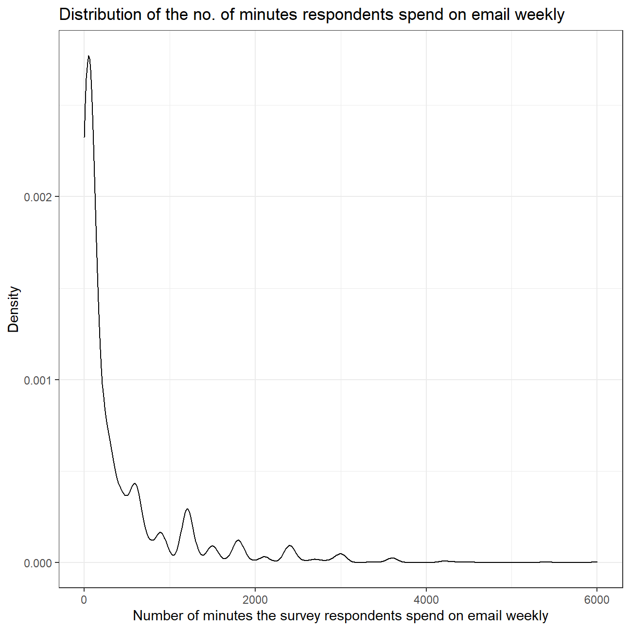
#Calculating summary statistics for 'email'
favstats(gss_email$email)
## min Q1 median Q3 max mean sd n missing
## 0 50 120 480 6000 417 680 1649 1218The distribution of the number of minutes the survey respondents spend on email weekly is heavily skewed towards the right. This means that most of the people responded with lower no. of minutes but some of the respondents spend much more time on email weekly. Therefore, the mean (417) of the variable is much greater than the median (120) of the variable, as the mean is pulled towards the right by the outliers.
Since the distribution is positively skewed with many outliers, median would be a better measure of central tendancy of the amount of time Americans spend on email weekly as median is not much affected by outliers as compared to mean.
- Using the
inferpackage, let’s calculate a 95% bootstrap confidence interval for the mean amount of time Americans spend on email weekly. We should interpret this interval in context of the data, reporting its endpoints in “humanized” units (e.g. instead of 108 minutes, report 1 hr and 8 minutes).
#Loading infer package
library(infer)

#Setting seed value
set.seed(1)

#Generate 1000 bootstrapped samples and calculating the mean
boot_mean_time <- gss_email %>%
  #Filtering out NA values
  filter(!is.na(email)) %>%

  specify(response = email) %>%

  generate(reps = 1000, type="bootstrap") %>%
  #Calculating mean for each sample
  calculate(stat = 'mean')

#Calculating CI for mean time spent on emails
bootstrap_ci <- boot_mean_time %>%
  get_confidence_interval(level = 0.95, type = "percentile") %>%

  #Rounding CIs to get integer value for total minutes
  mutate(lower_ci = round(lower_ci, 0),
         upper_ci = round(upper_ci, 0))

bootstrap_ci_time <- bootstrap_ci %>%
  mutate(
    #Calculating hours and minutes from total number of minutes
    lower_ci_hour = lower_ci %/% 60,
    lower_ci_minutes = lower_ci %% 60,
    upper_ci_hour = upper_ci %/% 60,
    upper_ci_minutes = upper_ci %% 60
  )

bootstrap_ci_time
## # A tibble: 1 x 6
## lower_ci upper_ci lower_ci_hour lower_ci_minutes upper_ci_hour
## <dbl> <dbl> <dbl> <dbl> <dbl>
## 1 385 450 6 25 7
## # ... with 1 more variable: upper_ci_minutes <dbl>The 95% confidence interval for the mean amount of time Americans spend on email weekly is from 6 hours and 25 minutes to 7 hours and 30 minutes. The population mean seems to be on the higher side because the sample data is heavily skewed towards the right. Due to this, the mean is pulled towards the outliers on the right side even though most of the data is towards the left side.
- Would you expect a 99% confidence interval to be wider or narrower than the interval you calculated above? Explain your reasoning.
Since the 99% confidence interval would be more confident than the 95% confidence interval, the 99% confidence interval would be wider as there is a 5% chance of being wrong in 95% confidence interval but there is just a 1% chance of being wrong in the 99% confidence interval.
3.Biden’s Approval Margins
As we saw in class, fivethirtyeight.com has detailed data on all polls that track the president’s approval
# Import approval polls data directly off fivethirtyeight website
approval_polllist <- read_csv('https://projects.fivethirtyeight.com/biden-approval-data/approval_polllist.csv')

glimpse(approval_polllist)
## Rows: 1,598
## Columns: 22
## $ president <chr> "Joseph R. Biden Jr.", "Joseph R. Biden Jr.", "Jos~
## $ subgroup <chr> "All polls", "All polls", "All polls", "All polls"~
## $ modeldate <chr> "9/16/2021", "9/16/2021", "9/16/2021", "9/16/2021"~
## $ startdate <chr> "1/31/2021", "1/31/2021", "2/1/2021", "2/1/2021", ~
## $ enddate <chr> "2/2/2021", "2/2/2021", "2/3/2021", "2/3/2021", "2~
## $ pollster <chr> "Rasmussen Reports/Pulse Opinion Research", "YouGo~
## $ grade <chr> "B", "B+", "B", "B", "B-", "B", "B", "A-", "B", "B~
## $ samplesize <dbl> 1500, 1500, 1500, 15000, 1005, 1500, 15000, 1429, ~
## $ population <chr> "lv", "a", "lv", "a", "a", "lv", "a", "a", "a", "l~
## $ weight <dbl> 0.3225, 1.0856, 0.3025, 0.2786, 0.8741, 0.2857, 0.~
## $ influence <dbl> 0, 0, 0, 0, 0, 0, 0, 0, 0, 0, 0, 0, 0, 0, 0, 0, 0,~
## $ approve <dbl> 51, 46, 52, 54, 57, 49, 54, 49, 54, 50, 54, 60, 51~
## $ disapprove <dbl> 47, 38, 46, 33, 34, 48, 34, 39, 34, 47, 34, 32, 46~
## $ adjusted_approve <dbl> 53.3, 47.3, 54.3, 52.5, 55.8, 51.3, 52.5, 49.7, 52~
## $ adjusted_disapprove <dbl> 41.0, 38.3, 40.0, 36.3, 35.1, 42.0, 37.3, 39.1, 37~
## $ multiversions <chr> NA, NA, NA, NA, NA, NA, NA, NA, NA, NA, NA, NA, NA~
## $ tracking <lgl> TRUE, NA, TRUE, TRUE, NA, TRUE, TRUE, NA, TRUE, TR~
## $ url <chr> "https://www.rasmussenreports.com/public_content/p~
## $ poll_id <dbl> 74333, 74332, 74338, 74366, 74345, 74347, 74367, 7~
## $ question_id <dbl> 139595, 139593, 139642, 139733, 139652, 139654, 13~
## $ createddate <chr> "2/3/2021", "2/3/2021", "2/4/2021", "2/11/2021", "~
## $ timestamp <chr> "14:39:16 16 Sep 2021", "14:39:16 16 Sep 2021", "1~# Use `lubridate` to fix dates, as they are given as characters.
#load lubridate
library(lubridate)
#mutate date collumns to contain dates not characters
approval_polllist<- approval_polllist %>%
#use mdy() as dates are in US style date format
mutate(modeldate = mdy(modeldate),
startdate = mdy(startdate),
enddate = mdy(enddate)
)Create a plot
What I would like you to do is to calculate the average net approval rate (approve- disapprove) for each week since he got into office. I want you plot the net approval, along with its 95% confidence interval. There are various dates given for each poll, please use enddate, i.e., the date the poll ended.
approval_polllist %>%
  #turn dates into weeks and calculate net approval rate in new column
  mutate(week = week(enddate),
         net_approval_rate = approve - disapprove) %>%

  #keep only "All polls" results
  filter(subgroup == "All polls") %>%

  #remove unwanted entries and columns
  unique() %>%
  select(week, pollster, samplesize,net_approval_rate) %>%
  arrange(week) %>%

  #calculate average net approval rate for each week
  group_by(week) %>%
  summarise(mean_net_approval = mean(net_approval_rate),
            SD= sd(net_approval_rate),
            n=n(),
            SE=SD/sqrt(n),
  #since we don't know the population's σ we will use the t-distribution derived CIs
            t_critical=qt(0.975, n-1),
            upper_CI = mean_net_approval +t_critical*SE,
            lower_CI = mean_net_approval -t_critical*SE) %>%

  #plot diagram using ggplot
  ggplot+
  geom_point(aes(x=week, y=mean_net_approval), color="red", alpha=0.4)+
  geom_line(aes(x=week, y=mean_net_approval),color="red", alpha=0.4)+

  #add regression line
  geom_smooth(aes(x=week, y=mean_net_approval),color="blue",se = FALSE)+

  #plot CIs
  geom_ribbon(aes(x= week,
                  ymin=mean_net_approval-t_critical*SE,
                  ymax=mean_net_approval+t_critical*SE), alpha=0.2)+

  #add reference line on y=0
   geom_hline(yintercept=0, lwd = 1.2,color = "orange")+

  #add legends
  labs(title="Estimating Approval Margin (approve - disapprove) for Joe Biden",
       subtitle = "Weekly Average of All Polls",
       x= "Week of the Year",
       y= "Average Net Approval")+

  #format y axis scale
  scale_y_continuous(
                    breaks = seq(-5, 30, by=5) ,
                    labels = function(x) paste0(x))+
  #change theme
   theme_bw()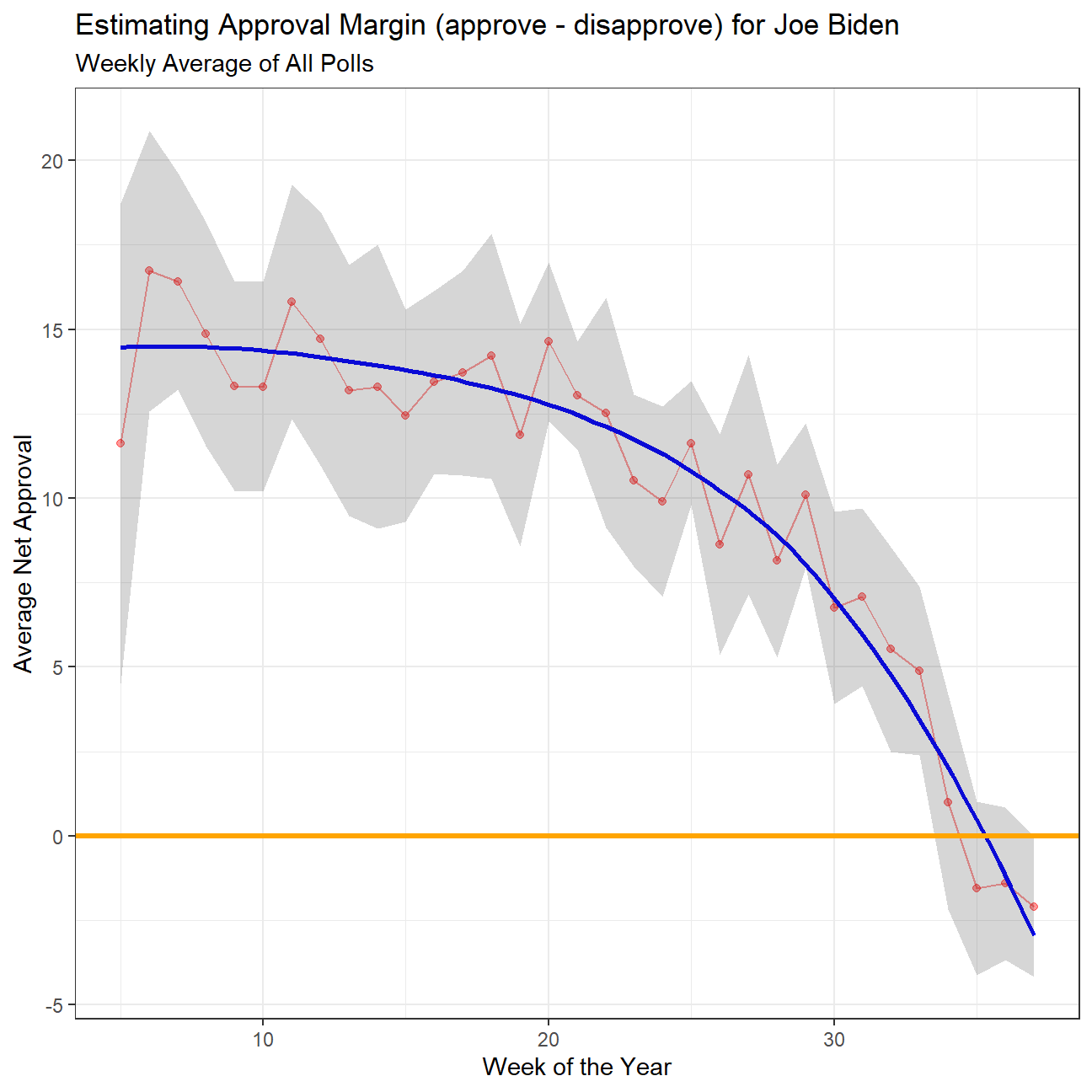
Also, please add an orange line at zero. Your plot should look like this:
 Thanfully the grah we created is very similar to the target one (if not for slight changes in data)
Compare Confidence Intervals
Compare the confidence intervals for week 3 and week 25. Can you explain what’s going on? One paragraph would be enough.
The difference is in the sample size available. While in week 3 we only had 4 polls to calculate the average from, in week 25 we had a record of 29 different polls to calculate the average. The bigger our sample size “n” is, (in this case the number of polls), the smaller the CIs are, given that they are calculated by subtracting and adding t_critical * s/qqrt(n) to the average value.
Note when this analysis was first performed the data set included 4 polls from week 3. Since then those values have been removed from the data set, and weeks 3 is no longer included, resulting in the above diagram showing similar CIs across weeks. We can however note that week 4 (only 8 polls) has a significantly wider CI for the aforementioned reasons
4.Gapminder revisited
Recall the gapminder data frame from the gapminder package. That data frame contains just six columns from the larger data in Gapminder World. In this part, you will join a few dataframes with more data than the ‘gapminder’ package. Specifically, you will look at data on
- Life expectancy at birth (life_expectancy_years.csv)
- GDP per capita in constant 2010 US$ (https://data.worldbank.org/indicator/NY.GDP.PCAP.KD)
- Female fertility: The number of babies per woman (https://data.worldbank.org/indicator/SP.DYN.TFRT.IN)
- Primary school enrollment as % of children attending primary school (https://data.worldbank.org/indicator/SE.PRM.NENR)
- Mortality rate, for under 5, per 1000 live births (https://data.worldbank.org/indicator/SH.DYN.MORT)
- HIV prevalence (adults_with_hiv_percent_age_15_49.csv): The estimated number of people living with HIV per 100 population of age group 15-49.
You must use the wbstats package to download data from the World Bank. The relevant World Bank indicators are SP.DYN.TFRT.IN, SE.PRM.NENR, NY.GDP.PCAP.KD, and SH.DYN.MORT
# load gapminder HIV data
hiv <- read_csv(here::here("data","adults_with_hiv_percent_age_15_49.csv"))
life_expectancy <- read_csv(here::here("data","life_expectancy_years.csv"))

# get World bank data using wbstats
indicators <- c("SP.DYN.TFRT.IN","SE.PRM.NENR", "SH.DYN.MORT", "NY.GDP.PCAP.KD")


library(wbstats)

worldbank_data <- wb_data(country="countries_only", #countries only- no aggregates like Latin America, Europe, etc.
                          indicator = indicators,
                          start_date = 1960,
                          end_date = 2016)

# get a dataframe of information regarding countries, indicators, sources, regions, indicator topics, lending types, income levels,  from the World Bank API
countries <-  wbstats::wb_cachelist$countries
You have to join the 3 dataframes (life_expectancy, worldbank_data, and HIV) into one. You may need to tidy your data first and then perform join operations. Think about what type makes the most sense and explain why you chose it.
#tidy HIV
hiv_tidy<-
  hiv %>%
  pivot_longer(cols=2:34,
               names_to="year",
               values_to = "hiv_percent")
#view(hiv_tidy)

#tidy life expectancy
life_exp_tidy<-
  # we only need date before 2021
  select( life_expectancy,c(1:223)) %>%
  pivot_longer(cols=2:223,
               names_to="year",
               values_to = "life_exp")
#view(life_exp_tidy)

#join region to worldbank data by iso3c
worldbank_data<- left_join(worldbank_data,select(countries, c('iso3c','region')))
# filter to see if there is missing values in region
worldbank_data %>%
  filter(is.na(region))
## # A tibble: 0 x 9
## # ... with 9 variables: iso2c <chr>, iso3c <chr>, country <chr>, date <dbl>,
## # NY.GDP.PCAP.KD <dbl>, SE.PRM.NENR <dbl>, SH.DYN.MORT <dbl>,
## # SP.DYN.TFRT.IN <dbl>, region <chr>To join the data frames, we use world bank data as the main one and left join others. Since each data frames contains some NA values in several years. If we use inner join, quite a lot rows will be missed.
# join life_expectancy, worldbank_data, and HIV
#worldbank_data contains year from 1960 to 2016
#rename date in worldbank data as year
worldbank_data <- rename(worldbank_data,year = date )
worldbank_data$year <- as.character(worldbank_data$year)
life_wb<-
  left_join(worldbank_data,life_exp_tidy,
             # by=c('country'='country','year'='year'),
            copy= TRUE)


life_wb_hiv <-
  left_join (life_wb,hiv_tidy,
             # by = c('country'='country','year'='year'),
copy= TRUE)- What is the relationship between HIV prevalence and life expectancy? Generate a scatterplot with a smoothing line to report your results. It is possible that we may find faceting useful
life_wb_hiv %>%
#filter NA
ggplot(aes(x=hiv_percent , y= life_exp))+
geom_point(alpha=0.2)+
geom_smooth( )+
theme_bw()+
ylim(40,100)+
facet_wrap(~ region, scales = "free" )+
labs( x='HIV prevalence ',
y='Life expectancy')+
NULL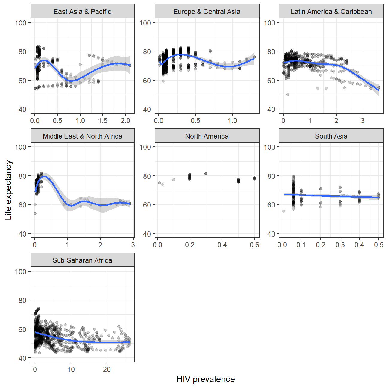 The higher HIV prevalence, the lower life expectancy. The have a slight negative correlation.
- What is the relationship between fertility rate and GDP per capita? We will generate a scatter plot with a smoothing line to report your results. It is posible that we may find faceting by region useful
#Female fertility: SP.DYN.TFRT.IN
#GDP per capita: NY.GDP.PCAP.KD
life_wb_hiv %>%
  ggplot(aes(x=SP.DYN.TFRT.IN , y= NY.GDP.PCAP.KD))+
  geom_point(alpha=0.2)+
  scale_y_log10()+
  geom_smooth(method= 'lm')+
  facet_wrap(~ region  )+
  labs(
    x='Female fertility',
    y='GDP per capita'
  )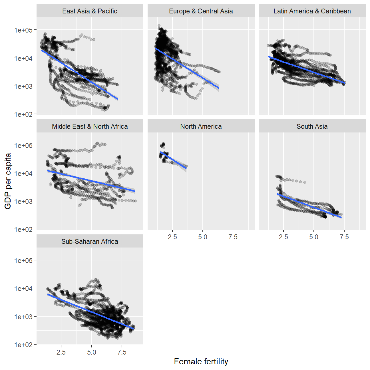
NULL## NULLThe lower and GDP per capita,the higher fertility rate. They have a negative correlation.
- Which regions have the most observations with missing HIV data? Generate a bar chart (
geom_col()), in descending order.
#join the region to hiv_tidy using countrycode

library(countrycode)
hiv_tidy$region   <- countrycode(hiv_tidy$country, origin = "country.name", destination = "region")
hiv_tidy%>%
  filter(is.na(region))
## # A tibble: 0 x 4
## # ... with 4 variables: country <chr>, year <chr>, hiv_percent <dbl>,
## # region <chr>#count the missing values
hiv_na<-hiv_tidy %>%
filter(is.na(hiv_percent)) %>%
group_by(region) %>%
count(sort= TRUE)
#plot
hiv_na %>%
filter(!is.na(region)) %>%
ggplot(aes(y=fct_reorder(region,n),x= n))+
geom_col()+
labs(
x='Observations with missing HIV data',
y='Region'
)+
theme_bw()+
NULL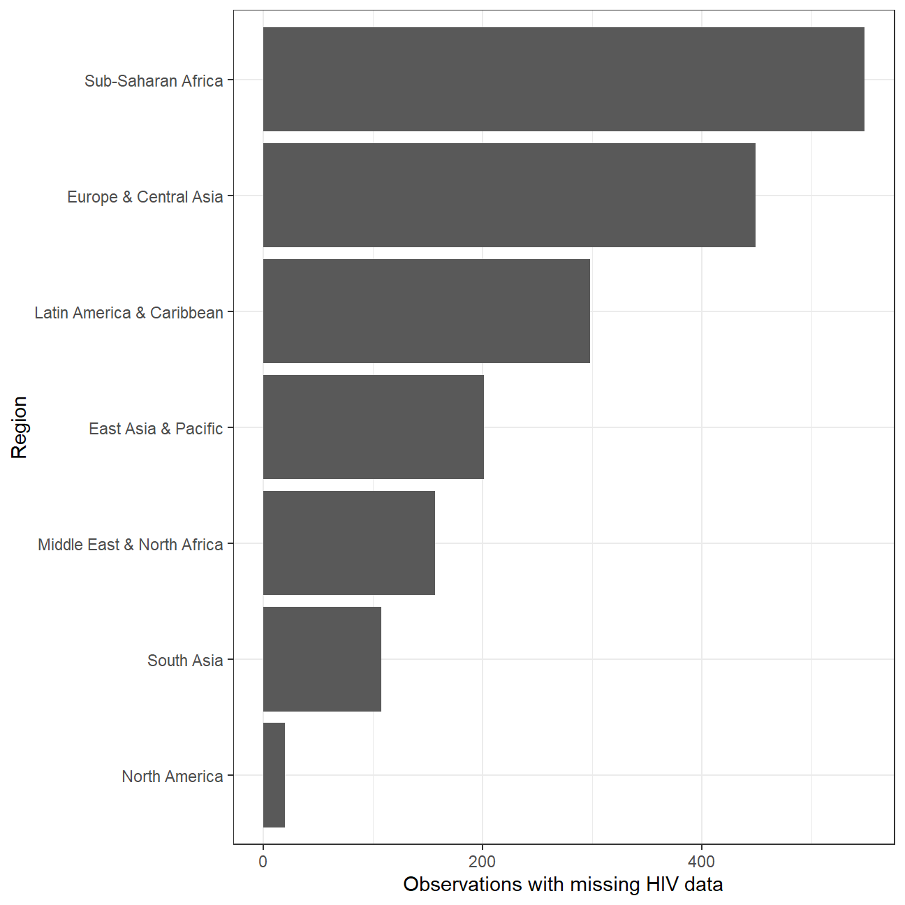 Sub-Saharan Africa has the most observations with missing HIV data.
- How has mortality rate for under 5 changed by region? In each region, let’s find the top 5 countries that have seen the greatest improvement, as well as those 5 countries where mortality rates have had the least improvement or even deterioration.
# filter na value in mortality rate
mortality<- worldbank_data %>%
  filter(!is.na(SH.DYN.MORT)) %>%
  select(country,year,region,SH.DYN.MORT)
#find the start/end year when the country has a mortality rate data
mortality_year<-
  mortality%>%
  group_by(country) %>%
  summarise(min_year=min(year),max_year=max(year),region) %>%
  distinct

# calculate the improvement of each country
mortality_improvement<-
  # find the mortality rate of start year.
  left_join(mortality_year,
            select(mortality,'country','year','SH.DYN.MORT'),
            by = c('country'='country','min_year'='year')) %>%
  rename(mort_start=SH.DYN.MORT) %>%
  # find the mortality rate of end year.
  left_join(select(mortality,'country','year','SH.DYN.MORT'),
            by = c('country'='country','max_year'='year')) %>%
  rename(mort_end=SH.DYN.MORT) %>%
  #calculate the improvement. We expect mortality rate becomes lower than before
  mutate(improvement_pct= (mort_start-mort_end)*100/mort_start) %>%
  #we only need country,region and improvement data
  select('country','region','mort_start','mort_end','improvement_pct') %>%
  arrange(region,desc(improvement_pct))
glimpse(mortality_improvement)
## Rows: 193
## Columns: 5
## Groups: country [193]
## $ country <chr> "Korea, Rep.", "Singapore", "Japan", "Thailand", "Chin~
## $ region <chr> "East Asia & Pacific", "East Asia & Pacific", "East As~
## $ mort_start <dbl> 112.2, 47.7, 39.7, 146.4, 117.6, 122.4, 92.6, 307.8, 1~
## $ mort_end <dbl> 3.4, 2.7, 2.7, 10.3, 9.9, 10.8, 8.2, 30.1, 18.8, 21.6,~
## $ improvement_pct <dbl> 97.0, 94.3, 93.2, 93.0, 91.6, 91.2, 91.1, 90.2, 89.1, ~In mortality_improvement data frame, we can see mortality improvement over the past years is order by region and descending values. Take East Asia & Pacific region as an example. We can find that Korea,Rep ,Singapore ,Japan ,Thailand ,China have seen the greatest improvement. And Micronesia, Fed. Sts. ,Korea, Dem. People’s Rep.,Palau, Nauru,Tuvalu have seen the least improvement. There is no deterioration in all regions.
- Is there a relationship between primary school enrollment and fertility rate?
life_wb_hiv %>%
ggplot(aes(x= SP.DYN.TFRT.IN, y= SE.PRM.NENR))+
geom_point(alpha=0.2)+
geom_smooth(method='lm')+
labs(
x= 'Fertility rate in total bith per woman',
y= 'Primary school enrollment (%)' )+
theme_bw()+
facet_wrap(~ region)+
NULL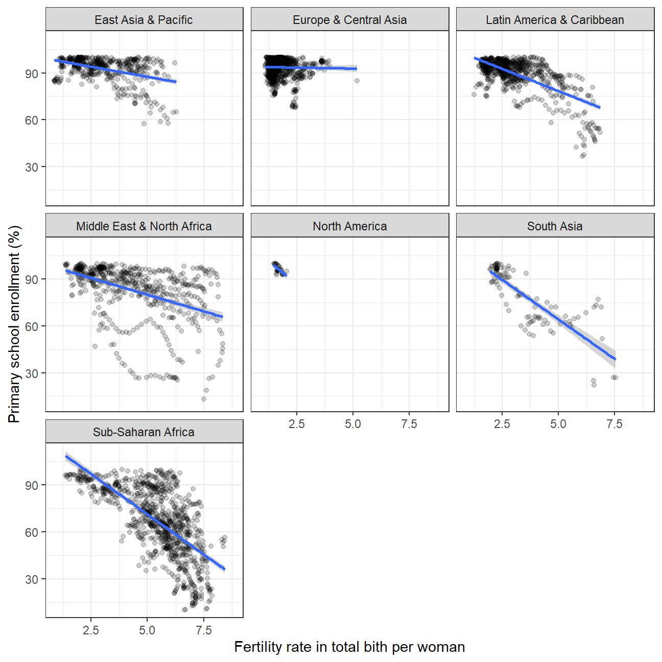 Indedd there is a negative correlation. The higher fertility rate, the lower primary school enrollment rate.
Challenge 1: Excess rentals in TfL bike sharing
Recall the TfL data on how many bikes were hired every single day. We can get the latest data by running the following
url <- "https://data.london.gov.uk/download/number-bicycle-hires/ac29363e-e0cb-47cc-a97a-e216d900a6b0/tfl-daily-cycle-hires.xlsx"

# Download TFL data to temporary file
httr::GET(url, write_disk(bike.temp <- tempfile(fileext = ".xlsx")))
## Response [https://airdrive-secure.s3-eu-west-1.amazonaws.com/london/dataset/number-bicycle-hires/2021-08-23T14%3A32%3A29/tfl-daily-cycle-hires.xlsx?X-Amz-Algorithm=AWS4-HMAC-SHA256&X-Amz-Credential=AKIAJJDIMAIVZJDICKHA%2F20210916%2Feu-west-1%2Fs3%2Faws4_request&X-Amz-Date=20210916T223944Z&X-Amz-Expires=300&X-Amz-Signature=6727f1ca583e0cd0b0235a8d613e3e532663f78e849b7e38346069255c5bc9e3&X-Amz-SignedHeaders=host]
## Date: 2021-09-16 22:39
## Status: 200
## Content-Type: application/vnd.openxmlformats-officedocument.spreadsheetml.sheet
## Size: 173 kB
## <ON DISK> C:\Users\Xinyue\AppData\Local\Temp\Rtmp8c2GNi\file6b80142bc0.xlsx# Use read_excel to read it as dataframe
bike0 <- read_excel(bike.temp,
sheet = "Data",
range = cell_cols("A:B"))
# change dates to get year, month, and week
bike <- bike0 %>%
clean_names() %>%
rename (bikes_hired = number_of_bicycle_hires) %>%
mutate (year = year(day),
month = lubridate::month(day, label = TRUE),
week = isoweek(day))We can easily create a facet grid that plots bikes hired by month and year.

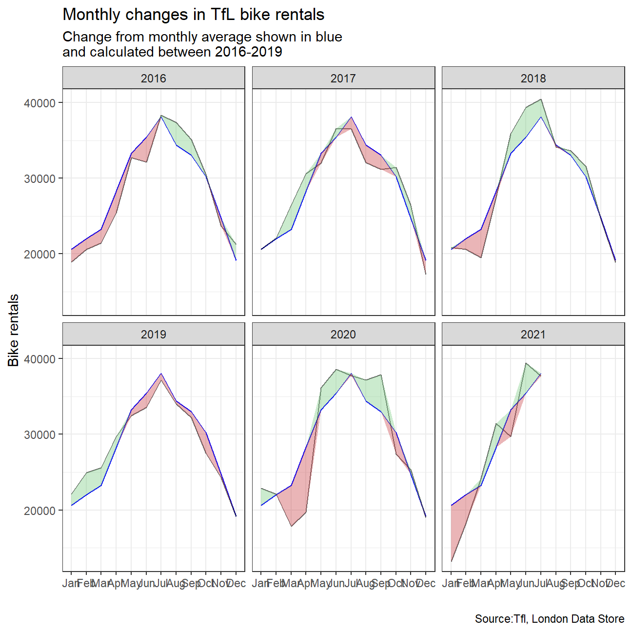
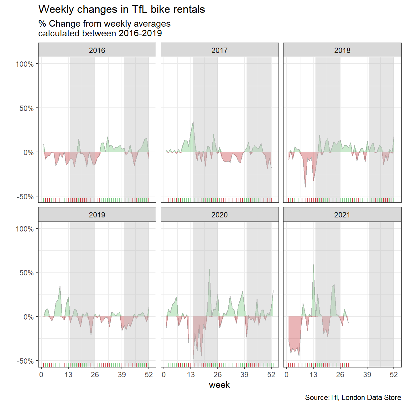
Look at May and Jun and compare 2020 with the previous years. What’s happening? The effect of the pandemic is clear. Bike rentals seem to fall considerably mainly because of lockdown
We will then try to replicate the graphs:
For both of these graphs, we have to calculate the expected number of rentals per week or month between 2016-2019 and then, see how each week/month of 2020-2021 compares to the expected rentals. Think of the calculation excess_rentals = actual_rentals - expected_rentals.
Should you use the mean or the median to calculate your expected rentals? Why?
#find key statistics about 2016-2019 period
bike_new<-bike %>%
  filter(year %in% c(2016,2017,2018,2019))
favstats(bikes_hired~month,data=bike_new)
## month min Q1 median Q3 max mean sd n missing
## 1 Jan 4894 16515 22430 25484 38042 20617 6106 124 0
## 2 Feb 8975 18624 23738 25791 35420 22049 5843 113 0
## 3 Mar 6362 19662 24782 28083 35321 23237 6982 124 0
## 4 Apr 7998 23946 28475 33427 45048 28299 7042 120 0
## 5 May 16227 28948 34613 38064 45435 33270 6467 124 0
## 6 Jun 13358 31250 37171 39900 46084 35413 6194 120 0
## 7 Jul 16392 34586 39332 42477 46625 38109 5996 124 0
## 8 Aug 8177 30762 35318 39350 44648 34393 6462 124 0
## 9 Sep 12376 29539 34736 36852 44909 33013 5996 120 0
## 10 Oct 10043 27085 32399 34717 39569 30235 6337 124 0
## 11 Nov 9585 19163 26730 29085 34747 24752 6145 120 0
## 12 Dec 5143 12885 18889 25199 37401 19118 7482 124 0#find average monthly rentals for 2016-2019
monthly_avg <- bike %>%
filter(year %in% c(2016,2017,2018,2019)) %>%
group_by(month) %>%
summarise(
mean_bikes_overall = mean(bikes_hired)
)
monthly_avg## # A tibble: 12 x 2
## month mean_bikes_overall
## <ord> <dbl>
## 1 Jan 20617.
## 2 Feb 22049.
## 3 Mar 23237.
## 4 Apr 28299.
## 5 May 33270.
## 6 Jun 35413.
## 7 Jul 38109.
## 8 Aug 34393.
## 9 Sep 33013.
## 10 Oct 30235.
## 11 Nov 24752.
## 12 Dec 19118.#find average monthly rentals for 2016-2019 (each year seperate)
bikes_monthly_mean <- bike %>%
filter(year %in% c(2016,2017,2018,2019,2020,2021)) %>%
group_by(month, year) %>%
summarize(
mean_monthly_bikes = mean(bikes_hired)
)
bikes_monthly_mean## # A tibble: 67 x 3
## # Groups: month [12]
## month year mean_monthly_bikes
## <ord> <dbl> <dbl>
## 1 Jan 2016 18914.
## 2 Jan 2017 20596.
## 3 Jan 2018 20836.
## 4 Jan 2019 22123.
## 5 Jan 2020 22893.
## 6 Jan 2021 13218.
## 7 Feb 2016 20608.
## 8 Feb 2017 22091.
## 9 Feb 2018 20587.
## 10 Feb 2019 24961.
## # ... with 57 more rowsbikes_with_avg <- left_join(bikes_monthly_mean, monthly_avg, on='month')
#find change in rentals compared to average
bikes_with_avg <- bikes_with_avg %>%
mutate(excess_rentals = mean_monthly_bikes - mean_bikes_overall)
bikes_with_avg## # A tibble: 67 x 5
## # Groups: month [12]
## month year mean_monthly_bikes mean_bikes_overall excess_rentals
## <ord> <dbl> <dbl> <dbl> <dbl>
## 1 Jan 2016 18914. 20617. -1703.
## 2 Jan 2017 20596. 20617. -20.6
## 3 Jan 2018 20836. 20617. 218.
## 4 Jan 2019 22123. 20617. 1505.
## 5 Jan 2020 22893. 20617. 2276.
## 6 Jan 2021 13218. 20617. -7399.
## 7 Feb 2016 20608. 22049. -1441.
## 8 Feb 2017 22091. 22049. 42.1
## 9 Feb 2018 20587. 22049. -1462.
## 10 Feb 2019 24961. 22049. 2912.
## # ... with 57 more rowsmonth_labs<-c("Jan","Feb","Mar","Apr","May","Jun","Jul","Aug","Sep","Oct","Nov","Dec")
bikes_with_avg$month <-factor(bikes_with_avg$month,label=month_labs,ordered = TRUE)
bikes_with_avg## # A tibble: 67 x 5
## # Groups: month [12]
## month year mean_monthly_bikes mean_bikes_overall excess_rentals
## <ord> <dbl> <dbl> <dbl> <dbl>
## 1 Jan 2016 18914. 20617. -1703.
## 2 Jan 2017 20596. 20617. -20.6
## 3 Jan 2018 20836. 20617. 218.
## 4 Jan 2019 22123. 20617. 1505.
## 5 Jan 2020 22893. 20617. 2276.
## 6 Jan 2021 13218. 20617. -7399.
## 7 Feb 2016 20608. 22049. -1441.
## 8 Feb 2017 22091. 22049. 42.1
## 9 Feb 2018 20587. 22049. -1462.
## 10 Feb 2019 24961. 22049. 2912.
## # ... with 57 more rows#create first required plot
#create variables "up" and "down" denoting the shifts from the average
bikes_with_avg_new<-bikes_with_avg %>%
mutate(up=ifelse(excess_rentals>0,as.numeric(excess_rentals),0),down=ifelse(excess_rentals<0,as.numeric(excess_rentals),0)) %>%
arrange(year,month)
bikes_with_avg_new## # A tibble: 67 x 7
## # Groups: month [12]
## month year mean_monthly_bikes mean_bikes_overall excess_rentals up down
## <ord> <dbl> <dbl> <dbl> <dbl> <dbl> <dbl>
## 1 Jan 2016 18914. 20617. -1703. 0 -1703.
## 2 Feb 2016 20608. 22049. -1441. 0 -1441.
## 3 Mar 2016 21435 23237. -1802. 0 -1802.
## 4 Apr 2016 25444. 28299. -2856. 0 -2856.
## 5 May 2016 32699. 33270. -571. 0 -571.
## 6 Jun 2016 32108. 35413. -3306. 0 -3306.
## 7 Jul 2016 38336. 38109. 227. 227. 0
## 8 Aug 2016 37368. 34393. 2975. 2975. 0
## 9 Sep 2016 35101. 33013. 2088. 2088. 0
## 10 Oct 2016 30488. 30235. 254. 254. 0
## # ... with 57 more rows#plot diagram
ggplot(bikes_with_avg_new, aes(x = month)) +
geom_line(aes(group=1, y = mean_bikes_overall),color = "blue") +
geom_line(aes(group=1, y = mean_monthly_bikes),color="black",alpha=0.6)+
#include lines that show shifts from mean
geom_ribbon(aes(group=1, ymin = mean_bikes_overall, ymax = mean_bikes_overall+up),fill="#7DCD85",alpha=0.4)+
geom_ribbon(aes(group=1, ymin = mean_bikes_overall, ymax = mean_bikes_overall+down),fill="#CB454A",alpha=0.4)+
#facet wrap by year
facet_wrap(~year) +
#change theme and legends
theme_bw()+labs(
title = "Monthly changes in TfL bike rentals",
subtitle = "Change from monthly average shown in blue\nand calculated between 2016-2019 ",
y="Bike rentals",
x="",
caption = "Source:Tfl, London Data Store"
)
#create dataframes for second required graph

#change certain dates (some days of the week at the end or the start of the year are counted towards the wrong year)
bike1<-bike %>%
  mutate(month=as.numeric(month)) %>%
  mutate(year=ifelse(month==12 & week==1, year+1,year)) %>%
  mutate(year=ifelse(month==1 & week==53, year-1,year))

#calculate weekly averages
weekly_avg <- bike1 %>%
  filter(year %in% c(2016,2017,2018,2019)) %>%
  group_by(week) %>%
  summarise(
    mean_weekly_overall = mean(bikes_hired)
  )

weekly_avg
## # A tibble: 52 x 2
## week mean_weekly_overall
## <dbl> <dbl>
## 1 1 17388.
## 2 2 22056.
## 3 3 21892.
## 4 4 21470.
## 5 5 21194.
## 6 6 20226.
## 7 7 23254.
## 8 8 23575.
## 9 9 20167
## 10 10 23403.
## # ... with 42 more rows#edit for week 53(some days are counted towards the wrong year)
weekly_avg_53 <- bike1 %>%
filter(year == 2015 & week==53) %>%
group_by(week) %>%
summarise(
mean_weekly_overall = mean(bikes_hired)
)
#combine the dataframes to create final dataframe
weekly_avg_new<-full_join(weekly_avg,weekly_avg_53,on='week')
weekly_avg_new## # A tibble: 53 x 2
## week mean_weekly_overall
## <dbl> <dbl>
## 1 1 17388.
## 2 2 22056.
## 3 3 21892.
## 4 4 21470.
## 5 5 21194.
## 6 6 20226.
## 7 7 23254.
## 8 8 23575.
## 9 9 20167
## 10 10 23403.
## # ... with 43 more rowsbikes_weekly_mean <- bike1 %>%
filter(year %in% c(2016,2017,2018,2019,2020,2021)) %>%
group_by(year,week) %>%
summarize(
mean_weekly_bikes = mean(bikes_hired)
)
bikes_weekly_mean## # A tibble: 291 x 3
## # Groups: year [6]
## year week mean_weekly_bikes
## <dbl> <dbl> <dbl>
## 1 2016 1 18867.
## 2 2016 2 20255.
## 3 2016 3 20937.
## 4 2016 4 20550.
## 5 2016 5 21230
## 6 2016 6 19896.
## 7 2016 7 19655.
## 8 2016 8 21205.
## 9 2016 9 19865.
## 10 2016 10 21974.
## # ... with 281 more rowsbikes_week_avg <- left_join(bikes_weekly_mean, weekly_avg_new, on='week')
bikes_week_avg <- bikes_week_avg %>%
mutate(excess_weekly_rentals = mean_weekly_bikes - mean_weekly_overall)
#mutate to include "up" and "down" variables (similarly as above)
bikes_week_avg_new<-bikes_week_avg %>%
mutate(excess_weekly_rentals_percent=(excess_weekly_rentals/mean_weekly_overall)*100,
up=ifelse(excess_weekly_rentals>0,
as.numeric(excess_weekly_rentals/mean_weekly_overall)*100,
0),
down=ifelse(excess_weekly_rentals<0,
as.numeric(excess_weekly_rentals/mean_weekly_overall)*100
,0)
) %>%
arrange(year,week)
bikes_week_avg_new## # A tibble: 291 x 8
## # Groups: year [6]
## year week mean_weekly_bikes mean_weekly_overall excess_weekly_rentals
## <dbl> <dbl> <dbl> <dbl> <dbl>
## 1 2016 1 18867. 17388. 1479.
## 2 2016 2 20255. 22056. -1802.
## 3 2016 3 20937. 21892. -955.
## 4 2016 4 20550. 21470. -920.
## 5 2016 5 21230 21194. 35.8
## 6 2016 6 19896. 20226. -330.
## 7 2016 7 19655. 23254. -3599
## 8 2016 8 21205. 23575. -2370.
## 9 2016 9 19865. 20167 -302.
## 10 2016 10 21974. 23403. -1429.
## # ... with 281 more rows, and 3 more variables:
## # excess_weekly_rentals_percent <dbl>, up <dbl>, down <dbl>#plot second graph
ggplot(bikes_week_avg_new, aes(x = week)) +
geom_line(aes(group=1, y = excess_weekly_rentals_percent),color="black",alpha=0.3) +
#include areas denoting shifts from the average
geom_ribbon(aes(group=1, ymin = 0, ymax = up),fill="#7DCD85",alpha=0.4)+
geom_ribbon(aes(group=1, ymin = 0, ymax = down),fill="#CB454A",alpha=0.4)+
#facet wrap by year
facet_wrap(~year) +
#edit scales
scale_y_continuous(breaks = c(-50, 0, 50,100),
labels = function(x) paste0(x, "%"),limits = c(-50,100))+
scale_x_continuous(breaks = seq(0,53,by=13),
limits = c(1,53))+
#edit legends theme and appearance of graph
theme_bw()+
annotate("rect", xmin=14, xmax=26, ymin=-Inf, ymax=Inf, alpha=0.4, fill="grey")+
annotate("rect", xmin=40, xmax=52, ymin=-Inf, ymax=Inf, alpha=0.4, fill="grey")+
#include lines at axis
geom_rug(data=bikes_week_avg_new[bikes_week_avg_new$up>0,],sides="b",colour="#7DCD85")+
geom_rug(data=bikes_week_avg_new[bikes_week_avg_new$down<0,],sides="b",colour="#CB454A")+
#change legends
labs(
title = "Weekly changes in TfL bike rentals",
subtitle = "% Change from weekly averages\ncalculated between 2016-2019 ",
y="",
x="week",
caption = "Source:Tfl, London Data Store"
)
Details
- Who did you collaborate with: Xenia Huber, Wei Guo, Harsh Tripathi,Xinyue Zhang, Nikolaos Panayotou
- Approximately how much time did you spend on this problem set: 10 hours
- What, if anything, gave you the most trouble: No problems
Rubric
Check minus (1/5): Displays minimal effort. Doesn’t complete all components. Code is poorly written and not documented. Uses the same type of plot for each graph, or doesn’t use plots appropriate for the variables being analyzed.
Check (3/5): Solid effort. Hits all the elements. No clear mistakes. Easy to follow (both the code and the output).
Check plus (5/5): Finished all components of the assignment correctly and addressed both challenges. Code is well-documented (both self-documented and with additional comments as necessary). Used tidyverse, instead of base R. Graphs and tables are properly labelled. Analysis is clear and easy to follow, either because graphs are labeled clearly or you’ve written additional text to describe how you interpret the output.