Group assignment 3 of Applied Statics

Youth Risk Behavior Surveillance
Every two years, the Centers for Disease Control and Prevention conduct the Youth Risk Behavior Surveillance System (YRBSS) survey, where it takes data from high schoolers (9th through 12th grade), to analyze health patterns. You will work with a selected group of variables from a random sample of observations during one of the years the YRBSS was conducted.
Load the data
This data is part of the openintro textbook and we can load and inspect it. There are observations on 13 different variables, some categorical and some numerical. The meaning of each variable can be found by bringing up the help file:
?yrbss
data(yrbss)
glimpse(yrbss)
## Rows: 13,583
## Columns: 13
## $ age <int> 14, 14, 15, 15, 15, 15, 15, 14, 15, 15, 15, 1~
## $ gender <chr> "female", "female", "female", "female", "fema~
## $ grade <chr> "9", "9", "9", "9", "9", "9", "9", "9", "9", ~
## $ hispanic <chr> "not", "not", "hispanic", "not", "not", "not"~
## $ race <chr> "Black or African American", "Black or Africa~
## $ height <dbl> NA, NA, 1.73, 1.60, 1.50, 1.57, 1.65, 1.88, 1~
## $ weight <dbl> NA, NA, 84.4, 55.8, 46.7, 67.1, 131.5, 71.2, ~
## $ helmet_12m <chr> "never", "never", "never", "never", "did not ~
## $ text_while_driving_30d <chr> "0", NA, "30", "0", "did not drive", "did not~
## $ physically_active_7d <int> 4, 2, 7, 0, 2, 1, 4, 4, 5, 0, 0, 0, 4, 7, 7, ~
## $ hours_tv_per_school_day <chr> "5+", "5+", "5+", "2", "3", "5+", "5+", "5+",~
## $ strength_training_7d <int> 0, 0, 0, 0, 1, 0, 2, 0, 3, 0, 3, 0, 0, 7, 7, ~
## $ school_night_hours_sleep <chr> "8", "6", "<5", "6", "9", "8", "9", "6", "<5"~skim(yrbss)| Name | yrbss |
| Number of rows | 13583 |
| Number of columns | 13 |
| _______________________ | |
| Column type frequency: | |
| character | 8 |
| numeric | 5 |
| ________________________ | |
| Group variables | None |
Variable type: character
| skim_variable | n_missing | complete_rate | min | max | empty | n_unique | whitespace |
|---|---|---|---|---|---|---|---|
| gender | 12 | 1.00 | 4 | 6 | 0 | 2 | 0 |
| grade | 79 | 0.99 | 1 | 5 | 0 | 5 | 0 |
| hispanic | 231 | 0.98 | 3 | 8 | 0 | 2 | 0 |
| race | 2805 | 0.79 | 5 | 41 | 0 | 5 | 0 |
| helmet_12m | 311 | 0.98 | 5 | 12 | 0 | 6 | 0 |
| text_while_driving_30d | 918 | 0.93 | 1 | 13 | 0 | 8 | 0 |
| hours_tv_per_school_day | 338 | 0.98 | 1 | 12 | 0 | 7 | 0 |
| school_night_hours_sleep | 1248 | 0.91 | 1 | 3 | 0 | 7 | 0 |
Variable type: numeric
| skim_variable | n_missing | complete_rate | mean | sd | p0 | p25 | p50 | p75 | p100 | hist |
|---|---|---|---|---|---|---|---|---|---|---|
| age | 77 | 0.99 | 16.16 | 1.26 | 12.00 | 15.0 | 16.00 | 17.00 | 18.00 | ▁▂▅▅▇ |
| height | 1004 | 0.93 | 1.69 | 0.10 | 1.27 | 1.6 | 1.68 | 1.78 | 2.11 | ▁▅▇▃▁ |
| weight | 1004 | 0.93 | 67.91 | 16.90 | 29.94 | 56.2 | 64.41 | 76.20 | 180.99 | ▆▇▂▁▁ |
| physically_active_7d | 273 | 0.98 | 3.90 | 2.56 | 0.00 | 2.0 | 4.00 | 7.00 | 7.00 | ▆▂▅▃▇ |
| strength_training_7d | 1176 | 0.91 | 2.95 | 2.58 | 0.00 | 0.0 | 3.00 | 5.00 | 7.00 | ▇▂▅▂▅ |
Exploratory Data Analysis
#See how many missing values in 'weight'
skim(yrbss)| Name | yrbss |
| Number of rows | 13583 |
| Number of columns | 13 |
| _______________________ | |
| Column type frequency: | |
| character | 8 |
| numeric | 5 |
| ________________________ | |
| Group variables | None |
Variable type: character
| skim_variable | n_missing | complete_rate | min | max | empty | n_unique | whitespace |
|---|---|---|---|---|---|---|---|
| gender | 12 | 1.00 | 4 | 6 | 0 | 2 | 0 |
| grade | 79 | 0.99 | 1 | 5 | 0 | 5 | 0 |
| hispanic | 231 | 0.98 | 3 | 8 | 0 | 2 | 0 |
| race | 2805 | 0.79 | 5 | 41 | 0 | 5 | 0 |
| helmet_12m | 311 | 0.98 | 5 | 12 | 0 | 6 | 0 |
| text_while_driving_30d | 918 | 0.93 | 1 | 13 | 0 | 8 | 0 |
| hours_tv_per_school_day | 338 | 0.98 | 1 | 12 | 0 | 7 | 0 |
| school_night_hours_sleep | 1248 | 0.91 | 1 | 3 | 0 | 7 | 0 |
Variable type: numeric
| skim_variable | n_missing | complete_rate | mean | sd | p0 | p25 | p50 | p75 | p100 | hist |
|---|---|---|---|---|---|---|---|---|---|---|
| age | 77 | 0.99 | 16.16 | 1.26 | 12.00 | 15.0 | 16.00 | 17.00 | 18.00 | ▁▂▅▅▇ |
| height | 1004 | 0.93 | 1.69 | 0.10 | 1.27 | 1.6 | 1.68 | 1.78 | 2.11 | ▁▅▇▃▁ |
| weight | 1004 | 0.93 | 67.91 | 16.90 | 29.94 | 56.2 | 64.41 | 76.20 | 180.99 | ▆▇▂▁▁ |
| physically_active_7d | 273 | 0.98 | 3.90 | 2.56 | 0.00 | 2.0 | 4.00 | 7.00 | 7.00 | ▆▂▅▃▇ |
| strength_training_7d | 1176 | 0.91 | 2.95 | 2.58 | 0.00 | 0.0 | 3.00 | 5.00 | 7.00 | ▇▂▅▂▅ |
#Filter to exclude NA values and summarize key statistics
yrbss %>%
  filter(weight!="NA") %>%
  summarise_each(funs(mean,median,sd,max,min),weight)
## # A tibble: 1 x 5
## mean median sd max min
## <dbl> <dbl> <dbl> <dbl> <dbl>
## 1 67.9 64.4 16.9 181. 29.9#Histogram for "weight"
yrbss %>%
filter(weight!="NA") %>%
ggplot(aes(x=weight)) +
geom_histogram() +
theme_bw() +
labs(title = "Histogram for Weight",
y = "Count of students",
x = "Weight (in kgs)"
)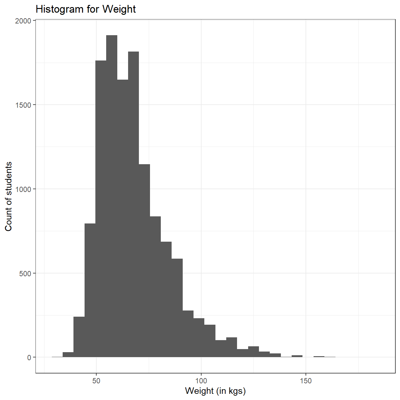 Weight distribution seems to be slightly right skewed, with some extreme values on the “heavy” side. This means that most of the students weigh around the median of the distribution, but we have some outliers towards the right side which pull the mean towards the right and hence, the mean of the distribution is greater than the median.
The average weight is 67.9 kg and the standard deviation is 16.9, showing a large range of values. Heaviest student is 181 kg and lightest is 29.9kg. We can also observe by skimming our data frame that 1004 values are missing from the weight column, but we have excluded those values from our analysis.
Let’s create a new variable in the dataframe yrbss, called physical_3plus , which will be yes if they are physically active for at least 3 days a week, and no otherwise. You may also want to calculate the number and % of those who are and are not active for more than 3 days. Use the count() function and see if you get the same results as group_by()... summarise()
#Create new variable (physical_3plus) and remove any NA values
yrbss <- yrbss %>%
  mutate(physical_3plus = case_when(
    physically_active_7d < 3 ~ "no",
    physically_active_7d >= 3 ~ "yes",
    TRUE ~ "NA"
  )) %>%
  filter(physical_3plus != "NA")

#Calculate number of people who are active and that of those who are not using "group_by()" and "summarise()"
yrbss %>%
  group_by(physical_3plus) %>%
  summarise(total_number = n()) %>%
  mutate(percent = total_number/sum(total_number)*100)
## # A tibble: 2 x 3
## physical_3plus total_number percent
## <chr> <int> <dbl>
## 1 no 4404 33.1
## 2 yes 8906 66.9#Perform the same task with "count()"
yrbss%>%
count(physical_3plus) %>%
mutate(percent = n/sum(n)*100)## # A tibble: 2 x 3
## physical_3plus n percent
## <chr> <int> <dbl>
## 1 no 4404 33.1
## 2 yes 8906 66.9We observe that 66.9% of the students are physically active for at least 3 days a week. We note that both, group_by()..summarise() and count() method give the same results.
Can you provide a 95% confidence interval for the population proportion of high schools that are NOT active 3 or more days per week?
#Calculate CIs for proportion (no/total)
yrbss  %>%
  count(physical_3plus) %>%
  mutate(proportion = n/sum(n),
         s_e = sqrt(proportion*(1-proportion)/sum(n)),
         t_critical = qt(0.975,n-1),
         interval_low = proportion - s_e*t_critical,
         interval_high = proportion + s_e*t_critical
         ) %>%
  filter(physical_3plus=="no")
## # A tibble: 1 x 7
## physical_3plus n proportion s_e t_critical interval_low interval_high
## <chr> <int> <dbl> <dbl> <dbl> <dbl> <dbl>
## 1 no 4404 0.331 0.00408 1.96 0.323 0.339We observe that the sample proportion of students who are not active for 3 or more days per week is 0.331. The 95% confidence interval for the proportion is [0.323, 0.339].
Make a boxplot of physical_3plus vs. weight. Is there a relationship between these two variables? What did you expect and why?
#Plot box plot
yrbss %>%
ggplot(aes(x = physical_3plus, y = weight, color = physical_3plus)) +
geom_boxplot() +
theme_bw() +
labs(color = 'Exercise 3 or more days per week',
x = 'Exercise 3 or more days per week',
y = 'Weight')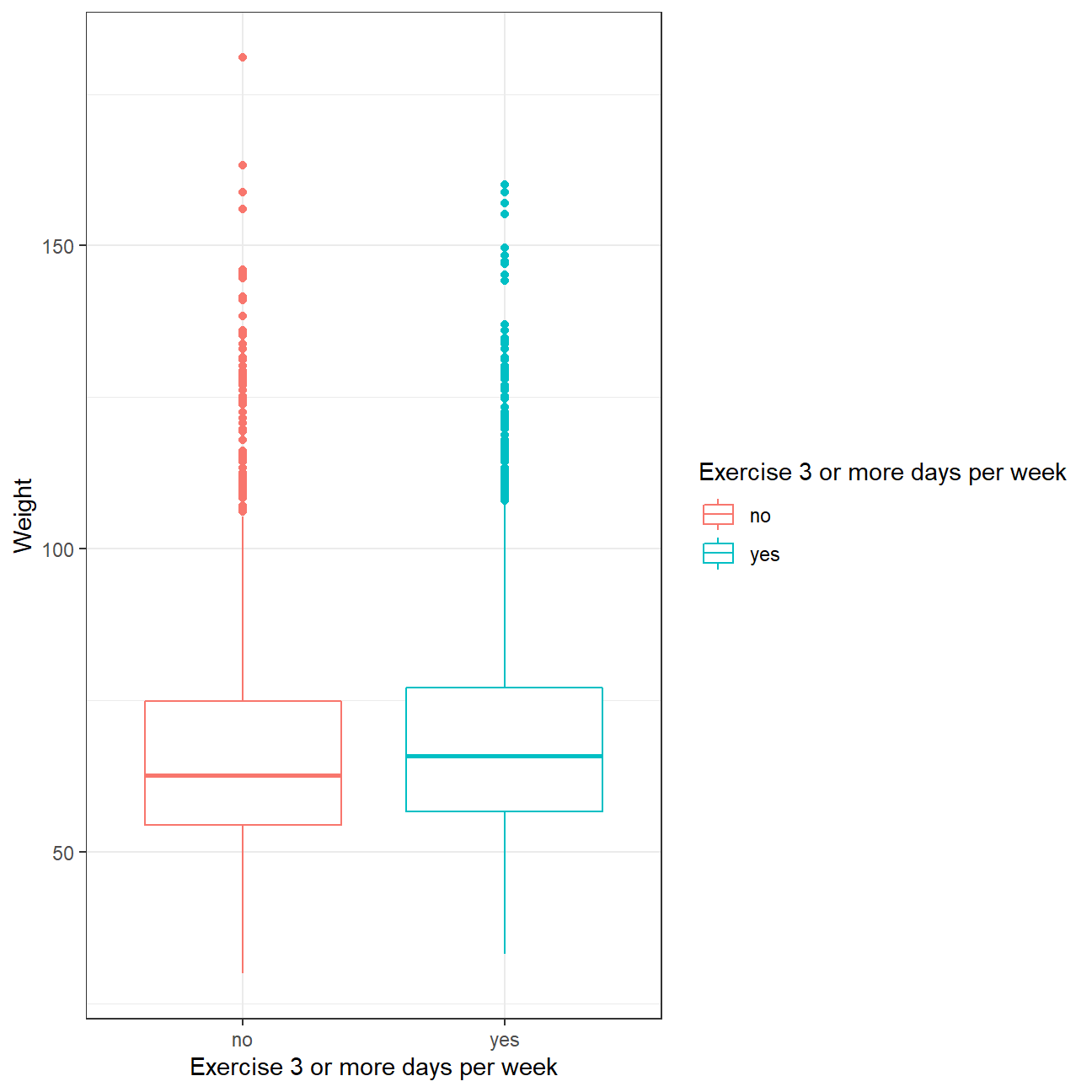 While our initial prejudices and intuition would suggest people who exercise more would be slimmer, data tells another story. It seems that people who regularly exercise on a weekly basis are slightly more heavy than people who don’t and that every quartile is higher for those. Perhaps people who go to the gym build up more muscle mass that contributes to their overall weight. We still need to perform hypothesis testing to determine if the observed difference is statistically significant, and cannot be attributed to luck.
Confidence Interval
Boxplots show how the medians of the two distributions compare, but we can also compare the means of the distributions using either a confidence interval or a hypothesis test. Note that when we calculate the mean, SD, etc. weight in these groups using the mean function, we must ignore any missing values by setting the na.rm = TRUE.
#Calculate mean sd and CI for weight factored by physical_3plus variable
yrbss %>%
  filter(physical_3plus != "NA", weight != "NA") %>%
  group_by(physical_3plus) %>%

  summarise(mean_weight = mean(weight),
            sd_weight = sd(weight),
            count = n()) %>%

  #Our sample size is large enough to use z values for our CIs
  mutate(se_weight = sd_weight/sqrt(count),
         intervel_high = mean_weight + se_weight * 1.96,
         intervel_low = mean_weight - se_weight * 1.96)
## # A tibble: 2 x 7
## physical_3plus mean_weight sd_weight count se_weight intervel_high
## <chr> <dbl> <dbl> <int> <dbl> <dbl>
## 1 no 66.7 17.6 4022 0.278 67.2
## 2 yes 68.4 16.5 8342 0.180 68.8
## # ... with 1 more variable: intervel_low <dbl>There is an observed difference of about 1.77kg (68.44 - 66.67), and we notice that the two confidence intervals do not overlap. It seems that the difference in weight for people who are physically active for at least 3 days and those who are not is statistically significant at 95% confidence level. Let us also conduct a hypothesis test.
Hypothesis test with formula
Null Hypothesis \(H_0\) : \(\mu_{exercise>=3days} - \mu_{exercise<3days} = 0\)
Alternative Hypothesis \(H_1\) : \(\mu_{exercise>=3days} - \mu_{exercise<3days} \neq 0\)
yrbss_weight_not_null <- yrbss %>%
  filter(physical_3plus != "NA", weight != "NA")

#Ho (null hypothesis): Difference of means is 0
#Ha (alternative hypothesis): Difference of means is not 0

#perform two sample t test fro mean difference
t.test(weight ~ physical_3plus, data = yrbss_weight_not_null)
##
## Welch Two Sample t-test
##
## data: weight by physical_3plus
## t = -5, df = 7479, p-value = 9e-08
## alternative hypothesis: true difference in means between group no and group yes is not equal to 0
## 95 percent confidence interval:
## -2.42 -1.12
## sample estimates:
## mean in group no mean in group yes
## 66.7 68.4We observe that the p-value is less than 0.05, so we can reject the null hypothesis at 95% confidence level and conclude that there is a significant difference in weight for people who are physically active for at least 3 days and those who are not is statistically significant.
Hypothesis test with infer
obs_diff <- yrbss_weight_not_null %>%

  #Specifying the variable of interest
  specify(weight ~ physical_3plus) %>%

  #Calculting difference in means
  calculate(stat = "diff in means", order = c("yes", "no"))

obs_diff
## Response: weight (numeric)
## Explanatory: physical_3plus (factor)
## # A tibble: 1 x 1
## stat
## <dbl>
## 1 1.77Notice how you can use the functions specify and calculate again like you did for calculating confidence intervals. Here, though, the statistic you are searching for is the difference in means, with the order being yes - no != 0.
null_dist <- yrbss_weight_not_null %>%
  #Specify variables of interest
  specify(weight ~ physical_3plus) %>%

  #Assume independence, i.e, there is no difference
  hypothesize(null = "independence") %>%

  #Generate 1000 reps, of type "permute"
  generate(reps = 1000, type = "permute") %>%

  #Calculate statistic of difference, namely "diff in means"
  calculate(stat = "diff in means", order = c("yes", "no"))
Here, hypothesize is used to set the null hypothesis as a test for independence, i.e., that there is no difference between the two population means. In one sample cases, the null argument can be set to point to test a hypothesis relative to a point estimate.
Also, note that the type argument within generate is set to permute, which is the argument when generating a null distribution for a hypothesis test.
We can visualize this null distribution with the following code:
#Visualising the null distribution
ggplot(data = null_dist, aes(x = stat)) +
  geom_histogram() +
  theme_bw() +
  labs(title = "Null distribution")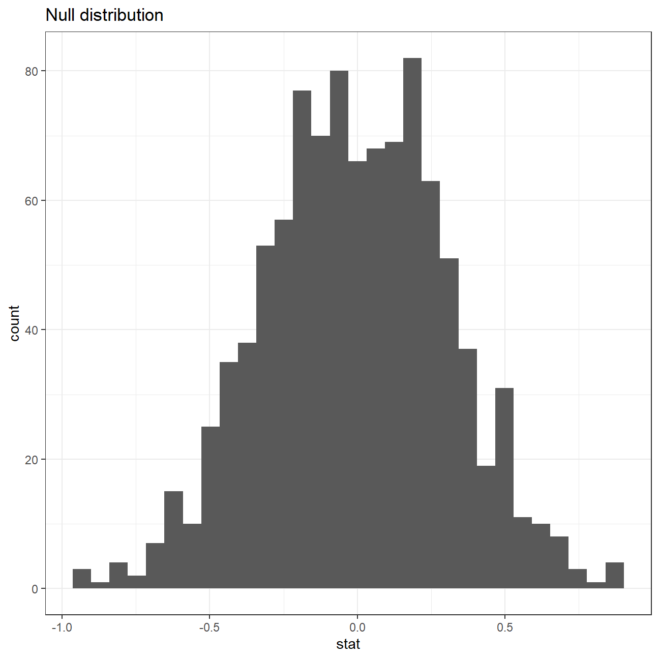
Now that the test is initialized and the null distribution formed, we can visualise to see how many of these null permutations have a difference of at least obs_stat of 1.77?
We can also calculate the p-value for your hypothesis test using the function infer::get_p_value().
null_dist %>% visualize() +
  shade_p_value(obs_stat = obs_diff, direction = "two-sided")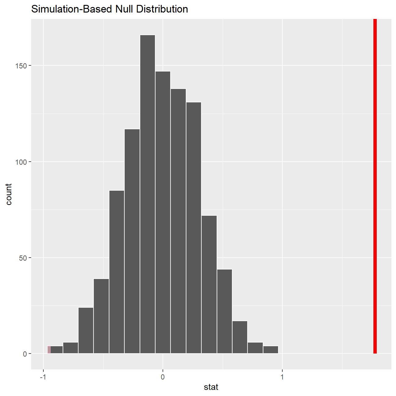
null_dist %>%
  get_p_value(obs_stat = obs_diff, direction = "two_sided")
## # A tibble: 1 x 1
## p_value
## <dbl>
## 1 0This is the standard workflow for performing hypothesis tests.
IMDB ratings: Differences between directors
Recall the IMBD ratings data. I would like you to explore whether the mean IMDB rating for Steven Spielberg and Tim Burton are the same or not. I have already calculated the confidence intervals for the mean ratings of these two directors and as you can see they overlap.

First, I would like you to reproduce this graph. You may find useful.
#Loading the movies dataset
movies <- read_csv(here::here("data", "movies.csv"))
glimpse(movies)
## Rows: 2,961
## Columns: 11
## $ title <chr> "Avatar", "Titanic", "Jurassic World", "The Avenge~
## $ genre <chr> "Action", "Drama", "Action", "Action", "Action", "~
## $ director <chr> "James Cameron", "James Cameron", "Colin Trevorrow~
## $ year <dbl> 2009, 1997, 2015, 2012, 2008, 1999, 1977, 2015, 20~
## $ duration <dbl> 178, 194, 124, 173, 152, 136, 125, 141, 164, 93, 1~
## $ gross <dbl> 7.61e+08, 6.59e+08, 6.52e+08, 6.23e+08, 5.33e+08, ~
## $ budget <dbl> 2.37e+08, 2.00e+08, 1.50e+08, 2.20e+08, 1.85e+08, ~
## $ cast_facebook_likes <dbl> 4834, 45223, 8458, 87697, 57802, 37723, 13485, 920~
## $ votes <dbl> 886204, 793059, 418214, 995415, 1676169, 534658, 9~
## $ reviews <dbl> 3777, 2843, 1934, 2425, 5312, 3917, 1752, 1752, 35~
## $ rating <dbl> 7.9, 7.7, 7.0, 8.1, 9.0, 6.5, 8.7, 7.5, 8.5, 7.2, ~ratings_per_director_CI <- movies %>%
filter(director %in% (c("Tim Burton","Steven Spielberg"))) %>%
#Grouping by director to construct 2 CIs
group_by(director) %>%
summarise(mean_rating = mean(rating),
median_rating = median(rating),
sd_rating = sd(rating),
count = n(),
# get t-critical value with (n-1) degrees of freedom
t_critical = qt(0.975, count-1),
se_rating = sd_rating/sqrt(count),
margin_of_error = t_critical * se_rating,
rating_low = mean_rating - margin_of_error,
rating_high = mean_rating + margin_of_error) %>%
arrange(desc(mean_rating))
#Displaying CI
ratings_per_director_CI## # A tibble: 2 x 10
## director mean_rating median_rating sd_rating count t_critical se_rating
## <chr> <dbl> <dbl> <dbl> <int> <dbl> <dbl>
## 1 Steven Spielberg 7.57 7.6 0.695 23 2.07 0.145
## 2 Tim Burton 6.93 7 0.749 16 2.13 0.187
## # ... with 3 more variables: margin_of_error <dbl>, rating_low <dbl>,
## # rating_high <dbl>#Visualise CIs for two directors
ratings_per_director_CI %>%
ggplot(aes(x = mean_rating, y = reorder(director, mean_rating),
colour=director)) +
geom_point(size = 5) +
#Plotting the error bar and adjusting the size
geom_errorbarh(aes(xmin=rating_low, xmax=rating_high), size=1.1, height = 0.2) +
#Getting the grey coloured block on the plot
annotate("rect", xmin= 7.27, xmax=7.33, ymin=-Inf, ymax=Inf, alpha=0.7, fill="grey") +
#Setting axes labels
labs(x="Mean IMDB Rating",
y= "",
title="Do Spielberg and Burton have the same mean IMDB rating?",
subtitle="95% confidence intervals overlap") +
theme_bw() +
#Adjusting the theme and text
theme(legend.position = "none") +
annotate("text",x=7.27,y=2.2,label="7.27",color='black',face='bold',size=4) +
annotate("text",x=7.57,y=2.2,label="7.57",color='black',face='bold',size=5) +
annotate("text",x=7.87,y=2.2,label="7.87",color='black',face='bold',size=4) +
annotate("text",x=6.53,y=1.2,label="6.53",color='black',face='bold',size=4) +
annotate("text",x=6.93,y=1.2,label="6.93",color='black',face='bold',size=5) +
annotate("text",x=7.33,y=1.2,label="7.33",color='black',face='bold',size=4)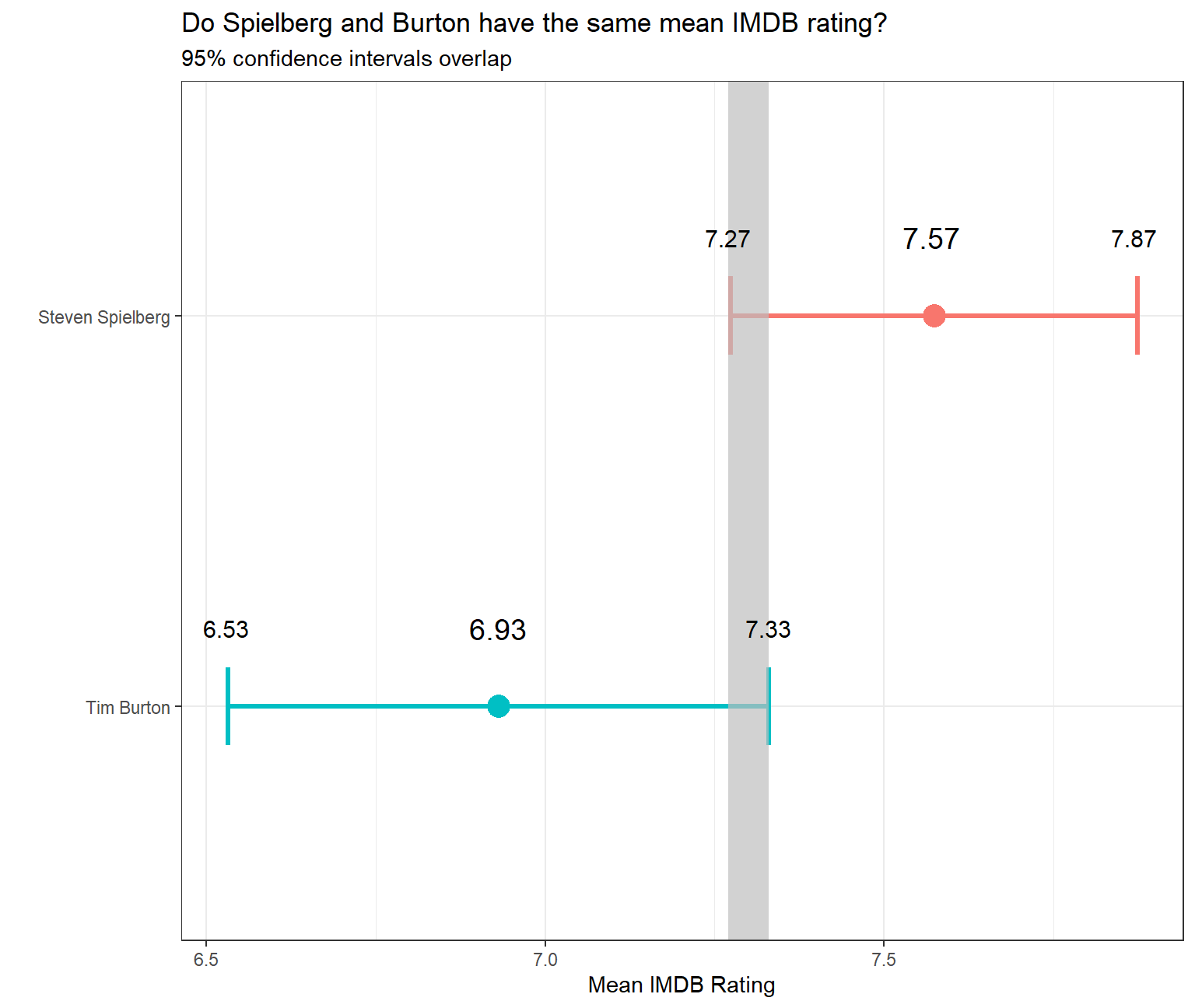
In addition, you will run a hypothesis test. You should use both the t.test command and the infer package to simulate from a null distribution, where you assume zero difference between the two.
Before anything, write down the null and alternative hypotheses, as well as the resulting test statistic and the associated t-stat or p-value. At the end of the day, what do you conclude?
Null Hypothesis \(H_0\) : \(\mu_{Steven Spielberg} - \mu_{Tim Burton} = 0\)
Alternative Hypothesis \(H_1\) : \(\mu_{Steven Spielberg} - \mu_{Tim Burton} \neq 0\)
#Selecting data for relevant directors
movies_new <- movies %>%
  filter(director %in% (c("Tim Burton","Steven Spielberg")))

#Hypothesis testing using t.test()
t.test(rating ~ director, data= movies_new)
##
## Welch Two Sample t-test
##
## data: rating by director
## t = 3, df = 31, p-value = 0.01
## alternative hypothesis: true difference in means between group Steven Spielberg and group Tim Burton is not equal to 0
## 95 percent confidence interval:
## 0.16 1.13
## sample estimates:
## mean in group Steven Spielberg mean in group Tim Burton
## 7.57 6.93We observe that the t-statistic for this hypothesis test is 3 and the associated p-value is 0.01. Since the p-value is less than 0.05, we can reject the null hypothesis at 95% confidence level and conclude that there is a statistically significant difference between the mean ratings of movies of Tim Burton and Steven Spielberg.
#Defining obs_diff for creating bootstrap confidence intervals

obs_diff <- movies_new %>%

  #Specifying the variable of interest
  specify(rating ~ director) %>%

  #Calculating difference in means
  calculate(stat = "diff in means", order = c("Steven Spielberg", "Tim Burton"))
#Constructing bootstrapped CI
set.seed(007)
rating_null_dist <- movies_new %>%
#Specify variables of interest
specify(rating ~ director) %>%
#Assume independence, i.e, there is no difference
hypothesize(null = "independence") %>%
#Generate 1000 reps, of type "permute"
generate(reps = 1000, type = "permute") %>%
#Calculate statistic of difference, namely "diff in means"
calculate(stat = "diff in means", order = c("Steven Spielberg",
"Tim Burton"))#Plotting histogram for null distribution
ggplot(data = rating_null_dist, aes(x = stat)) +
geom_histogram() +
theme_bw() +
labs(title = "Null distribution")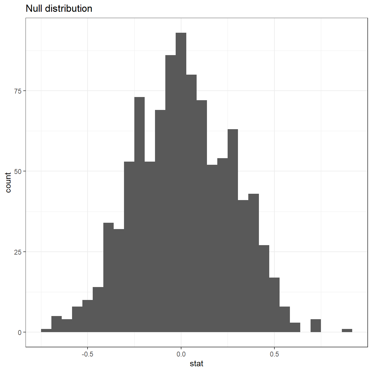
#Shading p-value region
rating_null_dist %>% visualize() +
  shade_p_value(obs_stat = obs_diff, direction = "two-sided")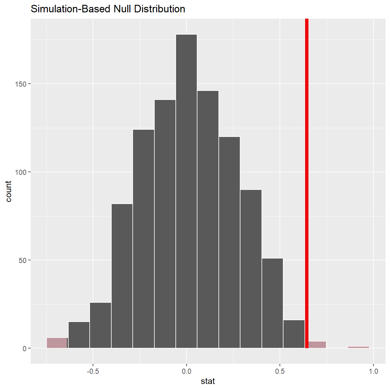
#Getting p-value
rating_null_dist %>%
  get_p_value(obs_stat = obs_diff, direction = "two_sided")
## # A tibble: 1 x 1
## p_value
## <dbl>
## 1 0.01Omega Group plc- Pay Discrimination
At the last board meeting of Omega Group Plc., the headquarters of a large multinational company, the issue was raised that women were being discriminated in the company, in the sense that the salaries were not the same for male and female executives. A quick analysis of a sample of 50 employees (of which 24 men and 26 women) revealed that the average salary for men was about 8,700 higher than for women. This seemed like a considerable difference, so it was decided that a further analysis of the company salaries was warranted.
You are asked to carry out the analysis. The objective is to find out whether there is indeed a significant difference between the salaries of men and women, and whether the difference is due to discrimination or whether it is based on another, possibly valid, determining factor.
Loading the data
#Loading the CSV
omega <- read_csv(here::here("data", "omega.csv"))
glimpse(omega) # examine the data frame
## Rows: 50
## Columns: 3
## $ salary <dbl> 81894, 69517, 68589, 74881, 65598, 76840, 78800, 70033, 635~
## $ gender <chr> "male", "male", "male", "male", "male", "male", "male", "ma~
## $ experience <dbl> 16, 25, 15, 33, 16, 19, 32, 34, 1, 44, 7, 14, 33, 19, 24, 3~Relationship Salary - Gender ?
The data frame omega contains the salaries for the sample of 50 executives in the company. Can you conclude that there is a significant difference between the salaries of the male and female executives?
Note that you can perform different types of analyses, and check whether they all lead to the same conclusion
. Confidence intervals . Hypothesis testing . Correlation analysis . Regression
Calculate summary statistics on salary by gender. Also, create and print a dataframe where, for each gender, you show the mean, SD, sample size, the t-critical, the SE, the margin of error, and the low/high endpoints of a 95% condifence interval
# Summary Statistics of salary by gender
mosaic::favstats (salary ~ gender, data=omega)
## gender min Q1 median Q3 max mean sd n missing
## 1 female 47033 60338 64618 70033 78800 64543 7567 26 0
## 2 male 54768 68331 74675 78568 84576 73239 7463 24 0# Dataframe with two rows (male-female) and having as columns gender, mean, SD, sample size,
# the t-critical value, the standard error, the margin of error,
# and the low/high endpoints of a 95% condifence interval
gender_salary_ci <- omega %>%
group_by(gender) %>%
summarise(
mean_salary = mean(salary),
sd_salary = sd(salary),
count = n(),
# get t-critical value with (n-1) degrees of freedom
t_critical = qt(0.975, count-1),
se_salary = sd_salary/sqrt(count),
margin_of_error = t_critical * se_salary,
salary_low = mean_salary - margin_of_error,
salary_high = mean_salary + margin_of_error
)
gender_salary_ci## # A tibble: 2 x 9
## gender mean_salary sd_salary count t_critical se_salary margin_of_error
## <chr> <dbl> <dbl> <int> <dbl> <dbl> <dbl>
## 1 female 64543. 7567. 26 2.06 1484. 3056.
## 2 male 73239. 7463. 24 2.07 1523. 3151.
## # ... with 2 more variables: salary_low <dbl>, salary_high <dbl>We observe that the 95% confidence intervals for mean salaries of both genders are not overlapping. Hence, we can conclude that there is a significant difference between the population means of salaries of males and females.
You can also run a hypothesis testing, assuming as a null hypothesis that the mean difference in salaries is zero, or that, on average, men and women make the same amount of money. You should tun your hypothesis testing using t.test() and with the simulation method from the infer package.
Null Hypothesis \(H_0\) : \(\mu_{male} - \mu_{female} = 0\) Alternative Hypothesis \(H_1\) : \(\mu_{male} - \mu_{female} \neq 0\)
#Hypothesis testing using t.test()
t.test(salary ~ gender, data= omega)
##
## Welch Two Sample t-test
##
## data: salary by gender
## t = -4, df = 48, p-value = 2e-04
## alternative hypothesis: true difference in means between group female and group male is not equal to 0
## 95 percent confidence interval:
## -12973 -4420
## sample estimates:
## mean in group female mean in group male
## 64543 73239By conducting this t-test, it can be concluded that the null hypothesis can be rejected at 95% confidence level as the p-value is less than 0.05. We can conclude that there is a significant difference between the population means of salaries of males and females.
# hypothesis testing using infer package
set.seed(1234)

boot_salary_null <- omega %>%

  #Specifying the variable of interest
  specify(salary ~ gender) %>%

  #Hypothesize a null of no difference
  hypothesize(null = "independence") %>%

  #Generating random samples
  generate(reps = 1000, type = "permute") %>%

  #Finding mean difference in samples
  calculate(stat = "diff in means", order = c("male", "female"))

boot_salary_null %>% visualize()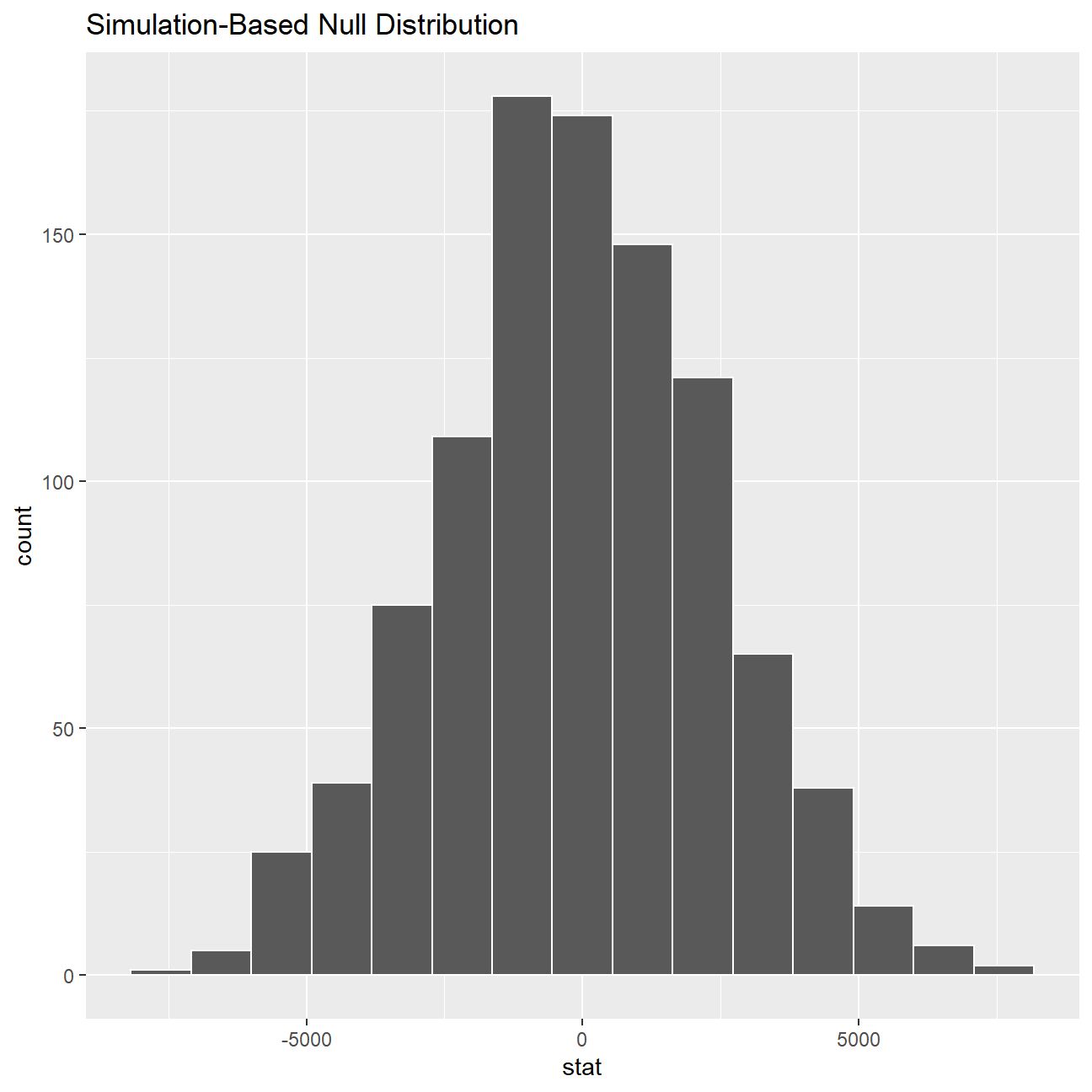
#We get this error in running the following code -
#"Error in if (abs(pval) < 1e-16)" and hence we have commented the code out.
# boot_salary_null %>%
#  get_pvalue(obs_stat = mean(stat), direction = 'both')
Since we see that the confidence intervals do not overlap and that the p-value is less than 0.05, we can conclude that there is a significant difference between the population means of salaries of males and females.
Relationship Experience - Gender?
At the board meeting, someone raised the issue that there was indeed a substantial difference between male and female salaries, but that this was attributable to other reasons such as differences in experience. A questionnaire send out to the 50 executives in the sample reveals that the average experience of the men is approximately 21 years, whereas the women only have about 7 years experience on average (see table below).
#Summary Statistics of salary by gender
favstats (experience ~ gender, data=omega)
## gender min Q1 median Q3 max mean sd n missing
## 1 female 0 0.25 3.0 14.0 29 7.38 8.51 26 0
## 2 male 1 15.75 19.5 31.2 44 21.12 10.92 24 0Based on this evidence, can you conclude that there is a significant difference between the experience of the male and female executives? Perform similar analyses as in the previous section. Does your conclusion validate or endanger your conclusion about the difference in male and female salaries?
experience_ci <- omega %>%
  group_by(gender) %>%
  summarise(
    mean_experience = mean(experience),
    sd_experience = sd(experience),
    count = n(),
    # get t-critical value with (n-1) degrees of freedom
    t_critical = qt(0.975, count-1),
    se_experience = sd_experience/sqrt(count),
    margin_of_error = t_critical * se_experience,
    experience_low = mean_experience - margin_of_error,
    experience_high = mean_experience + margin_of_error
  )

experience_ci
## # A tibble: 2 x 9
## gender mean_experience sd_experience count t_critical se_experience
## <chr> <dbl> <dbl> <int> <dbl> <dbl>
## 1 female 7.38 8.51 26 2.06 1.67
## 2 male 21.1 10.9 24 2.07 2.23
## # ... with 3 more variables: margin_of_error <dbl>, experience_low <dbl>,
## # experience_high <dbl>We observe that the 95% confidence intervals for mean experience of both genders are not overlapping. Hence, we can conclude that there is a significant difference between the population means of experience of males and females.
Null Hypothesis \(H_0\) : \(\mu_{male} - \mu_{female} = 0\) Alternative Hypothesis \(H_1\) : \(\mu_{male} - \mu_{female} \neq 0\)
# hypothesis testing using t.test()
t.test(experience ~ gender, data= omega)
##
## Welch Two Sample t-test
##
## data: experience by gender
## t = -5, df = 43, p-value = 1e-05
## alternative hypothesis: true difference in means between group female and group male is not equal to 0
## 95 percent confidence interval:
## -19.35 -8.13
## sample estimates:
## mean in group female mean in group male
## 7.38 21.12We observe that the mean experience of males is greater than that of females, and the confidence intervals for both genders are not overlapping. The p value of t test is 1e-05. Therefore, we can conclude that the population means of years of experience of males and females are statistically not the same at 95% confidence level. This conclusion endangers our previous one about the difference in male and female salaries. The difference in salary may be due to the difference in experience.
Relationship Salary - Experience ?
Someone at the meeting argues that clearly, a more thorough analysis of the relationship between salary and experience is required before any conclusion can be drawn about whether there is any gender-based salary discrimination in the company.
Analyse the relationship between salary and experience. Draw a scatterplot to visually inspect the data
omega %>%

  #Scatterplot between salary and experience
  ggplot(aes(x=experience, y=salary, col=gender)) +
  geom_point() +

  #Black and white theme
  theme_bw() +

  #Putting title and axes labels
  labs(title = "Scatterplot between Salary and Experience",
       x = "Number of years of work experience",
       y = "Salary",
       color = "Gender")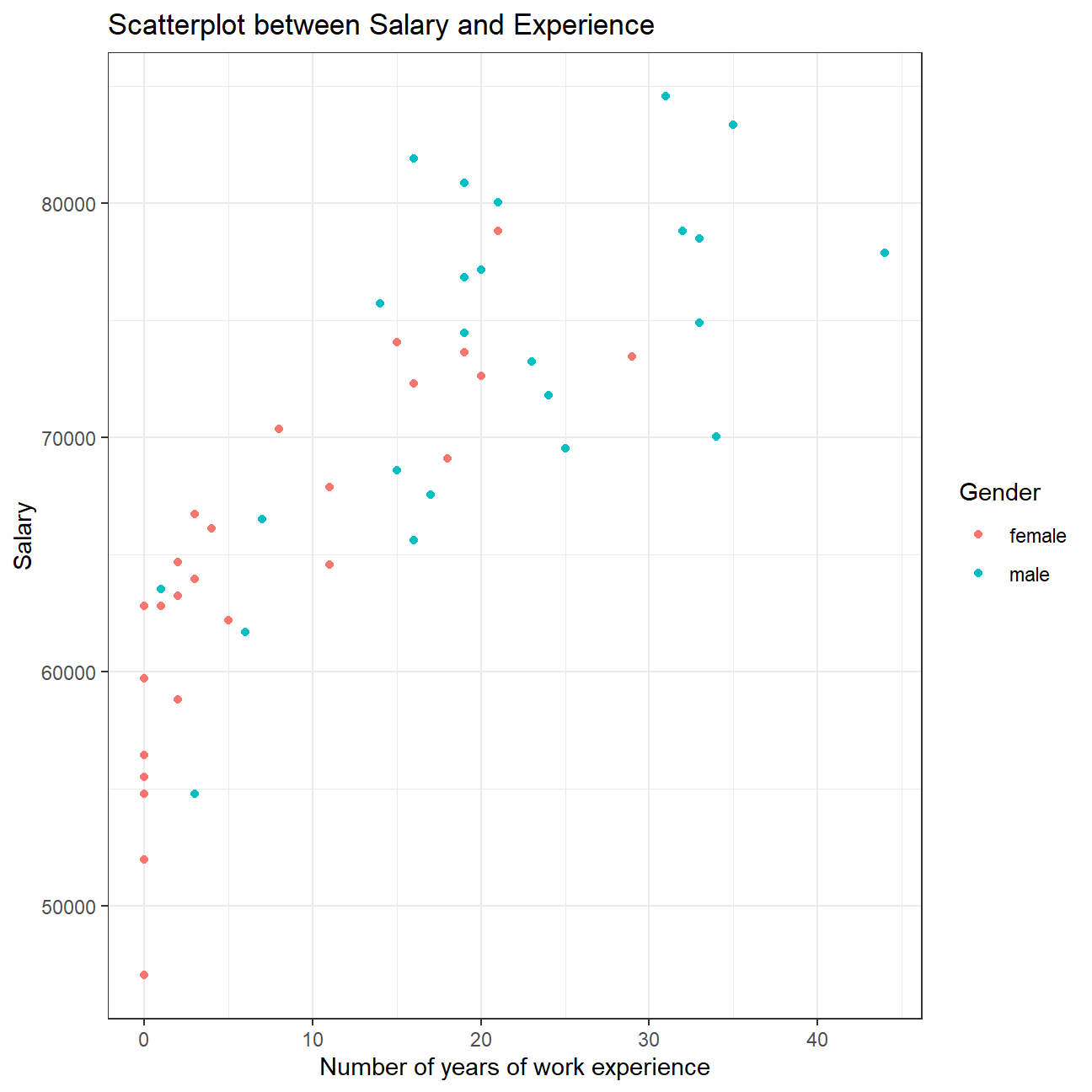
Check correlations between the data
You can use GGally:ggpairs() to create a scatterplot and correlation matrix. Essentially, we change the order our variables will appear in and have the dependent variable (Y), salary, as last in our list. We then pipe the dataframe to ggpairs() with aes arguments to colour by gender and make ths plots somewhat transparent (alpha = 0.3).
omega %>%
  select(gender, experience, salary) %>% #order variables they will appear in ggpairs()
  ggpairs(aes(colour=gender, alpha = 0.3))+
  theme_bw()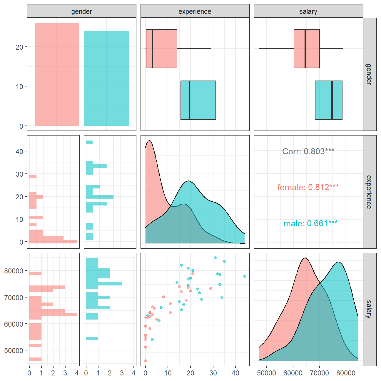
We can observe that salary and work experience are positively correlated. As the number of years of work experience increase, salary increases on average. This relation holds true for males as well as females. However, many women executives have experience less than 5 years and several even have zero year. This means Omega just started to promote women in the previous years, while experience of men executives are more evenly distributed.
Challenge 1: Brexit plot
Using your data manipulation and visualisation skills, please use the Brexit results dataframe (the same dataset you used in the pre-programme assignement) and produce the following plot. Use the correct colour for each party; google “UK Political Party Web Colours” and find the appropriate hex code for colours, not the default colours that R gives you.

#Loading the data
brexit_results <- read_csv(here::here("data","brexit_results.csv"))

glimpse(brexit_results)
## Rows: 632
## Columns: 11
## $ Seat <chr> "Aldershot", "Aldridge-Brownhills", "Altrincham and Sale W~
## $ con_2015 <dbl> 50.6, 52.0, 53.0, 44.0, 60.8, 22.4, 52.5, 22.1, 50.7, 53.0~
## $ lab_2015 <dbl> 18.3, 22.4, 26.7, 34.8, 11.2, 41.0, 18.4, 49.8, 15.1, 21.3~
## $ ld_2015 <dbl> 8.82, 3.37, 8.38, 2.98, 7.19, 14.83, 5.98, 2.42, 10.62, 5.~
## $ ukip_2015 <dbl> 17.87, 19.62, 8.01, 15.89, 14.44, 21.41, 18.82, 21.76, 19.~
## $ leave_share <dbl> 57.9, 67.8, 38.6, 65.3, 49.7, 70.5, 59.9, 61.8, 51.8, 50.3~
## $ born_in_uk <dbl> 83.1, 96.1, 90.5, 97.3, 93.3, 97.0, 90.5, 90.7, 87.0, 88.8~
## $ male <dbl> 49.9, 48.9, 48.9, 49.2, 48.0, 49.2, 48.5, 49.2, 49.5, 49.5~
## $ unemployed <dbl> 3.64, 4.55, 3.04, 4.26, 2.47, 4.74, 3.69, 5.11, 3.39, 2.93~
## $ degree <dbl> 13.87, 9.97, 28.60, 9.34, 18.78, 6.09, 13.12, 7.90, 17.80,~
## $ age_18to24 <dbl> 9.41, 7.33, 6.44, 7.75, 5.73, 8.21, 7.82, 8.94, 7.56, 7.61~#Pivoting the data to long format
elections_pivoted <- brexit_results %>%
#Select only party columns and leave share from the data
select(con_2015, lab_2015, ld_2015, ukip_2015, leave_share) %>%
#Pivot the data longer
pivot_longer(cols = c(con_2015, lab_2015, ld_2015, ukip_2015),
names_to = 'party',
values_to = 'voting_share') %>%
#Select relevant columns
select(party, leave_share, voting_share) %>%
#Rename the columns appropriately
mutate(party = case_when(
party == "con_2015" ~ "Conserative",
party == "lab_2015" ~ "Labour",
party == "ld_2015" ~ "Lib Dems",
party == "ukip_2015" ~ "UKIP"
))
elections_pivoted## # A tibble: 2,528 x 3
## party leave_share voting_share
## <chr> <dbl> <dbl>
## 1 Conserative 57.9 50.6
## 2 Labour 57.9 18.3
## 3 Lib Dems 57.9 8.82
## 4 UKIP 57.9 17.9
## 5 Conserative 67.8 52.0
## 6 Labour 67.8 22.4
## 7 Lib Dems 67.8 3.37
## 8 UKIP 67.8 19.6
## 9 Conserative 38.6 53.0
## 10 Labour 38.6 26.7
## # ... with 2,518 more rowselections_pivoted %>%
#Plotting a scatterplot
ggplot(aes(x=voting_share, y=leave_share, col=party)) +
geom_point(alpha=0.2) +
#Adding a regression line
geom_smooth(method = 'lm') +
#Expanding limits of y
expand_limits(y = c(20,40,60,80,100)) +
#Coloring the points according to party colour hex codes
scale_colour_manual(values = c("Conserative" = "#0087DC",
"Labour" = "#E4003B",
"Lib Dems" = "#FAA61A",
"UKIP" = "#EFE600"
)) +
#Making black & white theme and positioning the legend
theme_bw() +
theme(legend.position="bottom",
legend.title = element_blank()) +
#Adding title and axes labels
labs(title = "How political affiliation translated to Brexit Voting",
x = "Party % in the UK 2015 general election",
y = "Leave % in the 2016 Brexit referendum")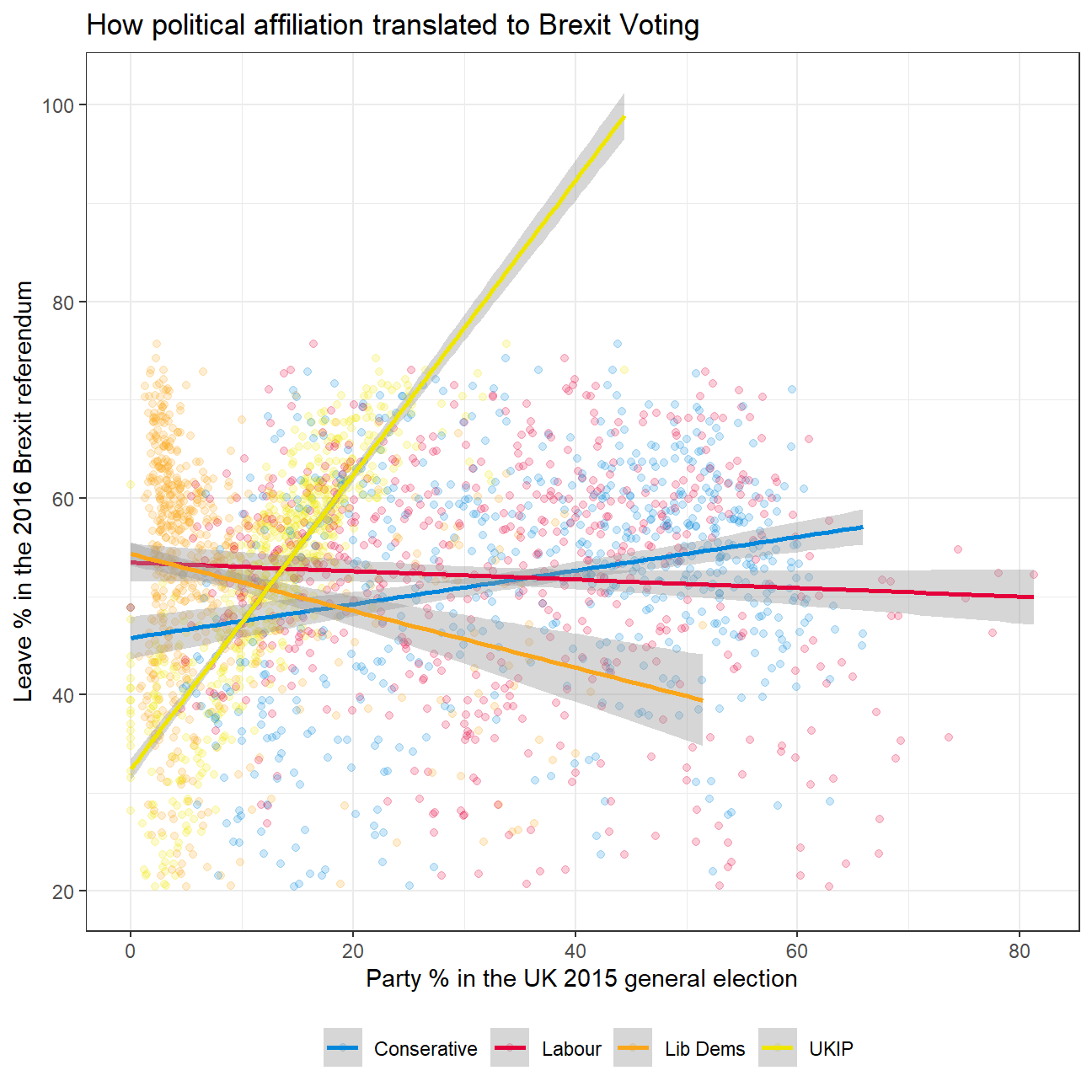
Challenge 2:GDP components over time and among countries
At the risk of oversimplifying things, the main components of gross domestic product, GDP are personal consumption (C), business investment (I), government spending (G) and net exports (exports - imports). You can read more about GDP and the different approaches in calculating at the Wikipedia GDP page.
The GDP data we will look at is from the United Nations’ National Accounts Main Aggregates Database, which contains estimates of total GDP and its components for all countries from 1970 to today. We will look at how GDP and its components have changed over time, and compare different countries and how much each component contributes to that country’s GDP. The file we will work with is GDP and its breakdown at constant 2010 prices in US Dollars and it has already been saved in the Data directory. Have a look at the Excel file to see how it is structured and organised
#Loading data
UN_GDP_data  <-  read_excel(here::here("data", "Download-GDPconstant-USD-countries.xls"), # Excel filename
                sheet="Download-GDPconstant-USD-countr", # Sheet name
                skip=2) # Number of rows to skip
The first thing you need to do is to tidy the data, as it is in wide format and you must make it into long, tidy format. Please express all figures in billions (divide values by 1e9, or \(10^9\)), and you want to rename the indicators into something shorter.
make sure you remove
eval=FALSEfrom the next chunk of R code– I have it there so I could knit the document
#Pivoting the data to long format
tidy_GDP_data  <-  UN_GDP_data %>%
  pivot_longer(
  cols = 4:51,
  names_to = 'year',
  values_to = 'value') %>%

  #Expressing values in billions and renaming indicators
  mutate(value = value / 1e9,
         year = as.integer(year),
         IndicatorName_clean = case_when(
           IndicatorName == "Exports of goods and services" ~ "Exports",
           IndicatorName == "General government final consumption expenditure" ~ "Government expenditure",
           IndicatorName == "Household consumption expenditure (including Non-profit institutions serving households)" ~ "Household expenditure",
           IndicatorName == "Imports of goods and services" ~ "Imports",
           TRUE ~ IndicatorName
         ))

glimpse(tidy_GDP_data)
## Rows: 176,880
## Columns: 6
## $ CountryID <dbl> 4, 4, 4, 4, 4, 4, 4, 4, 4, 4, 4, 4, 4, 4, 4, 4, 4,~
## $ Country <chr> "Afghanistan", "Afghanistan", "Afghanistan", "Afgh~
## $ IndicatorName <chr> "Final consumption expenditure", "Final consumptio~
## $ year <int> 1970, 1971, 1972, 1973, 1974, 1975, 1976, 1977, 19~
## $ value <dbl> 5.56, 5.33, 5.20, 5.75, 6.15, 6.32, 6.37, 6.90, 7.~
## $ IndicatorName_clean <chr> "Final consumption expenditure", "Final consumptio~# Let us compare GDP components for these 3 countries
country_list <- c("United States","India", "Germany")First, can you produce this plot?

tidy_GDP_data %>%

  #Filtering for given countries and indicatores
  filter(Country %in% country_list & IndicatorName_clean %in% c('Gross capital formation', 'Exports','Government expenditure', 'Household expenditure', 'Imports')) %>%

  #Plotting a line chart
  ggplot(aes(x = year, y = value, col=IndicatorName_clean)) +
  geom_line(size = 1.05) +

  #Faceting by country
  facet_wrap(~Country) +

  #Picking appropriate colours for components
  scale_colour_manual(values = c("Gross capital formation" = "coral",
    "Exports" = "darkgoldenrod",
    "Government expenditure" = "springgreen3",
    "Household expenditure" = "dodgerblue",
    "Imports" = "violet"
  )) +

  #Changing the theme and text size
  theme_bw() +
  theme(text = element_text(size=8)) +

  #Renaming the legend
  guides(col=guide_legend(title="Components of GDP")) +

  #Adding chart title and axes labels
  labs(title = "GDP Components over time",
       subtitle = "In constant 2010 USD",
       y = "Billion US$",
       x = "") +

  #Resizing the graph
  coord_fixed(0.01)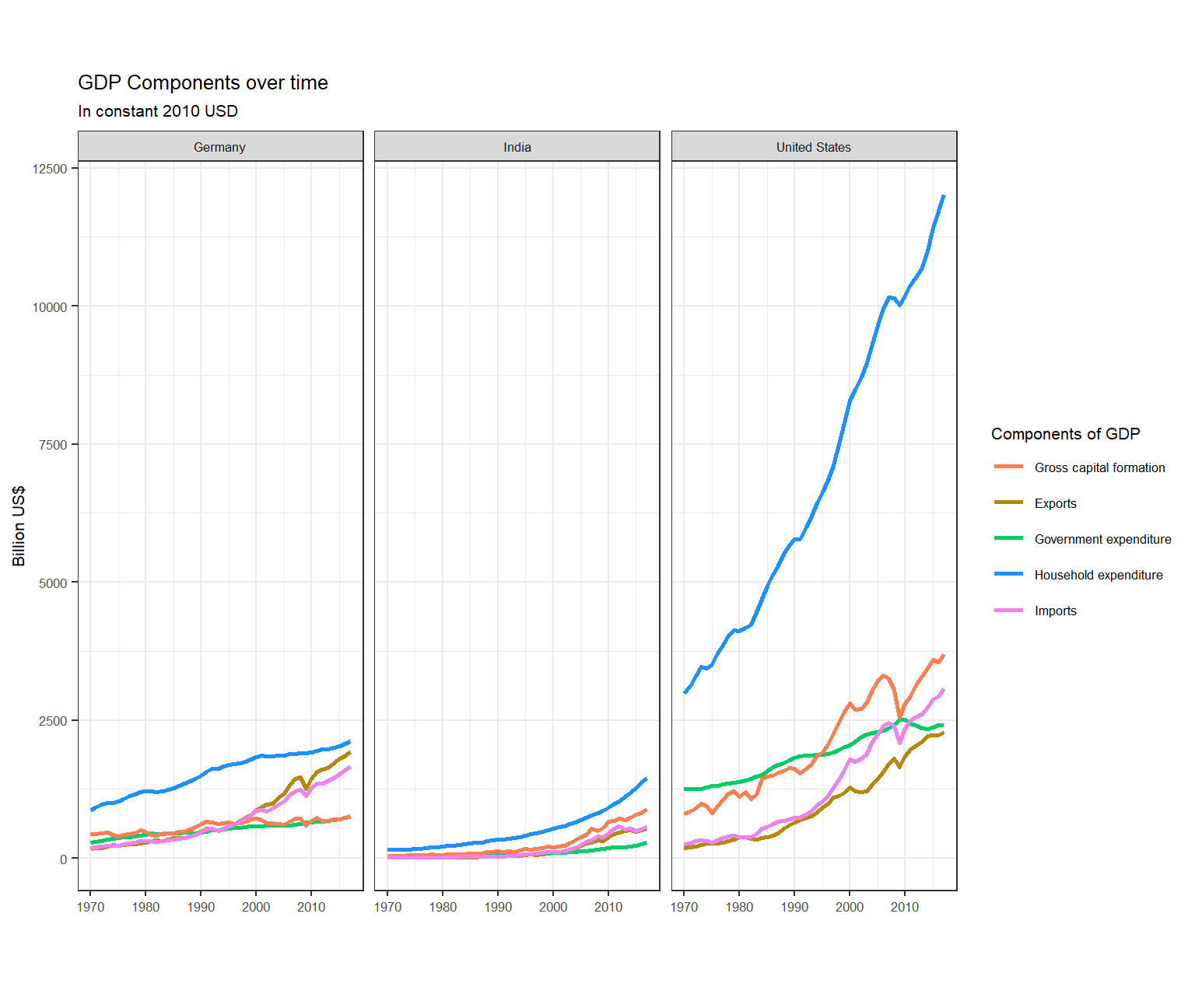
Secondly, recall that GDP is the sum of Household Expenditure (Consumption C), Gross Capital Formation (business investment I), Government Expenditure (G) and Net Exports (exports - imports). Even though there is an indicator Gross Domestic Product (GDP) in your dataframe, I would like you to calculate it given its components discussed above.
What is the % difference between what you calculated as GDP and the GDP figure included in the dataframe?
tidy_GDP_calculated <- tidy_GDP_data %>%

  #Filtering relevant countries and indicators
  filter(Country %in% country_list & IndicatorName_clean %in% c('Gross capital formation', 'Exports','Government expenditure', 'Household expenditure', 'Imports')) %>%

  #Taking negative of value for Imports as it has to be subtracted
  mutate(value = case_when(
    IndicatorName_clean == 'Imports' ~ (-1 * value),
    TRUE ~ value
  )) %>%

  #Grouping by country and year
  group_by(Country, year) %>%

  #Calculating sum of all values to get the GDP
  mutate(GDP_calculated = sum(value)) %>%

  #Selecting only relevant columns
  select(Country, year, GDP_calculated)

#Dropping duplicate values
tidy_GDP_calculated <- tidy_GDP_calculated %>%
  distinct(Country, year, GDP_calculated, .keep_all = TRUE)
#Manipulating data to get given GDP
GDP_given <- tidy_GDP_data %>%
select(Country, year, IndicatorName, value) %>%
filter(IndicatorName == "Gross Domestic Product (GDP)") %>%
rename(GDP_given = value) %>%
select(Country, year, GDP_given)
#Comparing calculated and given GDPs
GDP_diff <- left_join(tidy_GDP_calculated, GDP_given, on = c('Country', 'year'))
#Turning scientific notations off
options(scipen = 999)
#Calculating percentage diff b/w calculated and given GDP
GDP_diff <- GDP_diff %>%
mutate(percentage_diff = round(((GDP_calculated - GDP_given) * 100 / GDP_given), 2))#Plotting percentage diff
GDP_diff %>%
ggplot(aes(x = percentage_diff)) +
geom_histogram() +
theme_bw() +
labs(title = "Histogram for percentage difference in calculated and given GDP",
y = "Count",
x = "Percentage difference")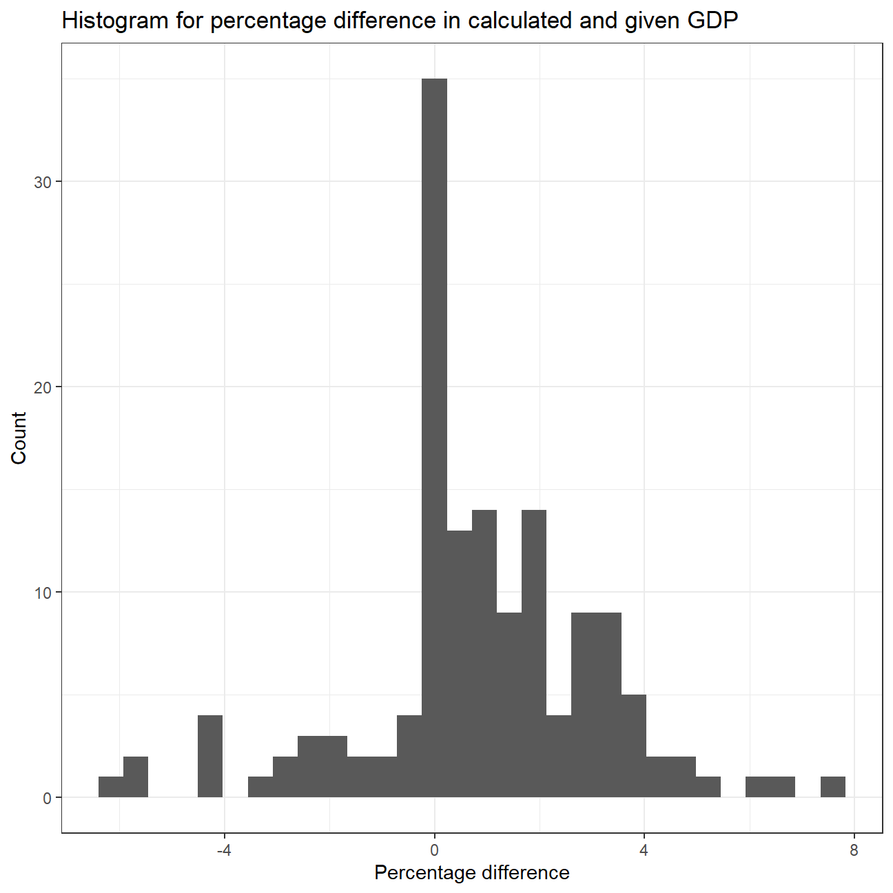
#Summary stat for percentage_diff by country
favstats(percentage_diff ~ Country, data = GDP_diff)
## Country min Q1 median Q3 max mean sd n missing
## 1 Germany -0.04 0.10 0.780 1.71 3.56 1.138 1.16 48 0
## 2 India -6.34 -2.19 -0.200 2.81 7.41 0.193 3.41 48 0
## 3 United States -0.05 0.03 0.985 2.00 4.55 1.269 1.34 48 0We observe that a lot of values have a percentage difference between Calculated and Given GDP as 0. Most of the values have a percentage difference between -4 and 4. On average, India’s calculated and given GDP is the closest while United States has the maximum percentage difference.

What is this last chart telling you? Can you explain in a couple of paragraphs the different dynamic among these three countries?
We observe that the Household Expenditure component is the highest for all the countries. For Germany, we see a flat line for proportion of Household expenditure over the years with a slight downward trend. For India, we see a significant downward trend from just over 70% in 1970 to around 55% in 2020. On the other hand, we see an upward trend in the US which saw an overall increase in Household Expenditure’s proportion of around 6%, from 63% in 1970 to 69% in 2020.
We see that Gross Capital Formation had the second highest proportion for Germany and India (except for a few years in Germany where Government Expenditure’s proportion was higher). For US, Government Expenditure had the second highest proportion until around 1993, after which Gross Capital Formation surpassed and had the second highest proportion till 2020. Gross Capital Formation’s proportion had no significant changes over the given years for Germany and United States, but an upward trend can be observed for India, specially in 2000s. Government expenditure’s proportion showed had a flat line over the given years for Germany and India, but US shows a constant downward trend.
Net Exports had the least proportion among these components for all the countries. Germany had no significant change in proportion till 2000, after which it showed a strong upward trend. India and US had a slight downward trend for Net Exports’ proportion.
If you want to, please change
country_list <- c("United States","India", "Germany")to include your own country and compare it with any two other countries you like
Deliverables
There is a lot of explanatory text, comments, etc. You do not need these, so delete them and produce a stand-alone document that you could share with someone. Knit the edited and completed R Markdown file as an HTML document (use the “Knit” button at the top of the script editor window) and upload it to Canvas.
Details
- Who did you collaborate with: Study Group 4 - Harsh Tripathi, Nikolaos Panayotou, Wei Guo, Xenia Huber, Xinyue Zhang
- Approximately how much time did you spend on this problem set: 12 hours
- What, if anything, gave you the most trouble: Challenges
Please seek out help when you need it, and remember the 15-minute rule. You know enough R (and have enough examples of code from class and your readings) to be able to do this. If you get stuck, ask for help from others, post a question on Slack– and remember that I am here to help too!
As a true test to yourself, do you understand the code you submitted and are you able to explain it to someone else?
Rubric
Check minus (1/5): Displays minimal effort. Doesn’t complete all components. Code is poorly written and not documented. Uses the same type of plot for each graph, or doesn’t use plots appropriate for the variables being analyzed.
Check (3/5): Solid effort. Hits all the elements. No clear mistakes. Easy to follow (both the code and the output).
Check plus (5/5): Finished all components of the assignment correctly and addressed both challenges. Code is well-documented (both self-documented and with additional comments as necessary). Used tidyverse, instead of base R. Graphs and tables are properly labelled. Analysis is clear and easy to follow, either because graphs are labeled clearly or you’ve written additional text to describe how you interpret the output.